Chart generation
This tutorial introduces you to chart generation using Vizro-AI. It explains the basics of creating a plotly chart that can be added to a Vizro dashboard. When you have followed it, you are set up to explore the Vizro and Vizro-AI packages further.
This tutorial requires you to:
- have Python installed
- have access to an API key by an LLM provider
This tutorial assumes an OpenAI API key. If you are using a different LLM provider, the examples will need to be adapted.
1. Install Vizro-AI and ensure you have an LLM API key
If you haven't already installed Vizro-AI and set up the API key for OpenAI, follow the installation guide.
In order to run the exact code in this tutorial, you will need to install Vizro-AI with the [openai] extra. If you want to use a different LLM provider, you can install Vizro-AI with the corresponding extra.
2. Open a Jupyter Notebook
A good way to initially explore Vizro-AI is from inside a Jupyter Notebook.
If you haven't used Jupyter before...
You may need to install the Jupyter package if you . From the terminal window:
Activate the virtual environment you used to install Vizro-AI, and start a new Notebook as follows:
The command opens Jupyter in a browser tab. Use the UI to navigate to a preferred folder in which to create this new dashboard.
Create a new Python 3 (ipykernel) Notebook from the "New" dropdown. Confirm your Vizro installation by typing the following into a cell in the Notebook and running it.
You should see a return output of the form x.y.z.
Required for Jupyter Notebooks
For Vizro-AI to work properly in Jupyter Notebooks, you must add the following two lines at the beginning of your notebook:
This is required because of conflicts between Jupyter's event loop and Pydantic AI's event loop. For more details, see the Pydantic AI troubleshooting guide.
3. Create your first plotly chart using Vizro-AI
Let's create a chart to illustrate the GDP per capita trends for each continent over time. We'll use Vizro-AI to generate the visualization by providing a natural language description of what we want.
API Key Management
For production use, it's preferable to store your API key in an environment variable. This keeps your API key secure and out of your code.
Help! The LLM request was unauthorized
If you see an error similar to this, your LLM API key is not valid:
pydantic_ai.exceptions.ModelHTTPError: status_code: 401, model_name: gpt-5-mini-2025-08-07, body: {'message': 'Incorrect API key provided...}
Make sure you have set up access to a large language model. If you are confident that you have specified your API key correctly and have sufficient credits associated with it, check your environment. Some developers export the environment explicitly to ensure the API key is available at runtime. Call the following in your terminal:
export OPENAI_API_KEY="sk-YOURKEY".
The call above makes the API key available from that terminal instance. If you want to access Vizro-AI from a Notebook, you should then run jupyter notebook (or just work within that terminal to run your Python script in app.py). When you restart the terminal, you'll need to call export again.
Create your first chart with Vizro-AI
# Import required modules
import plotly.express as px
from pydantic_ai.models.openai import OpenAIChatModel
from pydantic_ai.providers.openai import OpenAIProvider
from vizro_ai.agents import chart_agent

# Set up the LLM model
model = OpenAIChatModel(
    "gpt-5-nano-2025-08-07",  # (1)!
    provider=OpenAIProvider(api_key="your-api-key-here"),
)

# Load your data
df = px.data.gapminder()

# Run chart_agent with your natural language prompt
result = chart_agent.run_sync(
    model=model,
    user_prompt="""create a line graph for GDP per capita since 1950 for each continent.
    Mark the x axis as Year, y axis as GDP Per Cap and don't include a title.
    Make sure to take average over continent.""",
    deps=df,
)

# Get the figure object and display it
fig = result.output.chart_function(df)
fig.show()
- We chose this model as it is cheap but good enough for the task at hand.
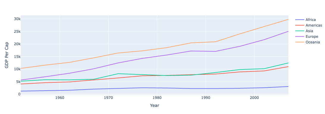
By passing your data and a natural language description, Vizro-AI generates the necessary code for data manipulation and chart creation, then returns an interactive Plotly chart. The chart created is interactive: you can hover over the data for more information.
To learn how to customize the model, check out the guide on how to customize models.
Curious about Vizro charts?
By default, chart_function returns a pure Plotly figure object. If you would like to generate a Vizro-compatible figure that also has the Vizro theming, use vizro_chart_function and ensure that vizro is installed: pip install vizro. More on this topic in our guide on how to add your Vizro-AI charts to a Vizro dashboard.
4. Access the response model
The chart_agent returns a BaseChartPlan object that includes the generated code along with metadata. For example, you can access the code using result.output.code or result.output.code_vizro for Vizro-compatible code. You can then use the code within a Vizro dashboard as illustrated in the Vizro documentation. For the line graph above, the code returned may be as follows:
Access response model properties
# Assuming you have a result object from chart_agent.run_sync()

# Access the code
print("Code:", result.output.code)

# Access Vizro-compatible code
print("Vizro code:", result.output.code_vizro)

# Get the figure object
fig = result.output.chart_function(df)
fig.show()

# Get a reusable chart function
chart_func = result.output.chart_function
fig = chart_func(df)

# Or get a Vizro-compatible chart function
vizro_func = result.output.vizro_chart_function
fig = vizro_func(df)
Code
import plotly.express as px


def custom_chart(data_frame):
    fig = px.choropleth(
        data_frame,
        locations="iso_alpha",
        color="lifeExp",
        hover_name="country",
        color_continuous_scale=px.colors.sequential.Plasma,
        labels={"lifeExp": "Life Expectancy"},
    )
    fig.update_layout(
        title="Global Life Expectancy Distribution",
        geo=dict(showframe=False, showcoastlines=True),
    )
    return fig
Vizro code
import vizro.plotly.express as px
from vizro.models.types import capture
import pandas as pd
import plotly.graph_objects as go
import numpy as np


@capture("graph")
def custom_chart(data_frame):
    fig = px.choropleth(
        data_frame,
        locations="iso_alpha",
        color="lifeExp",
        hover_name="country",
        color_continuous_scale=px.colors.sequential.Plasma,
        labels={"lifeExp": "Life Expectancy"},
    )
    fig.update_layout(
        title="Global Life Expectancy Distribution",
        geo=dict(showframe=False, showcoastlines=True),
    )
    return fig
5. Explore further
Congratulations! You have created your first charts with Vizro-AI and you are ready to explore further.
A good place to start would be to review the different how-to guides to learn about advanced options and how to add your Vizro-AI charts to a Vizro dashboard.
Want to create dashboards?
For dashboard generation, we recommend using Vizro-MCP. It doesn't require an API key and works with familiar LLM applications like VS Code, Cursor, or Claude Desktop.