Explore Vizro
In this tutorial, we walk through the process of creating a sophisticated dashboard. You'll be introduced to some Vizro components and learn how to create a pair of dashboard pages and configure their layout to suit the functionality you need. The example uses the gapminder data.
If you haven't yet done so, you may want to review the first dashboard tutorial before starting on this one.
1. Install Vizro and get ready to run your code
To get started with this tutorial, make sure you have installed Vizro, and can run the dashboard code within a Jupyter Notebook cell or from a Python script.
2. Create a first dashboard page
In this section we create a new Page called first_page.
The foundation of every Vizro dashboard is a Page object. A page uses a set of component types to display the content of the page. These components can be objects such as Graph, Table, Card, Button, Container, or Tabs.
2.1. Add the first figure
Vizro uses Graph objects and Plotly Express functions to build different types of figures.
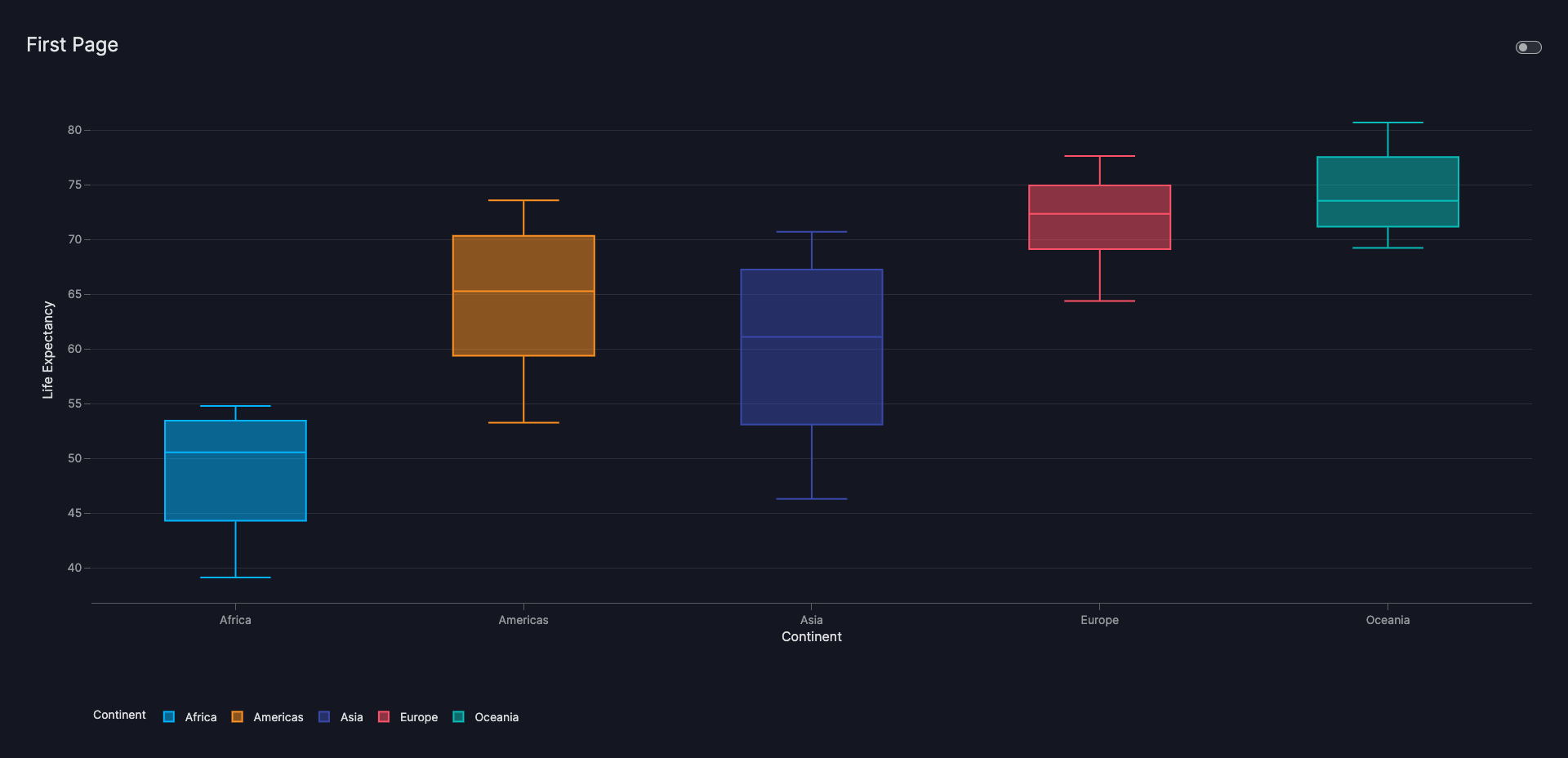
The code below shows the steps necessary to add a box plot to the page:
- Add a Vizro
Graphto thecomponentslist. - Add a
plotly.express.boxfigure to the list of components.
First component
from vizro import Vizro
import vizro.models as vm
import vizro.plotly.express as px

df = px.data.gapminder()
gapminder_data = (
        df.groupby(by=["continent", "year"]).
            agg({"lifeExp": "mean", "pop": "sum", "gdpPercap": "mean"}).reset_index()
    )

first_page = vm.Page(
    title="First Page",
    components=[
        vm.Graph(
            id="box_cont",
            figure=px.box(gapminder_data, x="continent", y="lifeExp", color="continent",
                            labels={"lifeExp": "Life Expectancy", "continent":"Continent"}),
        ),
    ],
)

dashboard = vm.Dashboard(pages=[first_page])
Vizro().build(dashboard).run()
To see the dashboard in action
Paste the above code into a Notebook cell, run the Notebook, and evaluate it.
If you prefer to use Python scripts to Notebooks, here's how to try out the dashboard:
- Create a new script called
app.py. - Copy the code above into the script.
- Navigate to the directory where
app.pyfile is located using your terminal. - Run the script by executing the command
python app.py.
Once the script is running, open your web browser and go to localhost:8050. You should see the dashboard page with the gapminder data displayed, as shown in the Result tab above.
As you can see from the code, the first_page is added to the Dashboard before building and running it with Vizro().build(dashboard).run(). Every Page that you want to display needs to be added to the Dashboard object.
2.2. Add further components
You can combine and arrange various types of components on a dashboard page. The components currently available are Card, Graph, and Button. For more information, refer to the components overview page to find the guide for each type.
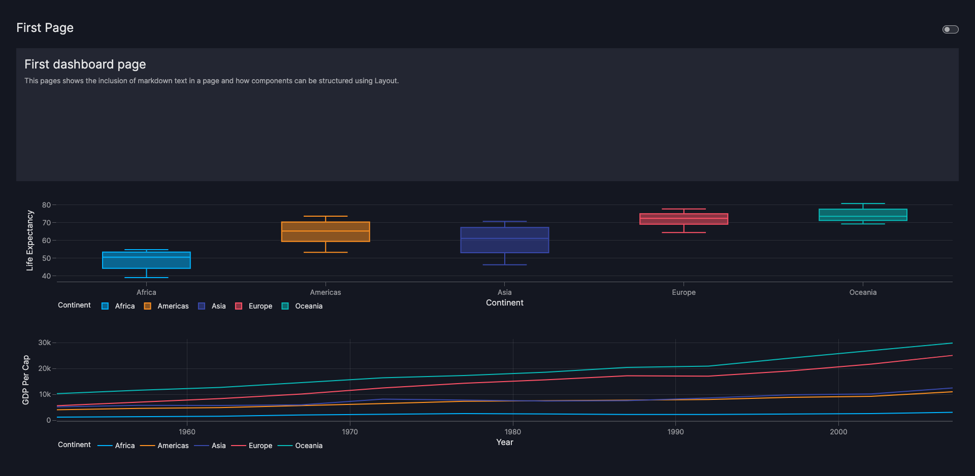
The code below adds two components to the page:
- A
Cardto insert markdown text into the dashboard. - A
Graphto illustrate GDP development per continent since 1952 as a line graph.
Before you run this code in a Jupyter Notebook
If you are following this tutorial in a Jupyter Notebook, you need to restart the kernel each time you evaluate the code. If you do not, you will see error messages such as "Components must uniquely map..." because those components already exist from the previous evaluation.
Add components
from vizro import Vizro
import vizro.models as vm
import vizro.plotly.express as px
df = px.data.gapminder()
gapminder_data = (
df.groupby(by=["continent", "year"]).
agg({"lifeExp": "mean", "pop": "sum", "gdpPercap": "mean"}).reset_index()
)
first_page = vm.Page(
title="First Page",
components=[
vm.Card(
    text="""
        # First dashboard page
        This pages shows the inclusion of markdown text in a page and how components
        can be structured using Layout.
    """,
),
vm.Graph(
id="box_cont",
figure=px.box(gapminder_data, x="continent", y="lifeExp", color="continent",
labels={"lifeExp": "Life Expectancy", "continent":"Continent"}),
),
vm.Graph(
    id="line_gdp",
    figure=px.line(gapminder_data, x="year", y="gdpPercap", color="continent",
                    labels={"year": "Year", "continent": "Continent",
                    "gdpPercap":"GDP Per Cap"}, title=''),
),
],
)
dashboard = vm.Dashboard(pages=[first_page])
Vizro().build(dashboard).run()
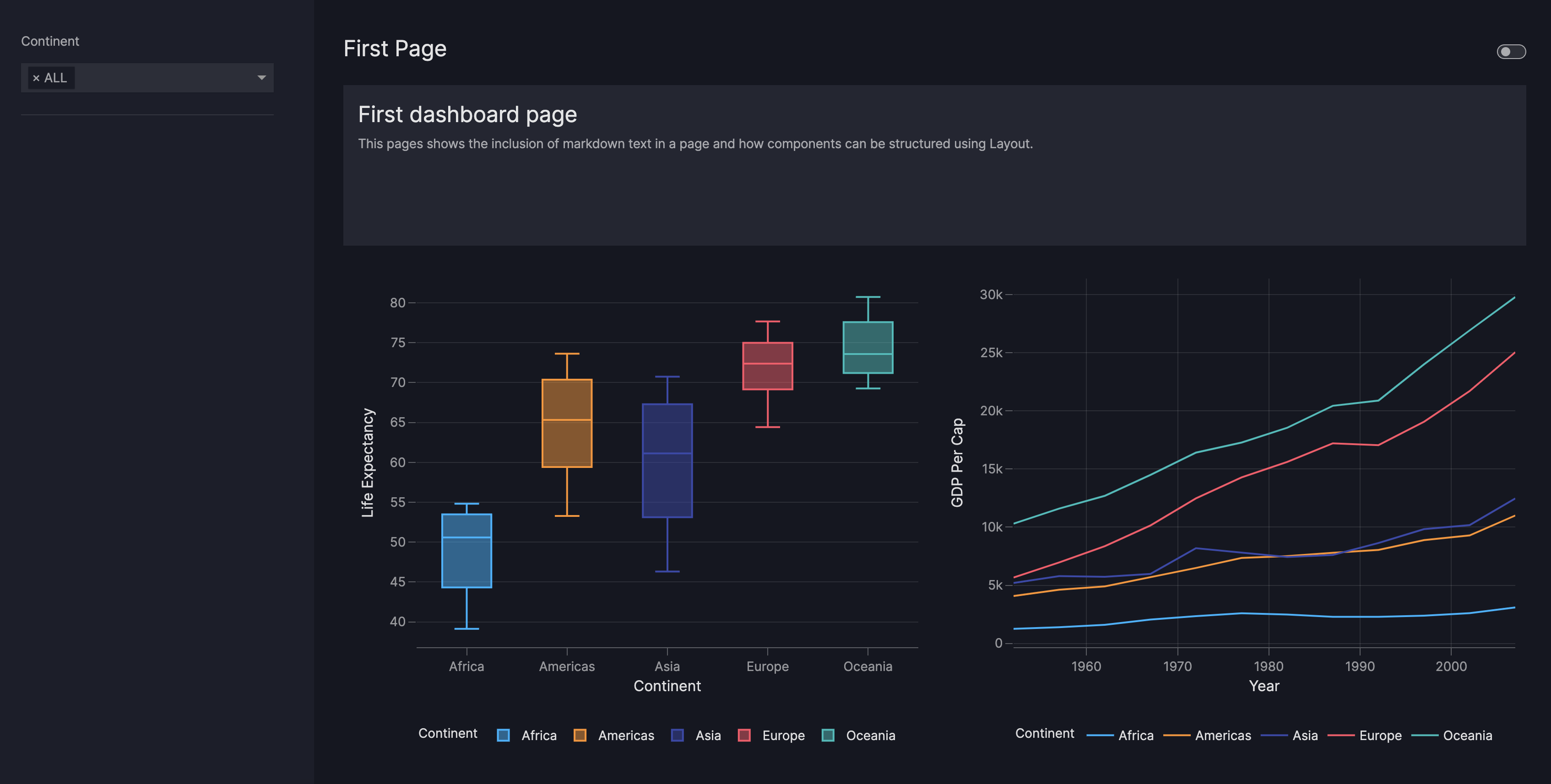
As you explore the dashboard, you may notice that the current layout could be further enhanced. The charts may appear cramped, while the text component has ample unused space. The next section explains how to configure the layout and arrange the components.
An introduction to Vizro-AI
In the example above, the code to create the line graph was generated using Vizro-AI. Vizro-AI enables you to use English, or other languages, to create interactive charts with Plotly by simplifying the process through use of a large language model. In essence, Vizro-AI generates code from natural language instructions so that you can add it into a Vizro dashboard, such as in the example above.
Find out more in the Vizro-AI documentation!
2.3. Configure the layout
By default, Vizro places each element in the order it was added to components list, and spaces them equally.
You can use the Layout object to specify the placement and size of components on the page. To learn more about how to
configure layouts, check out How to use layouts.
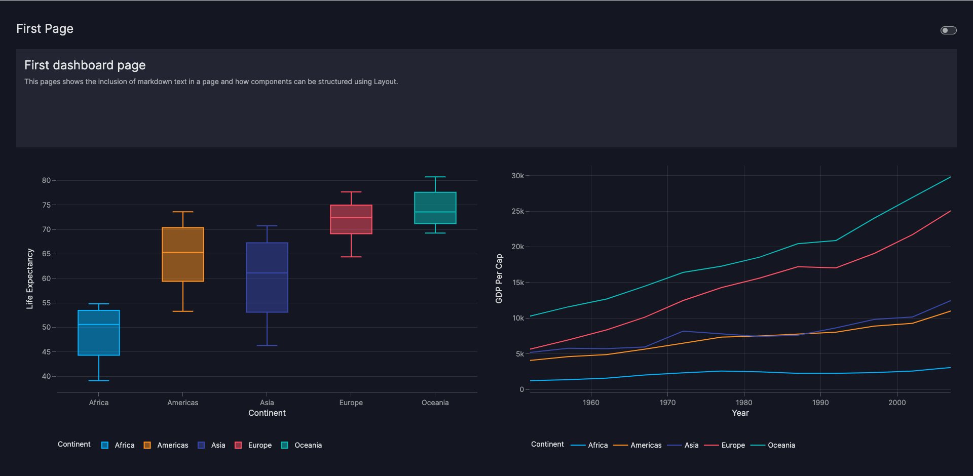
The following layout configuration positions the text at the top and the two charts side by side, giving them more space relative to the text component:
Vizro interprets these values as follows. First, the configuration divides the available space into two columns and
four rows. Each element in the list (such as [0,0]) represents one row of the grid layout:
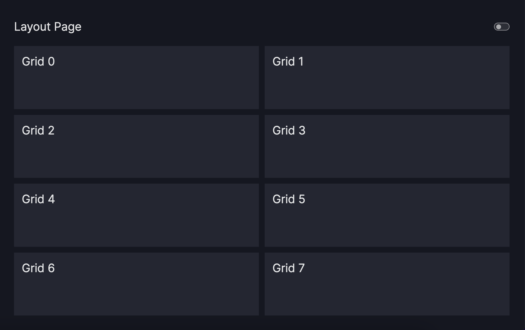
Each element in the components list is referenced with a unique number, and placed on the grid as visualized with the white frames. The Card, is referenced by 0 as it is the first element in the components list. It is placed in the first row and spans across both
columns ([0, 0]). The two Graph objects, referenced by 1 and 2, are positioned next to each other and occupy a column each.
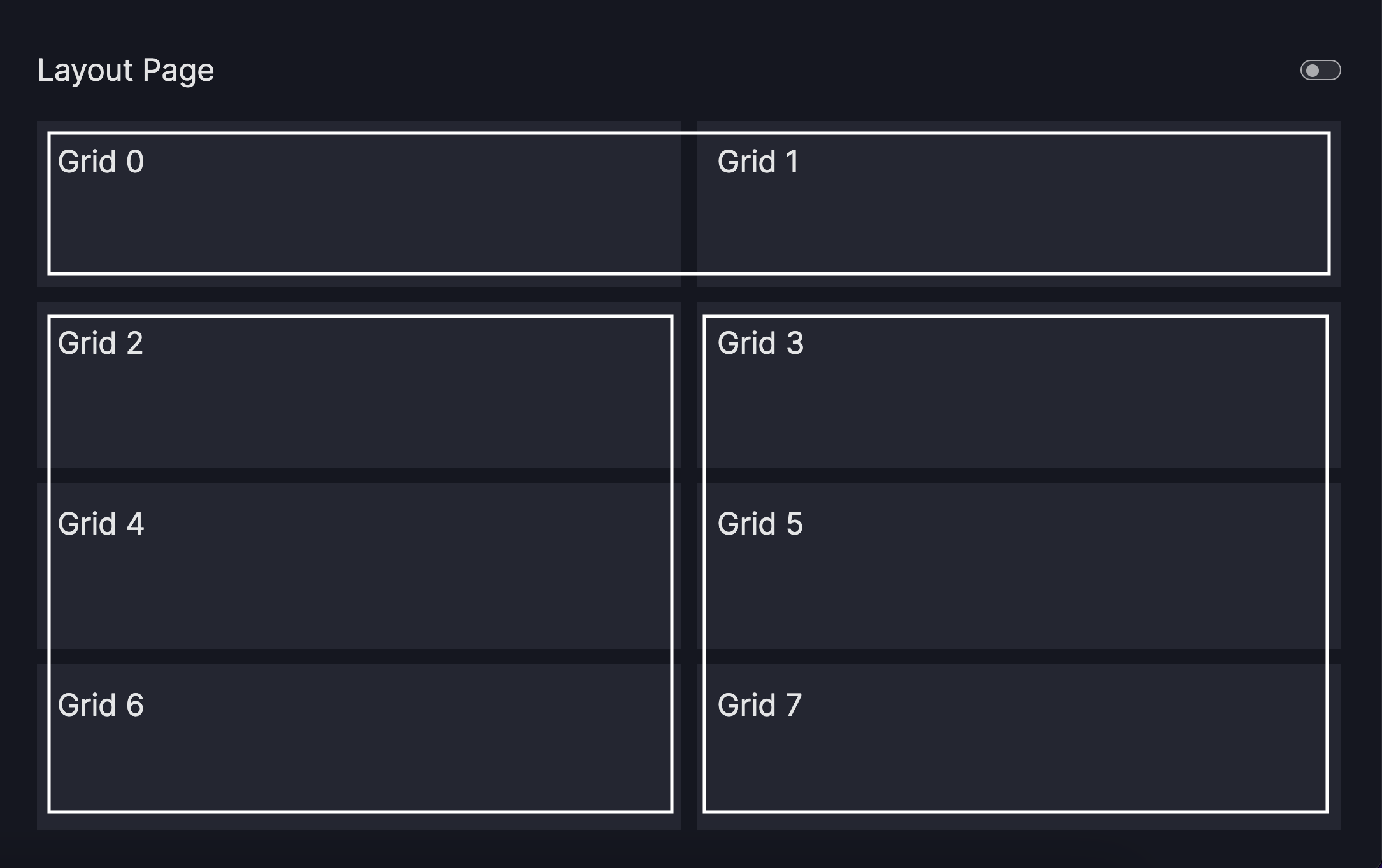
The Graph objects occupy three rows, denoted by [1, 2], [1, 2], [1, 2], while the
Card only occupies one row [0, 0]. As a result, the Graph objects occupy three-quarters of the vertical space, while the
Card occupies one-quarter of it.
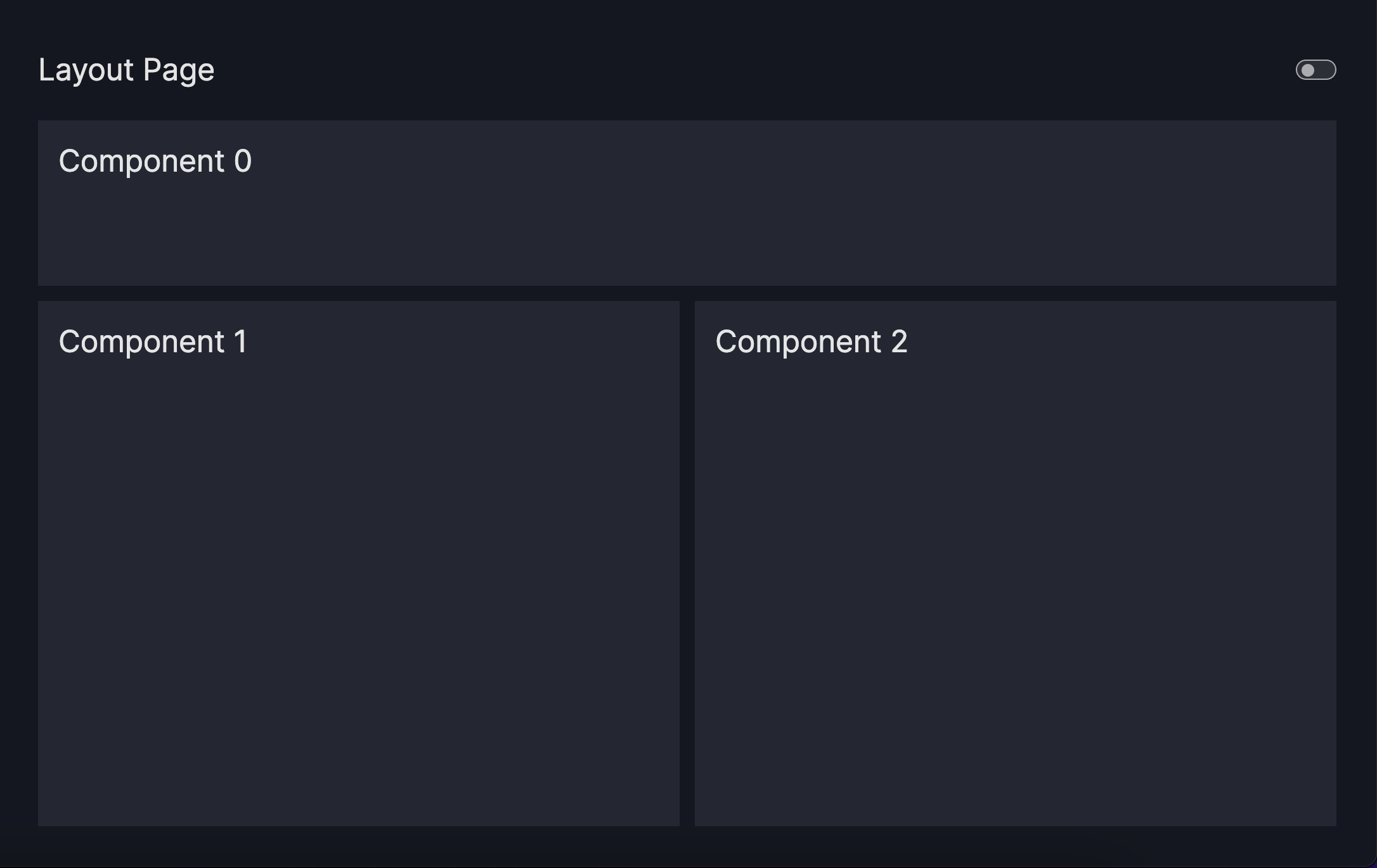
Run the code below to apply the layout to the dashboard page:
Configure layout
from vizro import Vizro
import vizro.models as vm
import vizro.plotly.express as px

df = px.data.gapminder()
gapminder_data = (
        df.groupby(by=["continent", "year"]).
            agg({"lifeExp": "mean", "pop": "sum", "gdpPercap": "mean"}).reset_index()
    )

first_page = vm.Page(
    title="First Page",
    layout=vm.Layout(grid=[[0, 0], [1, 2], [1, 2], [1, 2]]),
    components=[
        vm.Card(
            text="""
                # First dashboard page
                This pages shows the inclusion of markdown text in a page and how components
                can be structured using Layout.
            """,
        ),
        vm.Graph(
            id="box_cont",
            figure=px.box(gapminder_data, x="continent", y="lifeExp", color="continent",
                            labels={"lifeExp": "Life Expectancy", "continent":"Continent"}),
        ),
        vm.Graph(
            id="line_gdp",
            figure=px.line(gapminder_data, x="year", y="gdpPercap", color="continent",
                            labels={"year": "Year", "continent": "Continent",
                            "gdpPercap":"GDP Per Cap"}),
            ),
    ],
)

dashboard = vm.Dashboard(pages=[first_page])
Vizro().build(dashboard).run()
2.4. Add a control for dashboard interactivity
Controls add interactivity to the dashboard page and make it more dynamic, enabling users to have greater control and customization over the displayed data and components.
There are two types of control:
Filtersenable users to filter a column of the underlying data.Parametersenable users to change arguments or properties of the components, such as adjusting colors.
The guides for Filters and Parameters explain how to apply Filters and Parameters. For further customization, refer to the guide on selectors.
To link a control to a component, use the id assigned to the component, which is unique across all dashboard pages and serves as a reference to target it.
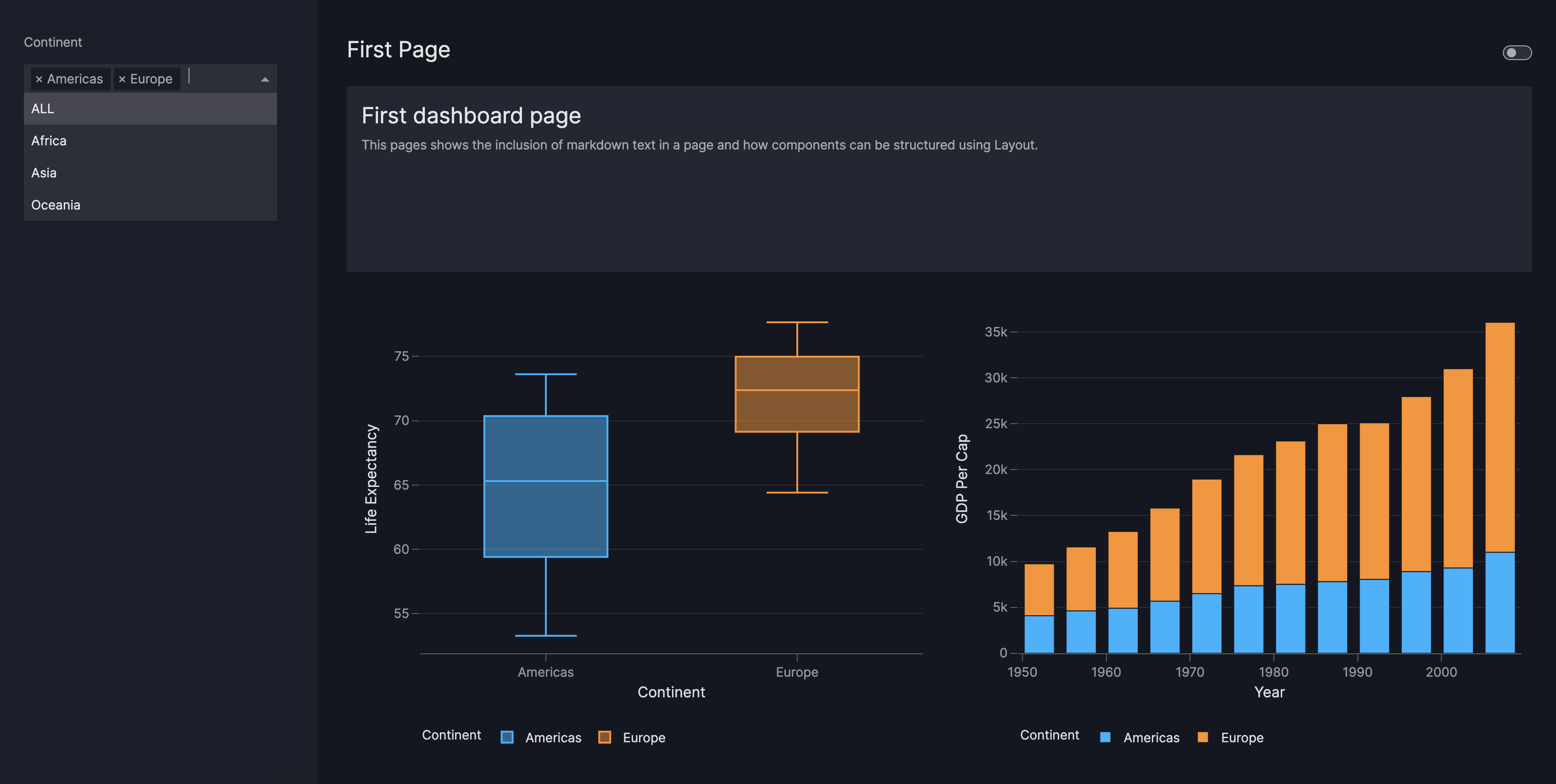
To illustrate, let's add a Filter on specific
continents of the underlying gapminder data. The Filter requires the column argument, that denotes
the target column to be filtered. Each control also has a targets parameter, to specify the
data and components targeted by the control. For this dashboard, both charts
are listed in the targets parameter, meaning that the filter is be applied to both charts. However, you can apply the Filter to only one specific chart if required.
Configure filter
from vizro import Vizro
import vizro.models as vm
import vizro.plotly.express as px
df = px.data.gapminder()
gapminder_data = (
df.groupby(by=["continent", "year"]).
agg({"lifeExp": "mean", "pop": "sum", "gdpPercap": "mean"}).reset_index()
)
first_page = vm.Page(
title="First Page",
layout=vm.Layout(grid=[[0, 0], [1, 2], [1, 2], [1, 2]]),
components=[
vm.Card(
text="""
# First dashboard page
This pages shows the inclusion of markdown text in a page and how components
can be structured using Layout.
""",
),
vm.Graph(
id="box_cont",
figure=px.box(gapminder_data, x="continent", y="lifeExp", color="continent",
labels={"lifeExp": "Life Expectancy", "continent":"Continent"}),
),
vm.Graph(
id="line_gdp",
figure=px.line(gapminder_data, x="year", y="gdpPercap", color="continent",
labels={"year": "Year", "continent": "Continent",
"gdpPercap":"GDP Per Cap"}),
),
],
controls=[
        vm.Filter(column="continent", targets=["box_cont", "line_gdp"]),
],
)
dashboard = vm.Dashboard(pages=[first_page])
Vizro().build(dashboard).run()
Fantastic job! You have completed first dashboard page and gained valuable skills to create an initial figure on a dashboard page, add extra components, arrange them in a layout configuration, and set up an interactive dashboard control.
3. Create a second dashboard page
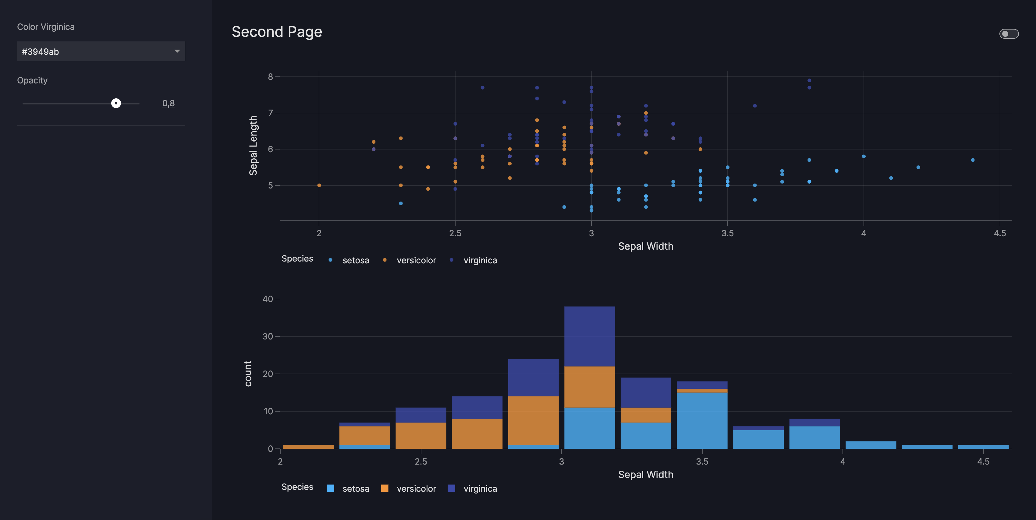
This section adds a second dashboard page and explains how to use controls and selectors. The new page is structured similarly to the page you created, but contains two charts that visualize the iris data.
The code below illustrates how to add the page, titled second_page to the dashboard by calling vm.Dashboard(pages=[first_page,second_page]). There are two Graph objects added to the list of components. To enable interactivity on those components, we add two Parameters to the list of controls.
In creating a Parameter object, you define the target it applies to. In the code below:
- The first parameter enables the user to change the color mapping for the
virginicacategory of the iris data, targeting both charts. - The second parameter adjusts the opacity of the first chart alone, through
scatter_iris.opacity.
In general, targets for Parameters are set following the structure of
component_id.argument. In certain cases, you may see a nested structure for the targets. An example of this is
scatter_iris.color_discrete_map.virginica. A nested structure targets a specific attribute within a
component. In this particular example, it specifies that only the color of the virginica flower type should be changed.
More information on how to set targets for Parameters can be found in the how-to guide
for parameters.
Second page
iris_data = px.data.iris()
second_page = vm.Page(
    title="Second Page",
    components=[
        vm.Graph(
            id="scatter_iris",
            figure=px.scatter(iris_data, x="sepal_width", y="sepal_length", color="species",
                color_discrete_map={"setosa": "#00b4ff", "versicolor": "#ff9222"},
                labels={"sepal_width": "Sepal Width", "sepal_length": "Sepal Length",
                        "species": "Species"},
            ),
        ),
        vm.Graph(
            id="hist_iris",
            figure=px.histogram(iris_data, x="sepal_width", color="species",
                color_discrete_map={"setosa": "#00b4ff", "versicolor": "#ff9222"},
                labels={"sepal_width": "Sepal Width", "count": "Count",
                        "species": "Species"},
            ),
        ),
    ],
    controls=[
        vm.Parameter(
            targets=["scatter_iris.color_discrete_map.virginica",
                        "hist_iris.color_discrete_map.virginica"],
            selector=vm.Dropdown(
                options=["#ff5267", "#3949ab"], multi=False, value="#3949ab", title="Color Virginica"),
            ),
        vm.Parameter(
            targets=["scatter_iris.opacity"],
            selector=vm.Slider(min=0, max=1, value=0.8, title="Opacity"),
        ),
    ],
)
from vizro import Vizro
import vizro.models as vm
import vizro.plotly.express as px

df = px.data.gapminder()
gapminder_data = (
        df.groupby(by=["continent", "year"]).
            agg({"lifeExp": "mean", "pop": "sum", "gdpPercap": "mean"}).reset_index()
    )
first_page = vm.Page(
    title="First Page",
    layout=vm.Layout(grid=[[0, 0], [1, 2], [1, 2], [1, 2]]),
    components=[
        vm.Card(
            text="""
                # First dashboard page
                This pages shows the inclusion of markdown text in a page and how components
                can be structured using Layout.
            """,
        ),
        vm.Graph(
            id="box_cont",
            figure=px.box(gapminder_data, x="continent", y="lifeExp", color="continent",
                            labels={"lifeExp": "Life Expectancy", "continent":"Continent"}),
        ),
        vm.Graph(
            id="line_gdp",
            figure=px.line(gapminder_data, x="year", y="gdpPercap", color="continent",
                            labels={"year": "Year", "continent": "Continent",
                            "gdpPercap":"GDP Per Cap"}),
            ),
    ],
    controls=[
        vm.Filter(column="continent", targets=["box_cont", "line_gdp"]),
    ],
)

iris_data = px.data.iris()
second_page = vm.Page(
    title="Second Page",
    components=[
        vm.Graph(
            id="scatter_iris",
            figure=px.scatter(iris_data, x="sepal_width", y="sepal_length", color="species",
                color_discrete_map={"setosa": "#00b4ff", "versicolor": "#ff9222"},
                labels={"sepal_width": "Sepal Width", "sepal_length": "Sepal Length",
                        "species": "Species"},
            ),
        ),
        vm.Graph(
            id="hist_iris",
            figure=px.histogram(iris_data, x="sepal_width", color="species",
                color_discrete_map={"setosa": "#00b4ff", "versicolor": "#ff9222"},
                labels={"sepal_width": "Sepal Width", "count": "Count",
                        "species": "Species"},
            ),
        ),
    ],
    controls=[
        vm.Parameter(
            targets=["scatter_iris.color_discrete_map.virginica",
                        "hist_iris.color_discrete_map.virginica"],
            selector=vm.Dropdown(
                options=["#ff5267", "#3949ab"], multi=False, value="#3949ab", title="Color Virginica"),
            ),
        vm.Parameter(
            targets=["scatter_iris.opacity"],
            selector=vm.Slider(min=0, max=1, value=0.8, title="Opacity"),
        ),
    ],
)

dashboard = vm.Dashboard(pages=[first_page,second_page])
Vizro().build(dashboard).run()
3.1. Customize with selectors
The code in the example above uses two different types of selector objects, namely
Dropdown and Slider upon the
Parameters. The selectors enable configuration of the controls to customize their behavior and appearance.
The first parameter is a Dropdown. It is configured with two available
options, disables multi-selection, and has a default value set to blue. Users can choose a single option
from the dropdown.
The second parameter is a Slider with a default value of 0.8. Users can adjust a value within the specified range of min=0 and max=1.
You can apply selectors to configure Filters and
Parameters to fine-tune the behavior and appearance of the controls. The selectors currently available are as follows:
4. The final touches
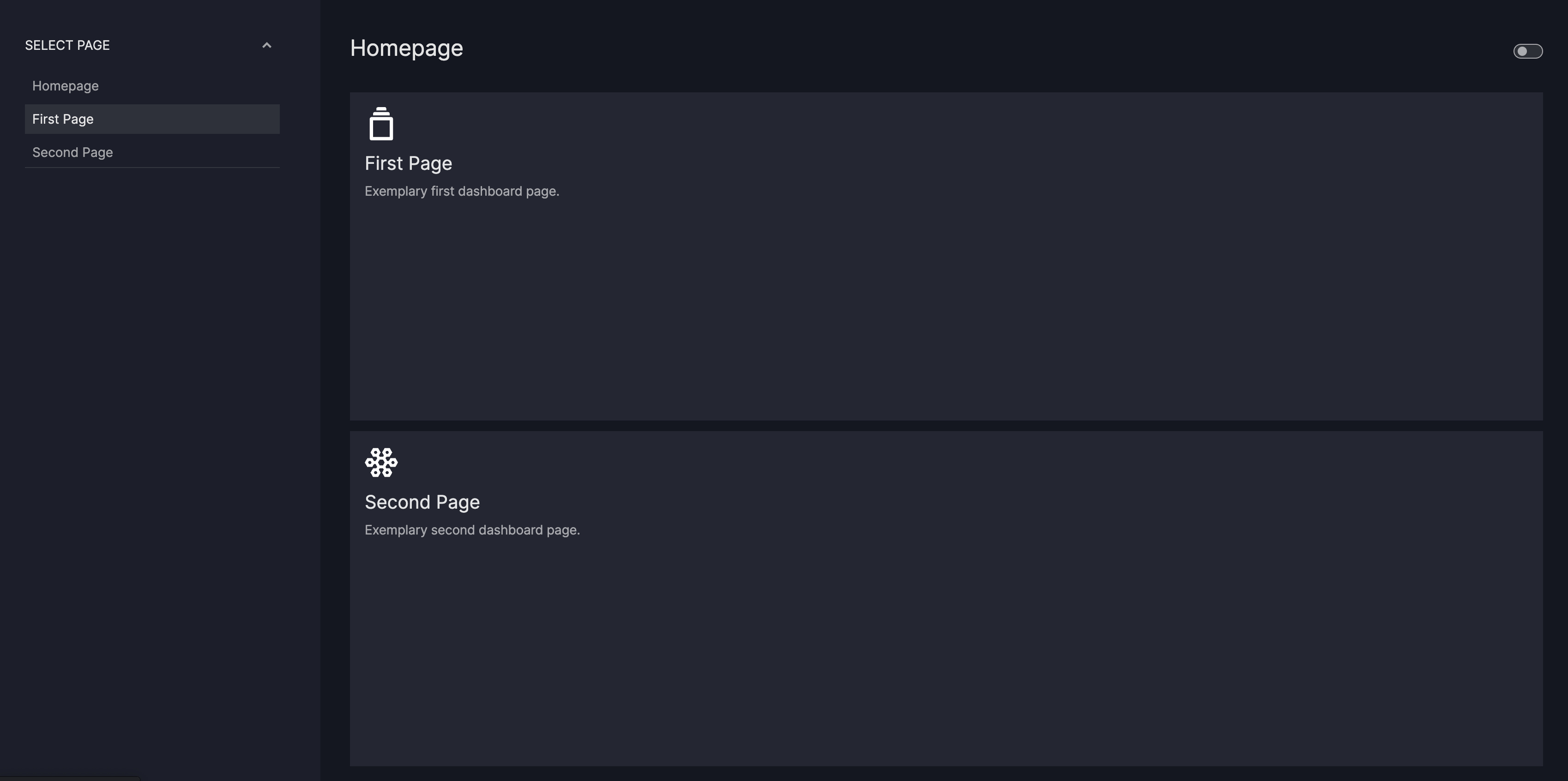
This section puts everything together by adding a homepage to the example for navigation between the two separate pages.
For easy navigation within your dashboard, we'll create a page that serves as the entry point for the user.
On this homepage are two Cards which serve as tiles that can be customized with a title, some text, and an
image. These cards link to the subpages within your dashboard using their href attributes as href="/first-page" and href="/second-page". This
establishes the navigation links from the homepage to each of the subpages.
Each page is added to the dashboard using the following line of code:
vm.Dashboard(pages=[home_page, first_page, second_page]). This ensures that all the pages are accessible.
The code below illustrates a functional dashboard where you can navigate from the homepage to each of the subpages. Additionally, you can use the navigation panel on the left side to switch between the three pages.
Final dashboard
home_page = vm.Page(
title="Homepage",
components=[
vm.Card(
text="""

### First Page
Exemplary first dashboard page.
""",
href="/first-page",
),
vm.Card(
text="""

### Second Page
Exemplary second dashboard page.
""",
href="/second-page",
),
],
)
from vizro import Vizro
import vizro.models as vm
import vizro.plotly.express as px
home_page = vm.Page(
title="Homepage",
components=[
vm.Card(
text="""

### First Page
Exemplary first dashboard page.
""",
href="/first-page",
),
vm.Card(
text="""

### Second Page
Exemplary second dashboard page.
""",
href="/second-page",
),
],
)
df = px.data.gapminder()
gapminder_data = (
df.groupby(by=["continent", "year"]).
agg({"lifeExp": "mean", "pop": "sum", "gdpPercap": "mean"}).reset_index()
)
first_page = vm.Page(
title="First Page",
layout=vm.Layout(grid=[[0, 0], [1, 2], [1, 2], [1, 2]]),
components=[
vm.Card(
text="""
# First dashboard page
This pages shows the inclusion of markdown text in a page and how components
can be structured using Layout.
""",
),
vm.Graph(
id="box_cont",
figure=px.box(gapminder_data, x="continent", y="lifeExp", color="continent",
labels={"lifeExp": "Life Expectancy", "continent":"Continent"}),
),
vm.Graph(
id="line_gdp",
figure=px.line(gapminder_data, x="year", y="gdpPercap", color="continent",
labels={"year": "Year", "continent": "Continent",
"gdpPercap":"GDP Per Cap"}),
),
],
controls=[
vm.Filter(column="continent", targets=["box_cont", "line_gdp"]),
],
)
iris_data = px.data.iris()
second_page = vm.Page(
title="Second Page",
components=[
vm.Graph(
id="scatter_iris",
figure=px.scatter(iris_data, x="sepal_width", y="sepal_length", color="species",
color_discrete_map={"setosa": "#00b4ff", "versicolor": "#ff9222"},
labels={"sepal_width": "Sepal Width", "sepal_length": "Sepal Length",
"species": "Species"},
),
),
vm.Graph(
id="hist_iris",
figure=px.histogram(iris_data, x="sepal_width", color="species",
color_discrete_map={"setosa": "#00b4ff", "versicolor": "#ff9222"},
labels={"sepal_width": "Sepal Width", "count": "Count",
"species": "Species"},
),
),
],
controls=[
vm.Parameter(
targets=["scatter_iris.color_discrete_map.virginica",
"hist_iris.color_discrete_map.virginica"],
selector=vm.Dropdown(
options=["#ff5267", "#3949ab"], multi=False, value="#3949ab", title="Color Virginica"),
),
vm.Parameter(
targets=["scatter_iris.opacity"],
selector=vm.Slider(min=0, max=1, value=0.8, title="Opacity"),
),
],
)
dashboard = vm.Dashboard(pages=[home_page, first_page, second_page])
Vizro().build(dashboard).run()
Congratulations on completing this tutorial! You have acquired the knowledge to configure layouts, add components, and implement interactivity in Vizro dashboards, working across two navigable pages.
Find out more
After completing the tutorial you now have a solid understanding of the main elements of Vizro and how to bring them together to create dynamic and interactive data visualizations.
You can find out more about the Vizro by reading the components overview page. To gain more in-depth knowledge about the usage and configuration details of individual controls, check out the guides dedicated to Filters, Parameters and Selectors. If you'd like to understand more about different ways to configure the navigation of your dashboard, head to Navigation.
Vizro doesn't end here, and we only covered the key features, but there is still much more to explore! You can learn:
- How to create you own components under custom components.
- How to add custom styling using custom css.
- How to use Actions for example, for chart interaction or custom controls.
- How to create dashboards from
yaml,dictorjsonfollowing the dashboard guide.
