Gallery of examples
Take a look at some more advanced charts that can be created with Vizro-AI using data from Plotly Express. The examples below use the OpenAI "gpt-4-0613" model as we are going to request specific updates to the layout of the charts, which are more complex than the default GPT 3.5 model can handle.
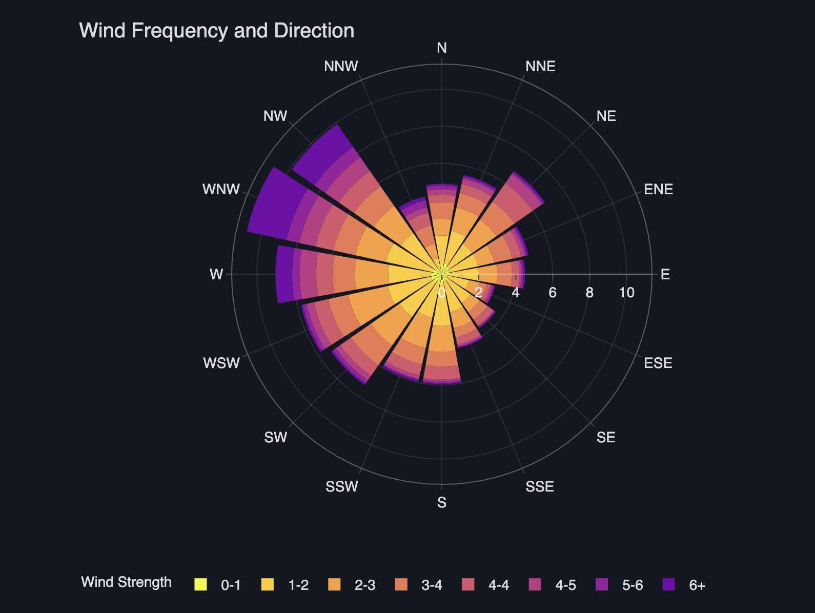
Polar bar chart
A polar bar chart is a circular graph where each axis represents a different variable, typically used for displaying cyclical or directional data. It's suitable for comparing multiple variables across different categories or directions. Let's make one using Vizro-AI.
Polar Bar Chart
import vizro_ai
from vizro_ai import VizroAI
import plotly.express as px

from dotenv import load_dotenv
load_dotenv()

df = px.data.wind()

vizro_ai = VizroAI(model="gpt-4-0613")
fig = vizro_ai.plot(df,
              """Describe wind frequency and direction using bar_polar chart.
                 Increase the width and height of the figure.
                 Improve layout by placing title to the left. Show legend""", explain=True)
fig.show()
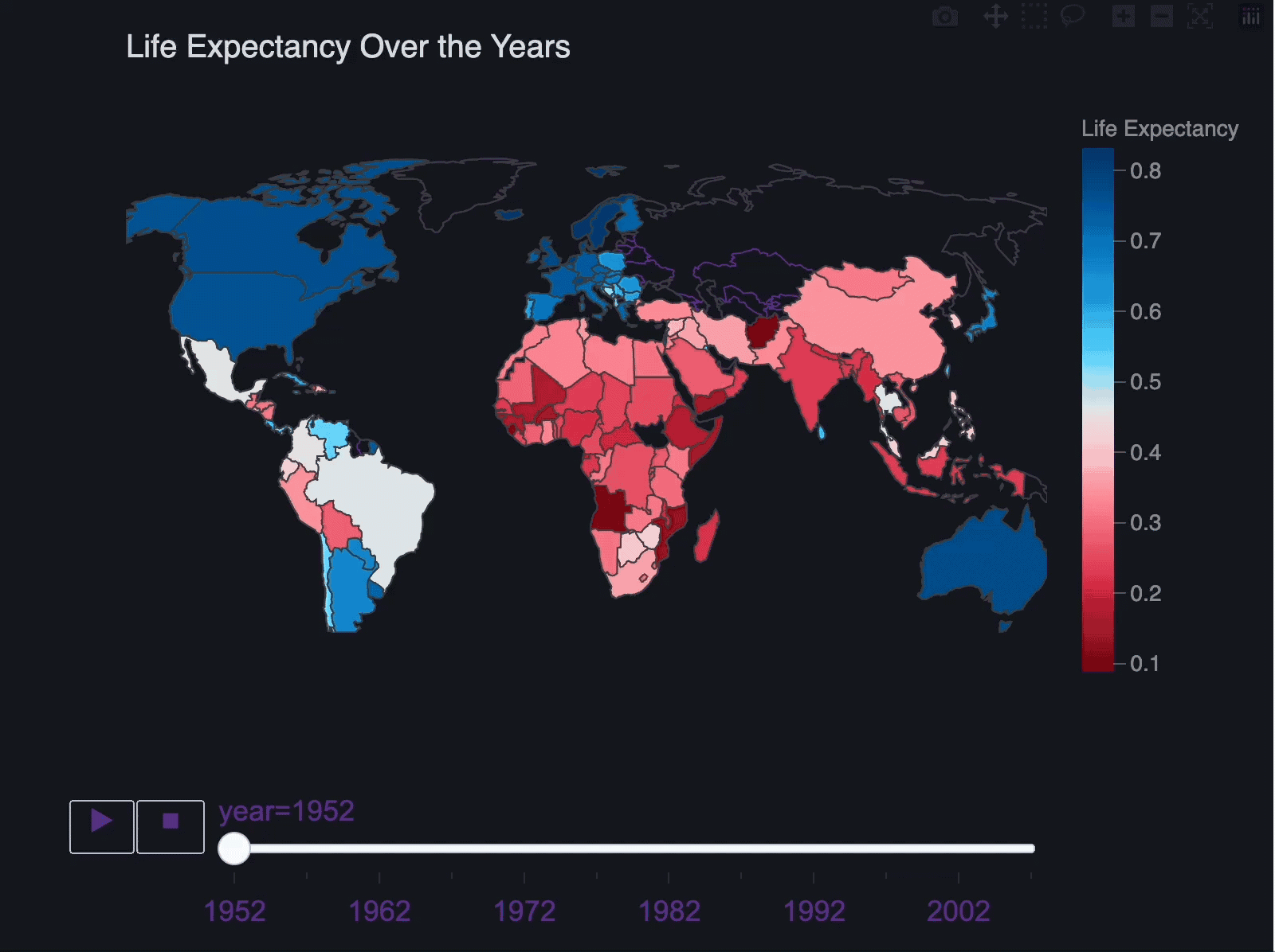
Geographical map chart
The next chart we'll look at is a geographical map chart to visualize spatial patterns in data, which often reveals insights not seen in other charts.
Map chart
import vizro_ai
from vizro_ai import VizroAI
import plotly.express as px

from dotenv import load_dotenv
load_dotenv()

df = px.data.gapminder()

vizro_ai = VizroAI(model="gpt-4-0613")
fig = vizro_ai.plot(df,
              """Visualize life expectancy over the years using map chart. Use life expectancy as the color dimension.
                 Improve layout by using Arial font. Increase the width and height of the map area. Outline continents on the map.
                 Show countries on the map.
                 Increase the width and height of the figure.""", explain=True)
fig.show()
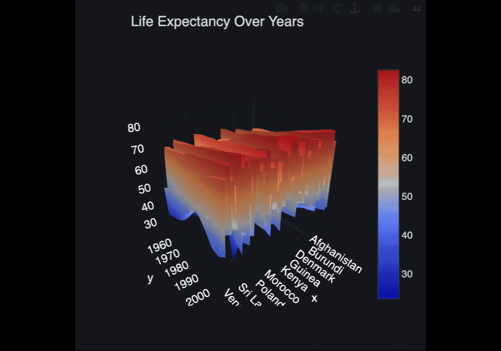
3D surface plot
Let's explore how to generate a 3-dimensional surface plot with VizroAI.