Controls
Vizro supports controls to perform common business intelligence (BI) operations. This guide gives an overview of the different ways you can configure controls.
The following components are reactive to controls:
- built-in graphs and custom graphs
- built-in tables and custom tables
- built-in figures and custom figures
It is possible to add controls to a page or container. Both the Page model and the Container model have an optional controls argument where you can configure any number of controls.
Vizro has two types of control:
-
Filter controls the data of reactive components. It filters the
data_frameof thefigurefunction of a target component model such asGraph. -
Parameter controls the configuration of a reactive component. It sets any argument other than
data_framein thefigurefunction of the target component model such asGraph. It can also be used to set dynamic data parameters.
All controls have an argument selector that configures the visual interface for the control, for example a checklist or a range slider. The same selectors are available for all controls.
Set a control
When the dashboard is running there are two ways for a user to set a control:
- Direct user interaction with the underlying selector. For example, the user selects values from a checklist.
- User interaction with a graph or table via the
set_controlaction. This enables functionality such as cross-filtering and cross-highlighting. To achieve a visually cleaner dashboard you might like to hide the control's underlying selector by setting the control's argumentvisible=False.
Tip
The state of any control that has show_in_url=True is included when you share the URL of your app.
Reset controls
You can reset all controls on the page to their original values with the "Reset controls" button at the bottom of the control panel on the left side of the page. This applies to all controls on the page, regardless of whether they are visible. When all controls on a page have visible=False and hence no control panel is shown, the "Reset controls" button appears next to the theme switch on the top right of the page.
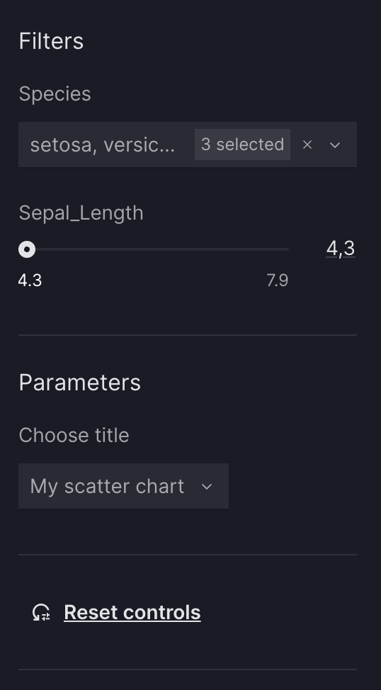
Group controls
To organize the control panel on a page into sections, you can group filters and parameters under a title using a ControlGroup. Control groups are only available for page-level controls. Use a control group when you want to:
- Visually separate different sets of controls on the same page (for example, "Filters" and "Parameters").
- Add a title or short description to a subset of controls so users understand what they affect.
- Keep the page control panel organized when you have many controls.
Control Group
from vizro import Vizro
import vizro.plotly.express as px
import vizro.models as vm

iris = px.data.iris()

page = vm.Page(
    title="My first page",
    components=[
        vm.Graph(
            id="scatter_chart",
            figure=px.scatter(iris, x="sepal_length", y="petal_width", color="species")
        ),
    ],
    controls=[
        vm.ControlGroup(
            title="Filters",
            controls=[
                vm.Filter(column="species"),
                vm.Filter(column="sepal_length")
            ]
        ),
        vm.ControlGroup(
            title="Parameter",
            controls=[
                vm.Parameter(
                    targets=["scatter_chart.title"],
                    selector=vm.Dropdown(
                        options=["My scatter chart", "A better title!", "Another title..."],
                        multi=False,
                    ),
                ),
            ]
        ),


    ],
)

dashboard = vm.Dashboard(pages=[page])
Vizro().build(dashboard).run()
 Run and edit this code in Py.Cafe
# Still requires a .py to add data to the data manager and parse YAML configuration
# See yaml_version example
pages:
  - title: My first page
    components:
      - id: scatter_chart
        figure:
          _target_: scatter
          data_frame: iris
          x: sepal_length
          y: petal_width
          color: species
        type: graph
    controls:
      - type: control_group
        title: Filters
        controls:
          - column: species
            type: filter
          - column: sepal_length
            type: filter
      - type: control_group
        title: Parameter
        controls:
          - type: parameter
            targets:
              - scatter-chart.title
            selector:
              options: [My scatter chart, A better title!, Another title...]
              multi: false
              type: dropdown
 ]
]