Graph and table interactions
In this guide we show you how to configure interactions between graphs and tables, as is commonly done in business intelligence (BI) tools. In Vizro, all such interactions are enabled by an intermediate control that you must explicitly define. For example:
- Cross-filter: a source graph or table filters the
data_frameof a target graph or table. The source component sets a filter, which in turn updates the target component. - Cross-parameter: a source graph or table updates any argument other than
data_frameof a target graph or table. The source component sets a parameter, which in turn updates the target component. - Cross-highlight: a source graph or table highlights data in a target graph or table. This is an example of a cross-parameter.
All these interactions use the set_control action. This gives very generic and powerful functionality thanks to the functionality of the intermediate control:
- The target components can be anything that reacts to a control: built-in graphs, custom graphs, built-in tables, custom tables, built-in figures and custom figures.
- A single control can update any number of these target components, and a single source component can set any number of controls. Hence a single source component can interact with any number of target components.
- A target component can be on the same page as the source or on a different page (so long as the intermediate control has
show_in_url=True). - A target component can also be the source component to enable a "self-interaction".
- The value of a control is persisted when you change page.
- Interactions are not "invisible"; they are explicitly shown on the screen by the value of the control. Just like a normal control, you can change the value manually.
Invisible controls
If you prefer, you can make your control invisible by setting visible=False, for example vm.Parameter(..., visible=False). The control can then only be set by set_control. This achieves a visually cleaner dashboard but can also make it less clear what graph and table interactions have been applied. We use visible=False in all our examples on cross-highlighting.
A user can reset all controls on a page, including those with visible=False, by clicking the "Reset controls" button.
Cross-filter
A cross-filter is when the user clicks on one source graph or table to filter one or more target components. In Vizro, a cross-filter operates through an intermediate filter. To configure a cross-filter:
-
Create a filter that targets the graphs, tables or figures you would like to filter. The filter can have any type of selector. For non-categorical selectors, see cross-filter with non-categorical selectors.
- Remember that if
targetsis not explicitly specified, a filter targets all components on the page whose data source includescolumn.
- Remember that if
-
Call
set_controlin theactionsargument of the sourceGraphorAgGridcomponent that triggers the cross-filter.- Set
controlto the ID of the filter. - Set
value. The format of this depends on the source model and is given in the API reference, but it is oftencolumnof the filter. Think of it as an instruction for what to lookup in the source data: whatever value is fetched from this lookup is used to setcontrol.
- Set
-
If your source component is a
Graphand you use a column name forvaluethen this must be included in thecustom_dataof your graph'sfigurefunction, for examplefigure=px.scatter(..., custom_data="species").
Tip
Often the value of set_control is the same as the column of the filter, but this does not need to be the case. You can perform a cross-filter where the source component's column name given by value is different from the target component's column name, which is given by the filter's column.
Cross-filter from table
The trigger for a cross-filter from an AG Grid is clicking on a row, selecting a row's checkbox or clicking a cell in the table. The value argument of the set_control action tells the action what to send to the control:
"cell"uses the clicked cell’s value."column"uses the clicked cell’s column id, which corresponds to the DataFrame column name."row"uses the clicked cell’s row id. The row id is AG Grid'srowId, which defaults to the row's index unless you configuregetRowIdindashGridOptions.- Any other string is treated as a column name and values are taken from selected rows.
Cross-filter from table to graph - sex column value from selected rows
import vizro.actions as va
import vizro.models as vm
import vizro.plotly.express as px
from vizro import Vizro
from vizro.tables import dash_ag_grid

tips = px.data.tips()

page = vm.Page(
    title="Cross-filter from table to graph",
    components=[
        vm.AgGrid(
            title="Click on a row to use that row's sex to filter graph",
            figure=dash_ag_grid(tips),
            actions=va.set_control(control="sex_filter", value="sex"),
        ),
        vm.Graph(id="tips_graph", figure=px.histogram(tips, x="tip")),  # (1)!
    ],
    controls=[vm.Filter(id="sex_filter", column="sex", targets=["tips_graph"])],  # (2)!
)

dashboard = vm.Dashboard(pages=[page])
Vizro().build(dashboard).run()
![]() Run and edit this code in Py.Cafe
Run and edit this code in Py.Cafe
- We give the
vm.Graphanidso that it can be targeted explicitly byvm.Filter(id="sex_filter"). - We give the
vm.Filteranidso that it can be set explicitly byva.set_control.
# Still requires a .py to add data to the data manager and parse YAML configuration
# See yaml_version example
pages:
  - components:
      - actions:
          - control: sex_filter
            type: set_control
            value: sex
        figure:
          _target_: dash_ag_grid
          data_frame: tips
        title: Click on a row to use that row's sex to filter graph
        type: ag_grid
      - figure:
          _target_: histogram
          data_frame: tips
          x: tip
        id: tips_graph
        type: graph
    controls:
      - column: sex
        id: sex_filter
        targets:
          - tips_graph
        type: filter
    title: Cross-filter from table to graph
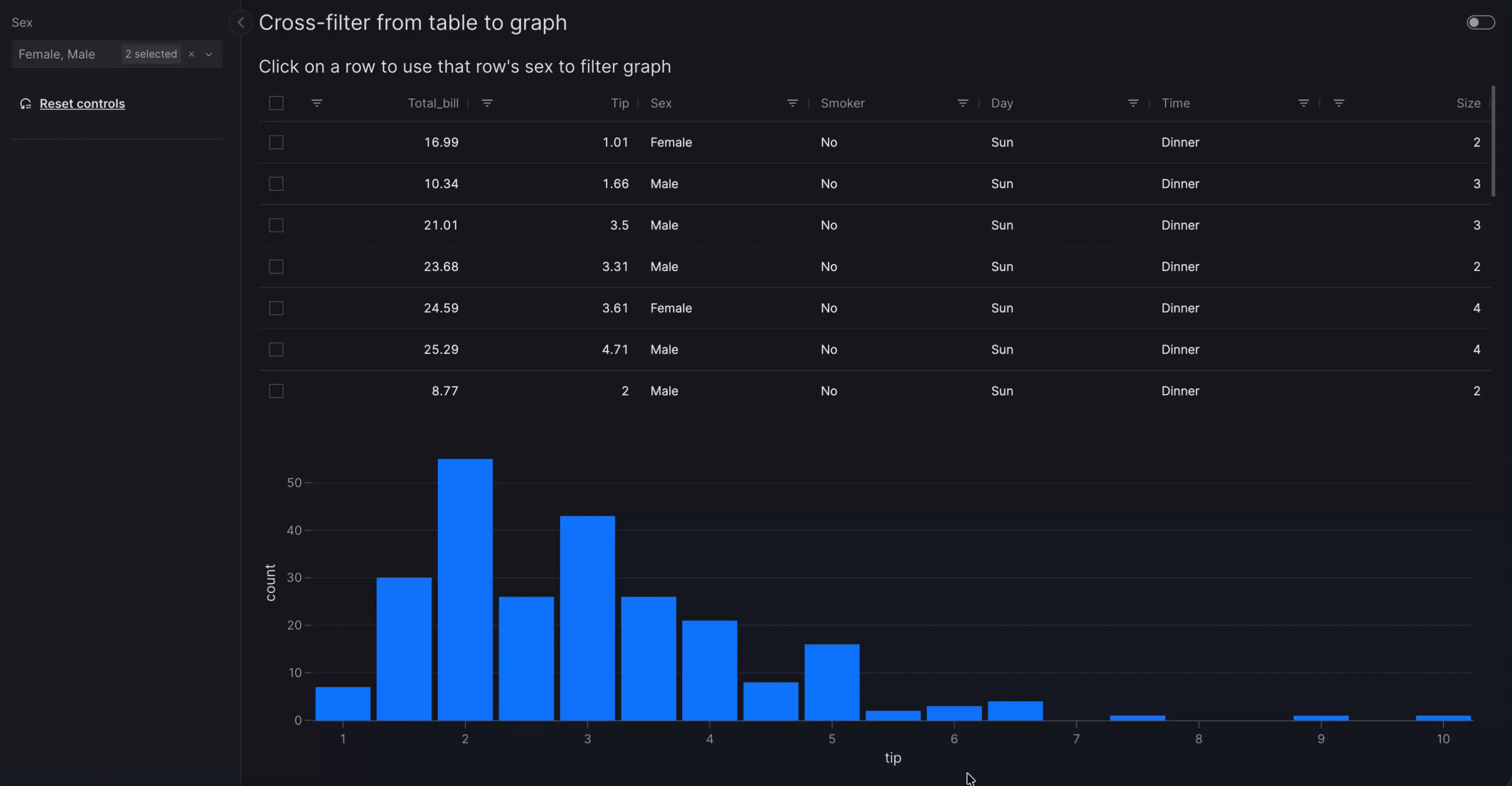
In the cross-filter from table example, when you select one or more rows in the table, the graph is cross-filtered to the corresponding sex values from those rows. Which cell you click does not change which field is used: the action always reads the sex column for the current row selection, not the clicked column.
Behind the scenes mechanism
In full, what happens is as follows:
- Changing row selection (for example, by clicking a row) triggers the
va.set_controlaction. This uses thesexcolumn value(s) for the selected row(s) (in other words, "Male" and/or "Female") to set the selector underlyingvm.Filter(id="sex_filter"). - The change in value of
vm.Filter(id="sex_filter")triggers the filter to be re-applied on itstargets=["tips_graph"]so that a filtered graph is shown.
The mechanism for triggering the filter when its value is set by va.set_control is an implicit actions chain.
When all rows are deselected, the control resets to its original value. This effectively clears any cross-filter or cross-parameter that was applied. You can also reset all controls on a page by clicking the "Reset controls" button.
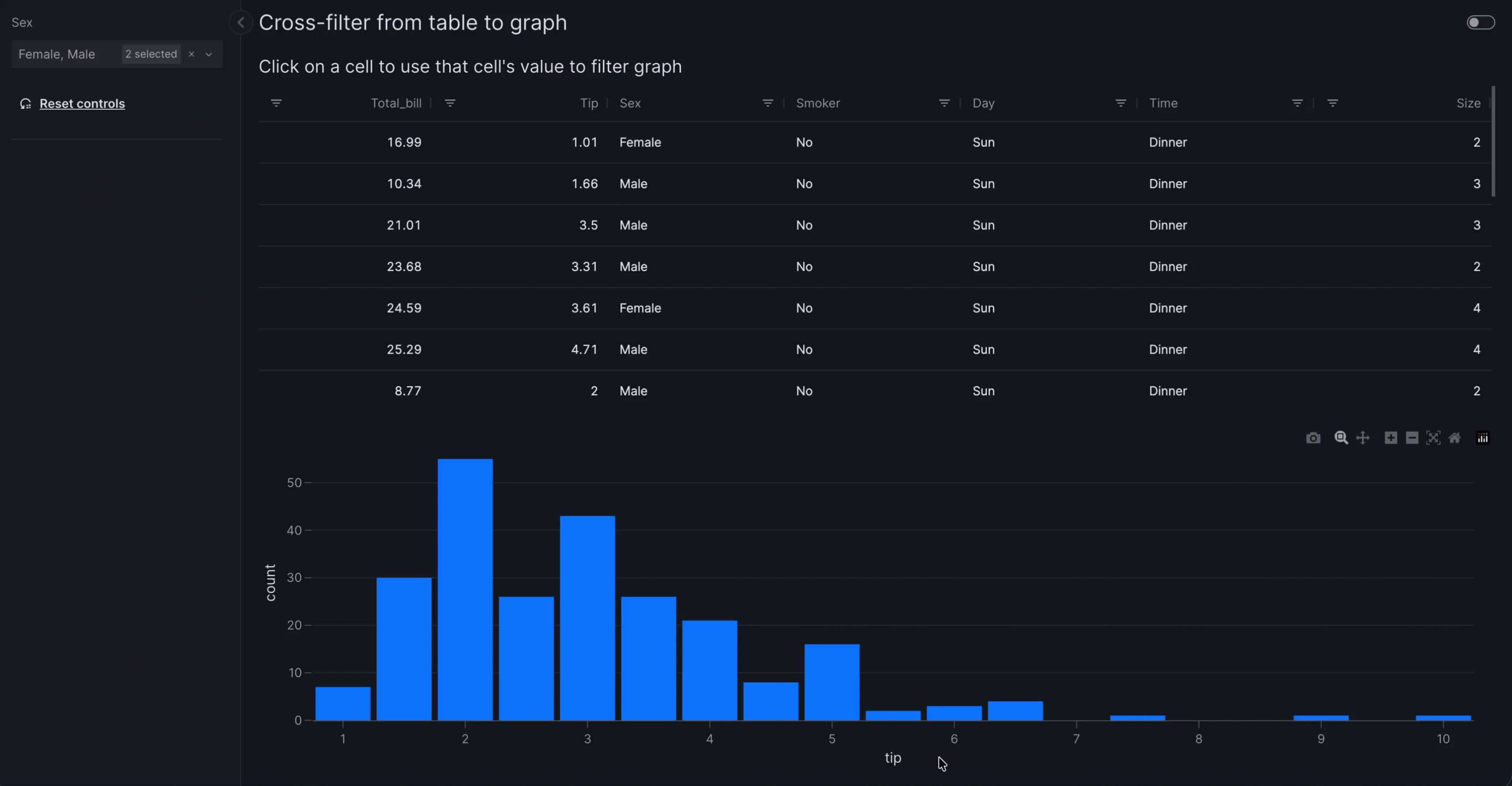
If you set the set_control.value argument to value="cell", the value of the clicked cell propagates to the control.
Cross-filter from table to graph - propagating cell value
import vizro.actions as va
import vizro.models as vm
import vizro.plotly.express as px
from vizro import Vizro
from vizro.tables import dash_ag_grid

tips = px.data.tips()

page = vm.Page(
    title="Cross-filter from table to graph",
    components=[
        vm.AgGrid(
            title="Click on a cell to use that cell's value to filter graph",
            figure=dash_ag_grid(tips),
            actions=va.set_control(control="sex_filter", value="cell"),
        ),
        vm.Graph(id="tips_graph", figure=px.histogram(tips, x="tip")),  # (1)!
    ],
    controls=[vm.Filter(id="sex_filter", column="sex", targets=["tips_graph"])],  # (2)!
)

dashboard = vm.Dashboard(pages=[page])
Vizro().build(dashboard).run()
![]() Run and edit this code in Py.Cafe
Run and edit this code in Py.Cafe
- We give the
vm.Graphanidso that it can be targeted explicitly byvm.Filter(id="sex_filter"). - We give the
vm.Filteranidso that it can be set explicitly byva.set_control.
# Still requires a .py to add data to the data manager and parse YAML configuration
# See yaml_version example
pages:
  - components:
      - actions:
          - control: sex_filter
            type: set_control
            value: cell
        figure:
          _target_: dash_ag_grid
          data_frame: tips
        title: Click on a row to use that row's value to filter graph
        type: ag_grid
      - figure:
          _target_: histogram
          data_frame: tips
          x: tip
        id: tips_graph
        type: graph
    controls:
      - column: sex
        id: sex_filter
        targets:
          - tips_graph
        type: filter
    title: Cross-filter from table to graph
Multi-select depends on how you set value in set_control:
- If
valueis a column name (values are taken from selected rows), multi-row selection is turned on by default, including checkboxes. - If
valueis"cell","column", or"row", multi-select is not available as interaction is driven by single cell clicks.
Tip
You can still customize selection with dashGridOptions on dash_ag_grid(...), for example figure=dash_ag_grid(..., dashGridOptions={"rowSelection": {"mode": "singleRow"}}) when you use a column name and want only one row selected. The Dash AG Grid offers many options to configure row selection. These can be passed directly into dash_ag_grid as keyword arguments or set for multiple tables by creating a custom table function.
When multi-row (or single-row) selection is enabled, click checkboxes or click any cell to select or deselect its row. Alternatively, set_control is also triggered by pressing Space while focused on a row.
Ranges of rows can be selected by holding down Shift while clicking on rows. This behavior also applies when checkbox selection is disabled, and in group selection. Ranges of rows can be selected by holding down Shift while clicking on rows.
Use Cmd click (or Ctrl click on Windows/Linux) to select or deselect individual rows one by one. This behavior also applies when checkbox selection is disabled, and in group selection. See the Dash AG Grid multi-row selection documentation for more examples.
If you use multi-row selection but your filter or parameter uses a single-value selector (for example vm.RadioItems()), the control only updates when exactly one row is selected. Selecting two or more rows leaves the control unchanged.
Cross-filter from graph
The trigger for a cross-filter from a graph is clicking on data in the graph. A single click sends one value to the control. You can also use box/lasso select to select multiple data points at once; see Cross-filter from graph - multi-select for details and examples.
The value argument of the set_control action can be used in two ways to specify what sets control:
- Column from which to take the value. This requires you to set
custom_datain the graph'sfigurefunction. For example, for a graphpx.bar(..., color="country", custom_data="country")you can useva.set_control(value="country", ...). - As a shortcut, if the value is encoded by a positional dimension such as
xorythen you can use that variable directly and do not need to setcustom_data. For example, for a graphpx.bar(x="country", ...)you can useva.set_control(value="x", ...). Positional dimensions includex,y,zfor Cartesian plots andlat,lon,locationfor choropleth maps.
Behind the scenes mechanism
value is an instruction for what to lookup in Plotly's clickData, whose format and content depend on the type of chart clicked. Generally speaking, positional information is automatically included in clickData but other information such as color must be manually supplied using custom_data to make it available.
The rules for how value is interpreted by set_control are:
- If the graph has
custom_datathen interpret thevalueas a column name and attempt to find it incustom_data. - If the graph does not have
custom_dataor does not includevalueas a column incustom_datathen perform a lookup insideclickData["points"][0]. For example:value="x"is equivalent to looking atclickData["points"][0]["x"].value="key.subkey[1]"is equivalent to looking atclickData["points"][0]["key"]["subkey"][1].
Based on the source graph and its available clickData, you can therefore configure precisely which property to set as value. For almost all use cases, this would be a column name or a positional variable such as x. However, advanced users might like to use other data that is available in clickData such as pointNumber or to refer to an object nested deeply inside custom_data.
We show an example of each of these in turn. Here is an example where we use custom_data and value="sex" to use a value from the sex column. We need to specify custom_data because the sex column is not a positional dimension in the plot.
Cross-filter from graph to table with custom_data
import vizro.actions as va
import vizro.models as vm
import vizro.plotly.express as px
from vizro import Vizro
from vizro.tables import dash_ag_grid
tips = px.data.tips()
page = vm.Page(
title="Cross-filter from graph to table",
components=[
vm.Graph(
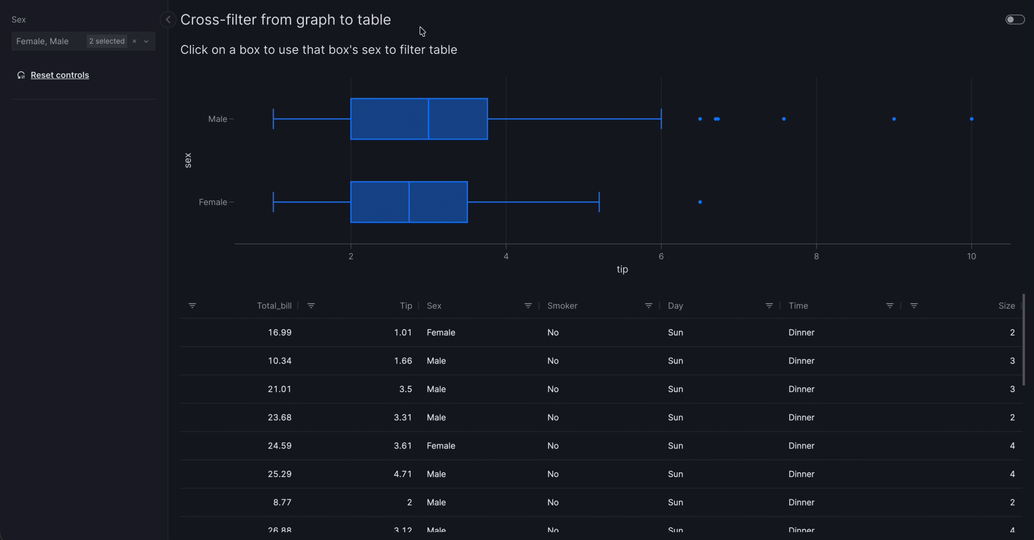
title="Click on a box to use that box's sex to filter table",
figure=px.box(tips, x="tip", y="time", color="sex", custom_data="sex"), # (1)!
actions=va.set_control(control="sex_filter", value="sex"),
),
vm.AgGrid(id="tips_table", figure=dash_ag_grid(tips)), # (2)!
],
controls=[vm.Filter(id="sex_filter", column="sex", targets=["tips_table"])], # (3)!
)
dashboard = vm.Dashboard(pages=[page])
Vizro().build(dashboard).run()
![]() Run and edit this code in Py.Cafe
Run and edit this code in Py.Cafe
- We encode the
sexcolumn ascolorin the plot and include it incustom_data="sex". - We give the
vm.AgGridanidso that it can be targeted explicitly byvm.Filter(id="sex_filter"). - We give the
vm.Filteranidso that it can be set explicitly byva.set_control.
# Still requires a .py to add data to the data manager and parse YAML configuration
# See yaml_version example
pages:
  - components:
      - actions:
          - control: sex_filter
            type: set_control
            value: sex
        figure:
          _target_: box
          color: sex
          custom_data: sex
          data_frame: tips
          x: tip
          y: time
        title: Click on a box to use that box's sex to filter table
        type: graph
      - figure:
          _target_: dash_ag_grid
          data_frame: tips
        id: tips_table
        type: ag_grid
    controls:
      - column: sex
        id: sex_filter
        targets:
          - tips_table
        type: filter
    title: Cross-filter from graph to table
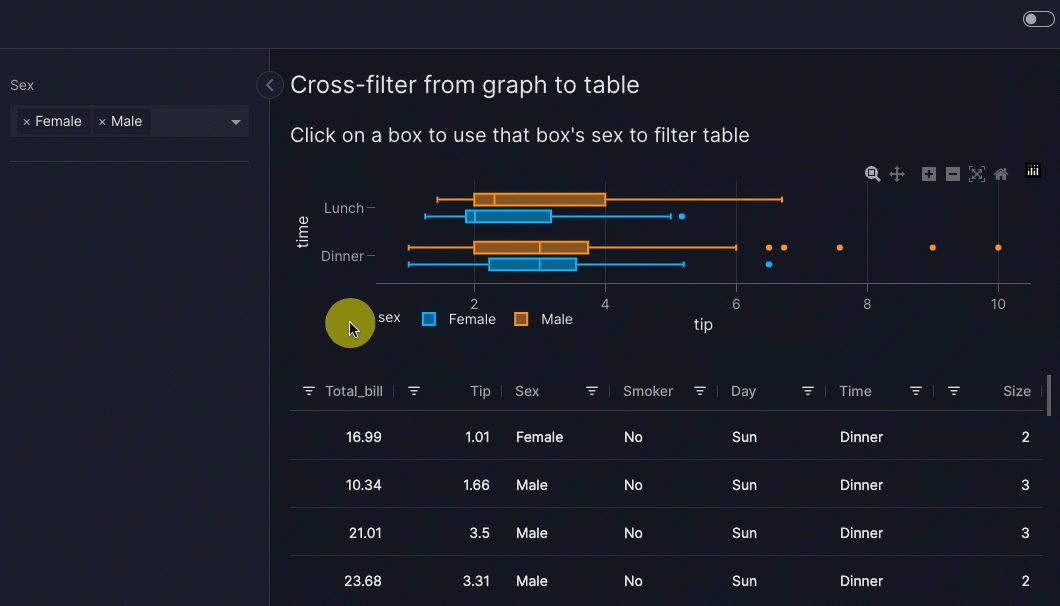
When you click on a box in the graph, the table is cross-filtered to show data for only one sex.
Behind the scenes mechanism
In full, what happens is as follows:
- Clicking on the box (or using box/lasso select on multiple data points) triggers the
va.set_controlaction. This uses the value ofsextaken from the graph'scustom_data(in other words, "Male" or "Female") to set the selector underlyingvm.Filter(id="sex_filter"). When multiple points are selected, unique values across all points are sent. - The change in value of
vm.Filter(id="sex_filter")triggers the filter to be re-applied on itstargets=["tips_table"]so that a filtered table is shown.
The mechanism for triggering the filter when its value is set by va.set_control is an implicit actions chain.
Cross-filter from custom chart
If you cross-filter from a custom chart and wish to use a column supplied through custom_data for the value argument of va.set_control then you must explicitly include custom_chart in the function signature:
Here is an example where we do not need to use custom_data because the value used in va.set_control is positional: it corresponds to the y axis of the graph.
Cross-filter from graph without custom_data to table
import vizro.actions as va
import vizro.models as vm
import vizro.plotly.express as px
from vizro import Vizro
from vizro.tables import dash_ag_grid

tips = px.data.tips()

page = vm.Page(
    title="Cross-filter from graph to table",
    components=[
        vm.Graph(
            title="Click on a box to use that box's sex to filter table",
            figure=px.box(tips, x="tip", y="sex"),
            actions=va.set_control(control="sex_filter", value="y"),
        ),
        vm.AgGrid(id="tips_table", figure=dash_ag_grid(tips)),  # (1)!
    ],
    controls=[vm.Filter(id="sex_filter", column="sex", targets=["tips_table"])],  # (2)!
)

dashboard = vm.Dashboard(pages=[page])
Vizro().build(dashboard).run()
![]() Run and edit this code in Py.Cafe
Run and edit this code in Py.Cafe
- We give the
vm.AgGridanidso that it can be targeted explicitly byvm.Filter(id="sex_filter"). - We give the
vm.Filteranidso that it can be set explicitly byva.set_control.
# Still requires a .py to add data to the data manager and parse YAML configuration
# See yaml_version example
pages:
  - components:
      - actions:
          - control: sex_filter
            type: set_control
            value: y
        figure:
          _target_: box
          data_frame: tips
          x: tip
          y: sex
        title: Click on a box to use that box's sex to filter table
        type: graph
      - figure:
          _target_: dash_ag_grid
          data_frame: tips
        id: tips_table
        type: ag_grid
    controls:
      - column: sex
        id: sex_filter
        targets:
          - tips_table
        type: filter
    title: Cross-filter from graph to table
When you click on a box in the graph, the table is cross-filtered to show data for only one sex, which is the y variable for the plot.
Behind the scenes mechanism
In full, what happens is as follows:
- Clicking on the box (or using box/lasso select on multiple data points) triggers the
va.set_controlaction. This uses the value ofy(in other words, "Male" or "Female") to set the selector underlyingvm.Filter(id="sex_filter"). When multiple points are selected, unique values across all points are sent. - The change in value of
vm.Filter(id="sex_filter")triggers the filter to be re-applied on itstargets=["tips_table"]so that a filtered table is shown.
The mechanism for triggering the filter when its value is set by va.set_control is an implicit actions chain.
Cross-filter from graph - multi-select
In addition to clicking on a single data point, graphs also support box select and lasso select to select multiple data points at once. When multiple points are selected, the unique values across all selected points are sent to the control.
Vizro automatically turns on click selection (clickmode is set to "event+select") and keeps the box and lasso tools in the graph's modebar when a graph has actions. This means that when a graph's point is clicked, it is highlighted. Also, holding Shift while clicking lets you select or deselect individual points on the graph.
Cross-filter from graph with multi-select
import vizro.actions as va
import vizro.models as vm
import vizro.plotly.express as px
from vizro import Vizro
from vizro.tables import dash_ag_grid

tips = px.data.tips()

page = vm.Page(
    title="Cross-filter from graph with selection",
    components=[
        vm.Graph(
            title="Use box or lasso select to filter by day",
            figure=px.scatter(tips, x="total_bill", y="tip", color="day", custom_data="day"),
            actions=va.set_control(control="day_filter", value="day"),
        ),
        vm.Graph(
            id="total_tips",
            title="Total tips by day",
            figure=px.bar(tips, x="day", y="tip", color="day"),
        ),
    ],
    controls=[vm.Filter(id="day_filter", column="day", targets=["total_tips"])],
)

dashboard = vm.Dashboard(pages=[page])
Vizro().build(dashboard).run()
![]() Run and edit this code in Py.Cafe
Run and edit this code in Py.Cafe
# Still requires a .py to add data to the data manager and parse YAML configuration
# See yaml_version example
pages:
  - components:
      - actions:
          - control: day_filter
            type: set_control
            value: day
        figure:
          _target_: scatter
          color: day
          custom_data: day
          data_frame: tips
          x: total_bill
          y: tip
        title: Use box or lasso select to filter by day
        type: graph
      - figure:
          _target_: bar
          color: day
          data_frame: tips
          x: day
          y: tip
        id: total_tips
        title: Total tips by day
        type: graph
    controls:
      - column: day
        id: day_filter
        targets:
          - total_tips
        type: filter
    title: Cross-filter from graph with selection
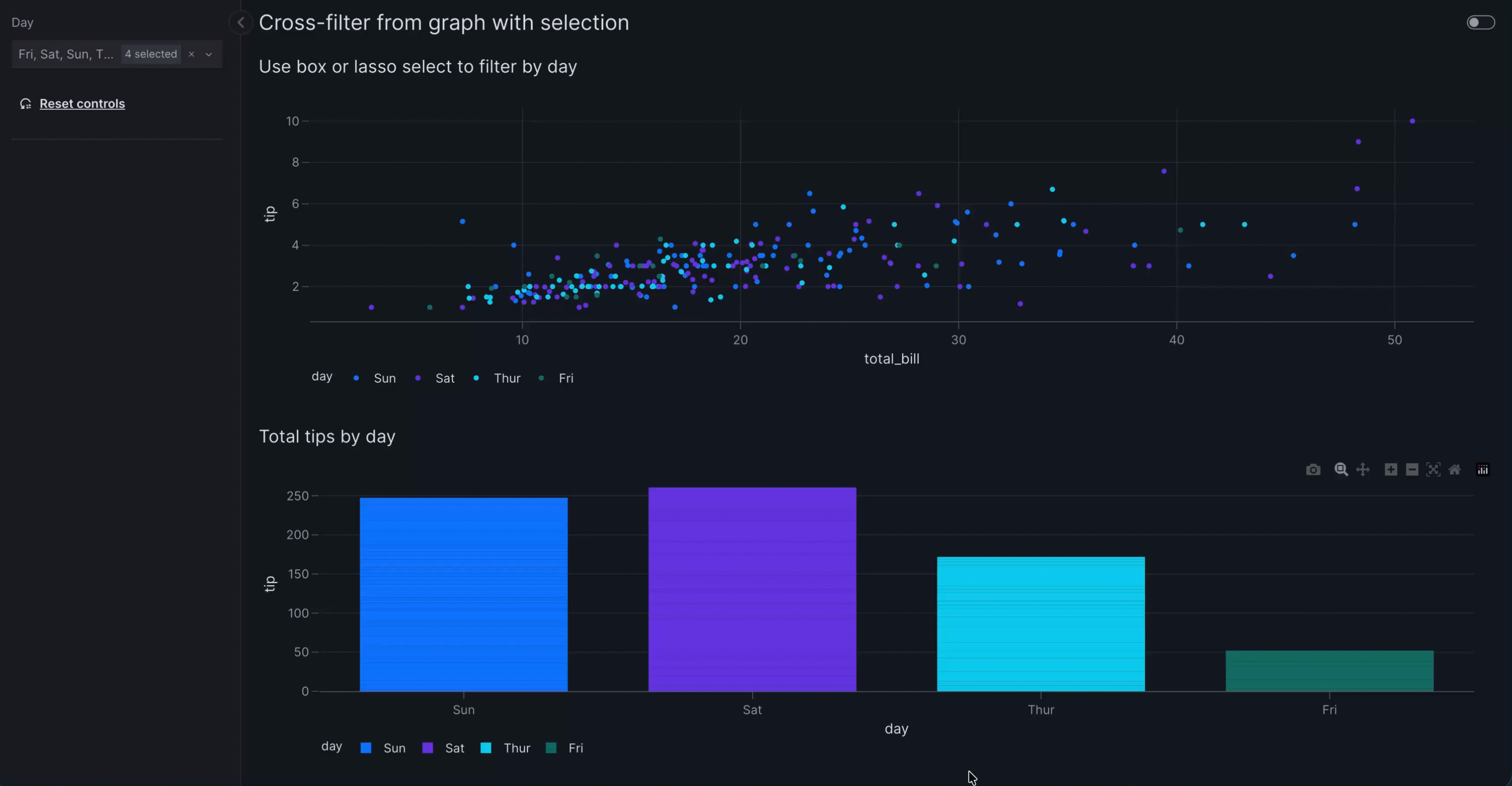
When select multiple points in the scatter plot, the bar chart is cross-filtered to show data for all the selected days. If only one point is clicked, the filter is set to that single value. If you deselect all points the control resets to its original value. You can deselect all points by double clicking on an empty area of the plot or by clicking on the last single selected point.
Behind the scenes mechanism
In full, what happens is as follows:
- A client-side callback combines the graph's
clickDataandselectedDatainto a single trigger. If box or lasso selection is used, the trigger contains all selected points; otherwise it contains the single clicked point. Graph._get_value_from_triggeriterates over all points in the trigger, extracts the unique values for the specifiedvalue, and returns a sorted list.- The
set_controlaction receives this list and sets the control accordingly: for a multi-value selector the full list is used, for a range selector the min and max are used, and for a single-value selector the control only updates when exactly one value is present. - If no points are selected (deselection),
Noneis returned, which resets the control to its original value.
The mechanism for triggering the filter when its value is set by va.set_control is an implicit actions chain.
Tip
If you use box/lasso selection but your filter or parameter uses a single-value selector (for example vm.Dropdown(multi=False)), the control only updates when exactly one point is selected. Selecting two or more points with different values leaves the control unchanged.
You can override the automatic clickmode by setting it explicitly in your figure function, for example fig.update_layout(clickmode="event") to disable highlighting points when clicked and Shift + click possibility.
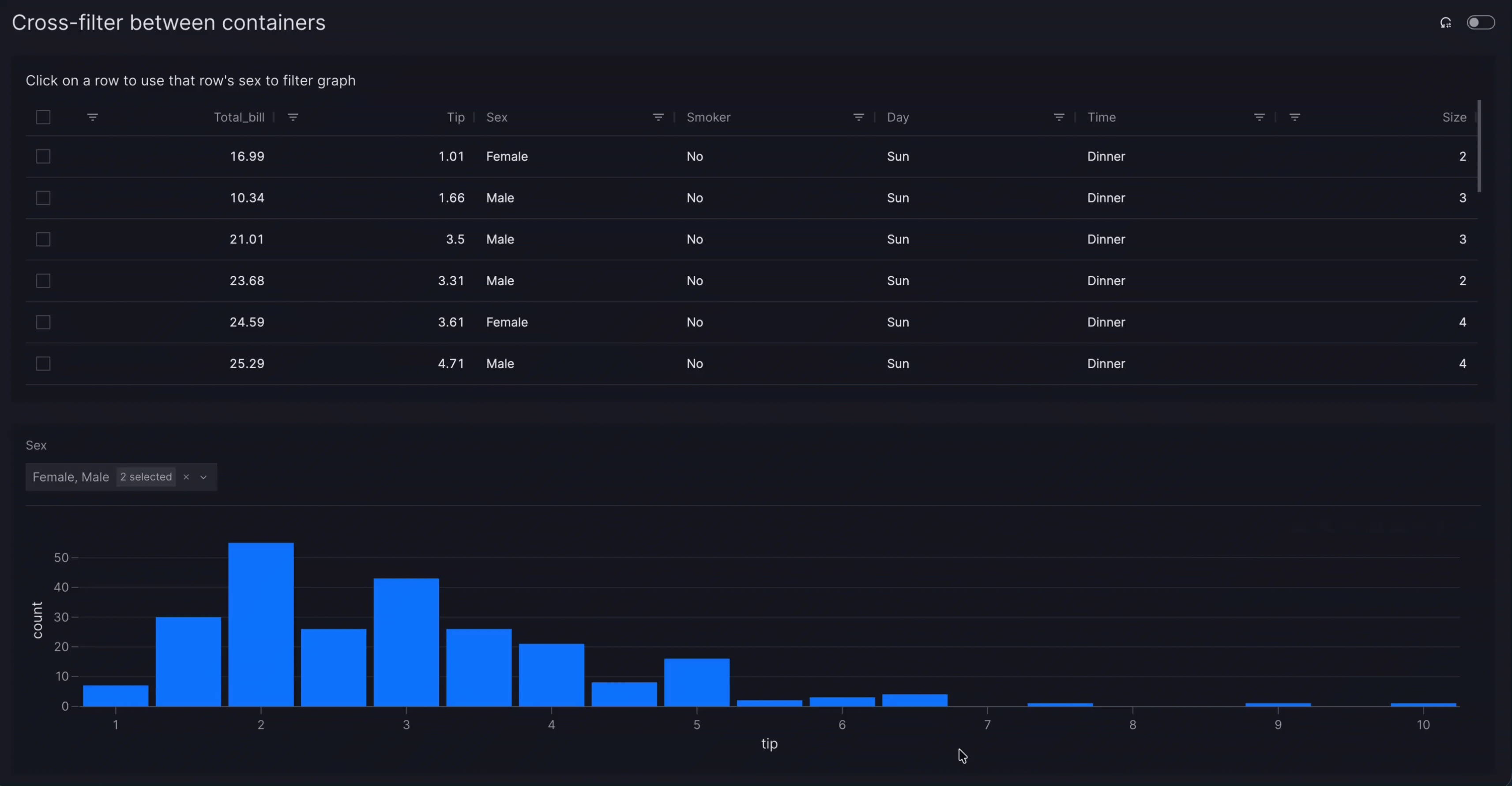
Cross-filter between containers
A cross-filter often works best when used inside a container. This typically makes it clearer which components the filter applies to, especially when the container is styled.
For example, let us rearrange the cross-filter from a table example into containers. Now the control appears directly above the table that it targets rather than on the left hand side of the page. The rearrangement here is purely visual to give a better user experience; va.set_control itself is configured exactly the same way and behaves identically while the dashboard is running.
Cross-filter between containers
import vizro.actions as va
import vizro.models as vm
import vizro.plotly.express as px
from vizro import Vizro
from vizro.tables import dash_ag_grid

tips = px.data.tips()

page = vm.Page(
    title="Cross-filter between containers",
    components=[
        vm.Container(
            components=[
                vm.AgGrid(
                    title="Click on a row to use that row's sex to filter graph",
                    figure=dash_ag_grid(tips),
                    actions=va.set_control(control="sex_filter", value="sex"),
                )
            ],
            variant="filled",  # (1)!
        ),
        vm.Container(
            components=[vm.Graph(figure=px.histogram(tips, x="tip"))],  # (2)!
            controls=[vm.Filter(id="sex_filter", column="sex")],  # (3)!
            variant="filled",
        ),
    ],
)

dashboard = vm.Dashboard(pages=[page])
Vizro().build(dashboard).run()
![]() Run and edit this code in Py.Cafe
Run and edit this code in Py.Cafe
- We use styled containers to make it clear which components and controls are in each container.
- The
vm.Graphno longer needs anidassigned to it, since thevm.Filterdoes not need to explicitly target it any more. - The
vm.Filterno longer needs to specifytargets. By default, thevm.Filtertargets all components in its container whose data source includescolumn="sex".
# Still requires a .py to add data to the data manager and parse YAML configuration
# See yaml_version example
pages:
  - components:
      - components:
          - actions:
              - control: sex_filter
                type: set_control
                value: sex
            figure:
              _target_: dash_ag_grid
              data_frame: tips
            title: Click on a row to use that row's sex to filter graph
            type: ag_grid
        type: container
        variant: filled
      - components:
          - figure:
              _target_: histogram
              data_frame: tips
              x: tip
            type: graph
        controls:
          - column: sex
            id: sex_filter
            type: filter
        type: container
        variant: filled
    title: Cross-filter between containers
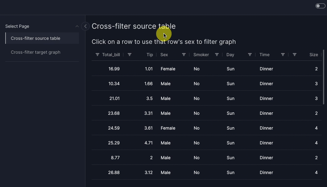
Cross-filter between pages
You can perform a cross-filter where the target components are on a different page from the source. The use of va.set_control is identical, but the intermediate filter must have show_in_url=True.
For example, let us rearrange the cross-filter from a table example so that the source table is on a different page from the target graph (and hence filter). When you click or press Space on a row in the table, you are taken to the target page with the graph cross-filtered to show data only for one sex.
Cross filter between pages
import vizro.actions as va
import vizro.models as vm
import vizro.plotly.express as px
from vizro import Vizro
from vizro.tables import dash_ag_grid

tips = px.data.tips()

page_1 = vm.Page(
    title="Cross-filter source table",
    components=[
        vm.AgGrid(
            title="Click on a row to use that row's sex to filter graph",
            figure=dash_ag_grid(tips),
            actions=va.set_control(control="sex_filter", value="sex"),
        )
    ],
)

page_2 = vm.Page(
    title="Cross-filter target graph",
    components=[vm.Graph(figure=px.histogram(tips, x="tip"))],   # (1)!
    controls=[vm.Filter(id="sex_filter", column="sex", show_in_url=True)],  # (2)!
)

dashboard = vm.Dashboard(pages=[page_1, page_2])
Vizro().build(dashboard).run()
![]() Run and edit this code in Py.Cafe
Run and edit this code in Py.Cafe
- The
vm.Graphno longer needs anidassigned to it, since thevm.Filterdoes not need to explicitly target it any more. - The
vm.Filterno longer needs to specifytargets. By default, thevm.Filtertargets all components on its page whose data source includescolumn="sex". We must setshow_in_url=Truefor this filter to be set byva.set_control.
# Still requires a .py to add data to the data manager and parse YAML configuration
# See yaml_version example
pages:
  - components:
      - actions:
          - control: sex_filter
            type: set_control
            value: sex
        figure:
          _target_: dash_ag_grid
          data_frame: tips
        title: Click on a row to use that row's sex to filter graph
        type: ag_grid
    title: Cross-filter source table
  - components:
      - figure:
          _target_: histogram
          data_frame: tips
          x: tip
        type: graph
    controls:
      - column: sex
        id: sex_filter
        show_in_url: true
        type: filter
    title: Cross-filter target graph
Cross-filter from pivoted or multi-dimensional data
A single source component can trigger multiple cross-filters. For example, pivoted data can be visualized using a table or a 2-dimensional heatmap.
To perform multiple cross-filters, each dimension that is filtered must have its own vm.Filter that is set by va.set_control in the actions of the source component in an actions chain. Here is a 2-dimensional example that cross-filters from a graph using the positional variables x and y.
Cross-filter over 2 dimensions - from a graph
import vizro.actions as va
import vizro.models as vm
import vizro.plotly.express as px
from vizro import Vizro
from vizro.tables import dash_ag_grid

tips = px.data.tips()

page = vm.Page(
    title="Cross-filter over 2 dimensions",
    components=[
        vm.Graph(
            title="Click on a cell to use that cell's sex and day to filter table",
            figure=px.density_heatmap(  # (1)!
                tips,
                x="day",
                y="sex",
                category_orders={"day": ["Thur", "Fri", "Sat", "Sun"]},
            ),
            actions=[
                va.set_control(control="day_filter", value="x"),  # (2)!
                va.set_control(control="sex_filter", value="y"),
            ],
        ),
        vm.AgGrid(id="tips_table", figure=dash_ag_grid(tips)),
    ],
    controls=[
        vm.Filter(id="day_filter", column="day", targets=["tips_table"]),  # (3)!
        vm.Filter(id="sex_filter", column="sex", targets=["tips_table"]),
    ],
)

dashboard = vm.Dashboard(pages=[page])
Vizro().build(dashboard).run()
![]() Run and edit this code in Py.Cafe
Run and edit this code in Py.Cafe
- We make a 2-dimensional histogram to show the number of rows in the
tipsdata for each day and sex. - Each dimension has its own
va.set_controlto set the relevantvm.Filter. - Each has its own
vm.Filterto filter by the relevantcolumn.
# Still requires a .py to add data to the data manager and parse YAML configuration
# See yaml_version example
pages:
  - components:
      - actions:
          - control: day_filter
            type: set_control
            value: x
          - control: sex_filter
            type: set_control
            value: y
        figure:
          _target_: density_heatmap
          category_orders:
            day:
              - Thur
              - Fri
              - Sat
              - Sun
          data_frame: tips
          x: day
          y: sex
        title: Click on a cell to use that cell's sex and day to filter table
        type: graph
      - figure:
          _target_: dash_ag_grid
          data_frame: tips
        id: tips_table
        type: ag_grid
    controls:
      - column: day
        id: day_filter
        targets:
          - tips_table
        type: filter
      - column: sex
        id: sex_filter
        targets:
          - tips_table
        type: filter
    title: Cross-filter over 2 dimensions
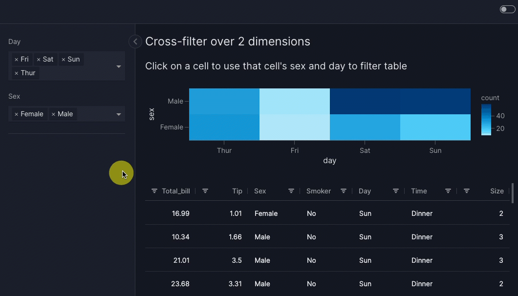
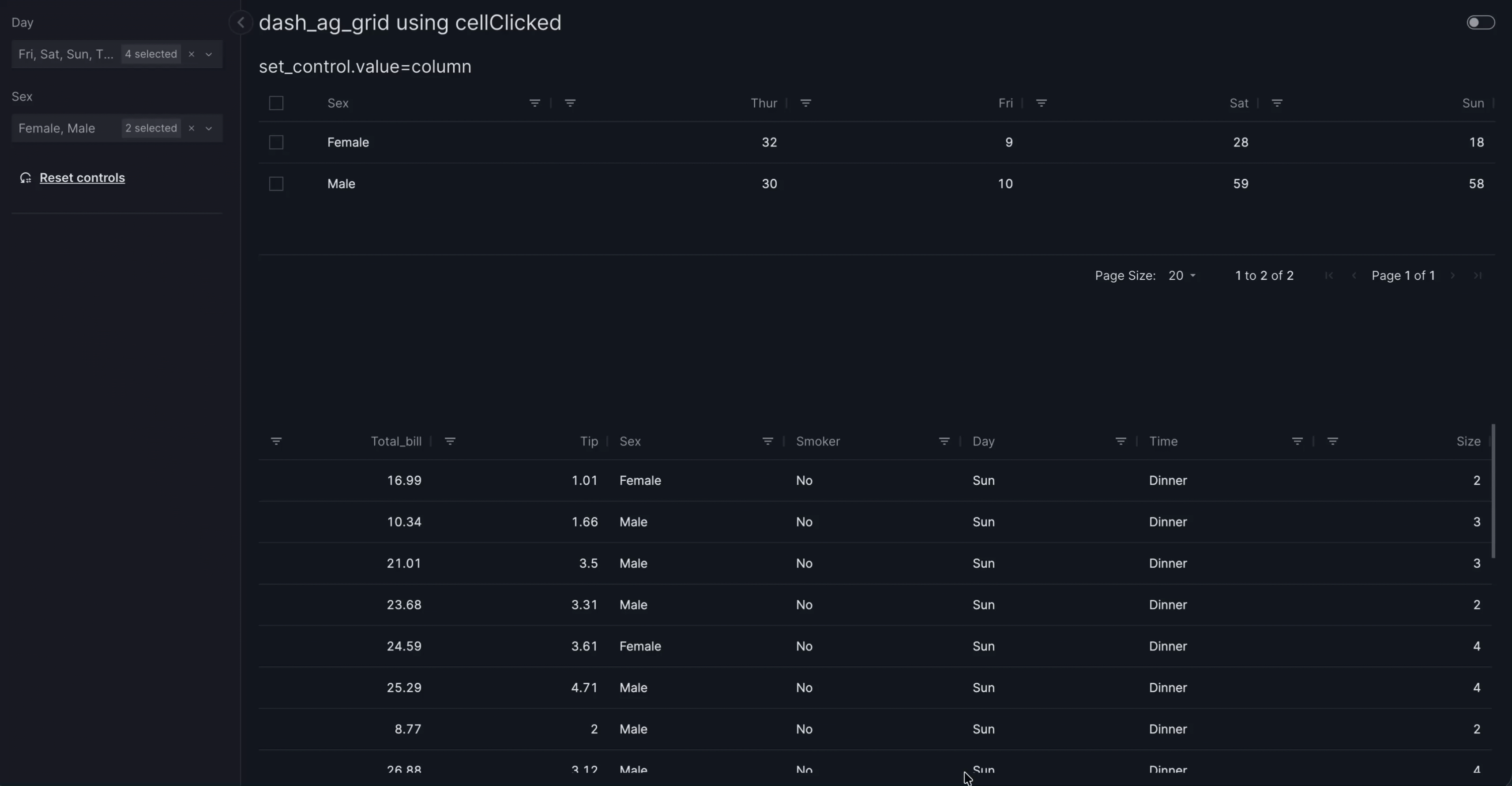
When you click on a colored cell in the heatmap, the table is cross-filtered to show data for only one sex and one day. The "count" shown for each heatmap cell corresponds to the number of rows shown in the filtered table when that cell is clicked.
Behind the scenes mechanism
In full, what happens is as follows:
- Clicking on a cell triggers the first
va.set_controlaction. This uses the value ofday(in other words, "Thur", "Fri", "Sat" or "Sun") to set the selector underlyingvm.Filter(id="day_filter"). When multiple points are selected, unique values across all points are sent. - When the
day_filterhas been set, the secondva.set_controlaction runs. This uses the value ofsex(in other words, "Male" or "Female") to set the selector underlyingvm.Filter(id="sex_filter"). - The change in value of
vm.Filter(id="day_filter")triggers the filter on itstargets=["tips_table"]so that a filtered table is shown. - The change in value of
vm.Filter(id="sex_filter")triggers the filter on itstargets=["tips_table"]so that a filtered table is shown.
The mechanism for triggering the filter when its value is set by va.set_control is an implicit actions chain, while the sequence of applying the two va.set_control is an explicit actions chain. In general, steps 2 and 3 above will execute in parallel.
When performing multiple filters with dynamic data, you should consider configuring a cache so that steps 3 and 4 above do not repeatedly perform a slow data load.
Multiple cross-filters are similarly possible from a table:
vm.AgGrid(
    ...,
    actions=[
        va.set_control(control="day_filter", value="day"),
        va.set_control(control="sex_filter", value="sex"),
    ],
)
Cross-filter over 2 dimensions - from a table
import vizro.actions as va
import vizro.models as vm
import vizro.plotly.express as px
from vizro import Vizro
from vizro.tables import dash_ag_grid


tips = px.data.tips()
pivot_tips = (
    tips.pivot_table(index="sex", columns="day", aggfunc="size", fill_value=0)
    .reindex(columns=["Thur", "Fri", "Sat", "Sun"])
    .reset_index()
)


page = vm.Page(
    title="dash_ag_grid using cellClicked",
    components=[
        vm.AgGrid(
            title="set_control.value=column",
            figure=dash_ag_grid(pivot_tips),   # (1)!
            actions=[
                va.set_control(control="day_filter", value="column"),  # (2)!
                va.set_control(control="sex_filter", value="sex"),
            ],
        ),
        vm.AgGrid(id="tips_table", figure=dash_ag_grid(tips)),
    ],
    controls=[
        vm.Filter(id="day_filter", column="day", targets=["tips_table"]),  # (3)!
        vm.Filter(id="sex_filter", column="sex", targets=["tips_table"]),
    ],
)

dashboard = vm.Dashboard(pages=[page])
Vizro().build(dashboard).run()
![]() Run and edit this code in Py.Cafe
Run and edit this code in Py.Cafe
- We make a 2-dimensional AgGrid to show the number of rows in the
tipsdata for each day and sex. - Each dimension has its own
va.set_controlto set the relevantvm.Filter. - Each has its own
vm.Filterto filter by the relevantcolumn.
# Still requires a .py to add data to the data manager and parse YAML configuration
# See yaml_version example
pages:
  - components:
      - actions:
          - control: day_filter
            type: set_control
            value: column
          - control: sex_filter
            type: set_control
            value: sex
        figure:
          _target_: dash_ag_grid
          data_frame: pivot_tips
        title: set_control.value=column
        type: ag_grid
      - figure:
          _target_: dash_ag_grid
          data_frame: tips
        id: tips_table
        type: ag_grid
    controls:
      - column: day
        id: day_filter
        targets:
          - tips_table
        type: filter
      - column: sex
        id: sex_filter
        targets:
          - tips_table
        type: filter
    title: dash_ag_grid using cellClicked
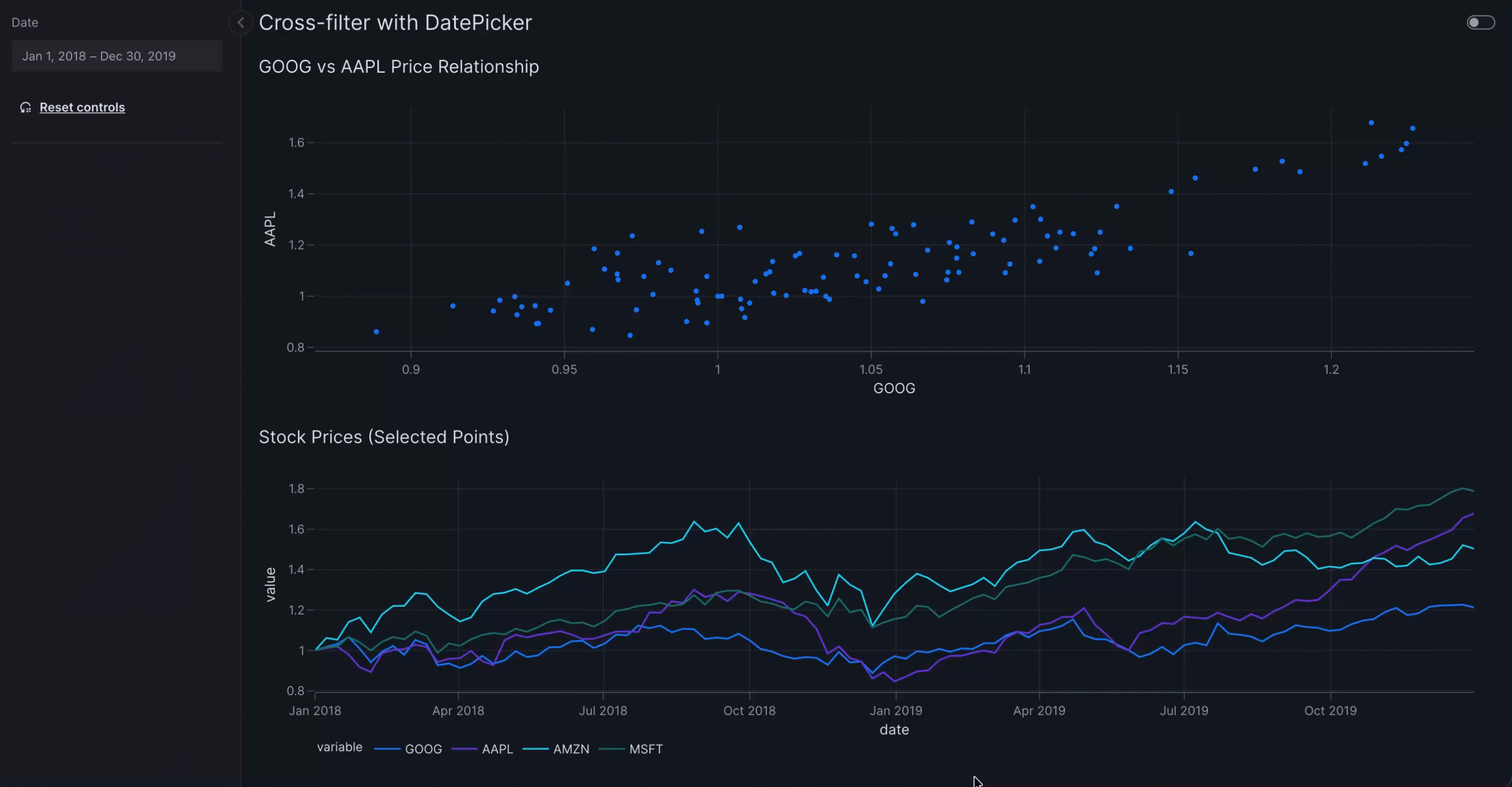
Cross-filter with non-categorical selectors
The examples above use categorical selectors such as Dropdown and Checklist, but you can target non-categorical selectors as well with set_control action. The example below uses (vm.DatePicker(range=True)):
Cross-filter from table with non-categorical selector
import pandas as pd

import vizro.actions as va
import vizro.models as vm
import vizro.plotly.express as px
from vizro import Vizro

stocks = px.data.stocks()
stocks["date"] = pd.to_datetime(stocks["date"])

page = vm.Page(
    title="Cross-filter with DatePicker",
    components=[
        vm.Graph(
            id="stocks_graph",
            title="GOOG vs AAPL Price Relationship",
            figure=px.scatter(stocks, x="GOOG", y="AAPL", custom_data="date"),
            actions=va.set_control(control="date_filter", value="date"),
        ),
        vm.Graph(
            id="stocks_graph_2",
            title="Stock Prices (Selected Points)",
            figure=px.line(stocks, x="date", y=["GOOG", "AAPL", "AMZN", "MSFT"])
        )
    ],
    controls=[
        vm.Filter(
            id="date_filter",
            column="date",
            targets=["stocks_graph_2"],
            selector=vm.DatePicker(range=True),
        ),
    ],
)

dashboard = vm.Dashboard(pages=[page])
Vizro().build(dashboard).run()
![]() Run and edit this code in Py.Cafe
Run and edit this code in Py.Cafe
# Still requires a .py to add data to the data manager and parse YAML configuration
# See yaml_version example
pages:
  - components:
      - actions:
          - control: date_filter
            type: set_control
            value: date
        figure:
          _target_: scatter
          data_frame: stocks
          x: GOOG
          y: AAPL
          custom_data: date
        id: stocks_graph
        title: GOOG vs AAPL Price Relationship
        type: graph
      - figure:
          _target_: line
          data_frame: stocks
          x: date
          y:
            - GOOG
            - AAPL
            - AMZN
            - MSFT
        id: stocks_graph_2
        title: Stock Prices (Selected Points)
        type: graph
    controls:
      - column: date
        id: date_filter
        selector:
          range: true
          type: date_picker
        targets:
          - stocks_graph_2
        type: filter
    title: Cross-filter with DatePicker
Cross-parameter
A cross-parameter is when the user clicks on one source graph or table to update any argument other than data_frame of one or more target components. In Vizro, a cross-parameter operates through an intermediate parameter. To configure a cross-parameter:
-
Create a parameter that targets the graphs, tables or figures you would like to update. The parameter can have any type of selector.
-
Call
set_controlin theactionsargument of the sourceGraphorAgGridcomponent that triggers the cross-parameter.- Set
controlto the ID of the parameter. - Set
value. The format of this depends on the source model and is given in the API reference. Think of it as an instruction for what to lookup in the source data: whatever value is fetched from this lookup is used to setcontrol.
- Set
Cross-highlight
A cross-highlight is an example of a cross-parameter where the effect of the intermediate parameter is to highlight data. When a user clicks on one source graph or table, the corresponding data is highlighted in a target graph or table (typically a custom graph).
In Vizro, cross-highlighting operates through an intermediate parameter. Often this parameter is hidden from view with visible=False since the highlighting effect itself provides sufficient visual feedback about the selected data. Remember that the cross-highlight can be cleared with the "Reset controls" button.
In general, there are many different ways to visually highlight data in a graph. For example:
- Change the style of a marker, line or bar, for example its color, opacity or shape.
- Add an annotation.
- Highlight a region of the plot's background.
Tip
All cross-parameters, which includes cross-highlights, can operate across different containers and different pages. The use of va.set_control is identical to when source and target are in the same container and page. For further examples and styling hints, see the sections on cross-filtering between containers and between pages.
Cross-highlight from table
This example shows how to configure cross-highlighting where clicking on the row in a table highlights the corresponding data in a target scatter graph. The highlighting is visually shown by changing the color of the point for the selected country. Since cross-highlight is a sort of cross-parameter, the method follows the same pattern as configuring a cross-parameter.
-
Create a parameter that targets the graph you would like to visually highlight.
import vizro.models as vm controls = [ vm.Parameter( id="highlight_parameter", # (1)! targets=["scatter_chart.highlight_country"], # (2)! selector=vm.RadioItems(options=["NONE", ...]), # (3)! visible=False, # (4)! ) ]- We give the parameter an
idso that it can be set explicitly byva.set_control. - The parameter targets the argument
highlight_countryofvm.Graph(id="scatter_chart"). - We add
"NONE"as an option, corresponding to a parameter valuehighlight_country=None. This is used so the target graph is initially unhighlighted. - We set
visible=Falseto hide the parameter selector from the user interface while keeping the functionality active.
- We give the parameter an
-
Call
set_controlin theactionsargument of the sourceAgGridcomponent that triggers the cross-highlight.- Set
controlto the ID of the parameter. - Set
valueto specify which column contains the value that sets the control when a row in the table is clicked.
- Set
-
Create a custom chart that highlights the data corresponding to
highlight_country.import vizro.plotly.express as px from vizro.models.types import capture @capture("graph") def scatter_with_highlight(data_frame, highlight_country): # (1)! country_is_highlighted = data_frame["country"] == highlight_country # (2)! return px.scatter(data_frame, x=..., y=..., color=country_is_highlighted) # (3)!- The
highlight_countryargument receives the selected country name fromhighlight_parameter. country_is_highlightedis a pandas Series that containsTruefor the highlighted country andFalsefor all others.- We color the points by
country_is_highlighted. This will color differently the valuesTrue(for the highlighted country) andFalse(for all others).
- The
The full code is given below. This shows a slightly more complicated highlighting style that also changes some additional properties of the highlighted point like its opacity.
Cross-highlight from table
import vizro.plotly.express as px
import vizro.models as vm
import vizro.actions as va
from vizro.models.types import capture
from vizro import Vizro
from vizro.tables import dash_ag_grid

gapminder = px.data.gapminder().query("continent == 'Europe' and year == 2007")

@capture("graph")
def scatter_with_highlight(data_frame, highlight_country=None):  # (1)!
    country_is_highlighted = data_frame["country"] == highlight_country  # (2)!
    fig = px.scatter(
        data_frame,
        x="gdpPercap",
        y="lifeExp",
        size="pop",
        size_max=60,
        opacity=0.3,
        color=country_is_highlighted,
        category_orders={"color": [False, True]},  # (3)!
    )

    if highlight_country is not None: # (4)!
        fig.update_traces(selector=1, marker={"line_width": 2, "opacity": 1})  # (5)!

    fig.update_layout(showlegend=False)
    return fig


page = vm.Page(
    title="Cross-highlight from table",
    layout=vm.Grid(grid=[[0, 1]], col_gap="80px"),  # (6)!
    components=[
        vm.AgGrid(
            header="💡 Click on a row to highlight that country in the scatter plot",
            figure=dash_ag_grid(data_frame=gapminder),
            actions=va.set_control(control="highlight_parameter", value="country"),  # (7)!
        ),
        vm.Graph(
            id="scatter_chart",   # (8)!
            figure=scatter_with_highlight(gapminder),
        ),
    ],
    controls=[
        vm.Parameter(
            id="highlight_parameter",   # (9)!
            targets=["scatter_chart.highlight_country"],   # (10)!
            selector=vm.RadioItems(options=["NONE", *gapminder["country"]]),   # (11)!
            visible=False,   # (12)!
        ),
    ],
)

dashboard = vm.Dashboard(pages=[page])
Vizro().build(dashboard).run()
![]() Run and edit this code in Py.Cafe
Run and edit this code in Py.Cafe
- The
highlight_countryargument receives the selected country name fromhighlight_parameter. country_is_highlightedis a pandas Series that containsTruefor the highlighted country andFalsefor all others. We use this to change the color of the highlighted point.- We make sure that the colors are always ordered the same way. This ensures that the highlighted point always has the same color regardless of which row in the table is clicked.
- When a country is highlighted, make further modifications to the style of the highlighted point's marker to make it stand out more.
update_tracesupdates only the trace selected with index 1. The traces are ordered bycategory_orders={"color": [False, True]}and so this corresponds toTrue, in other words the trace that hascountry_is_highlighted=Trueand contains the highlighted point.- We use a side-by-side layout with an 80px column gap to display the table and graph together.
- The table's
va.set_controlsetshiglight_parameterto the country from the clicked row. - We give the
vm.Graphanidso that it can be targeted byhighlight_parameter. - We give the parameter an
idso that it can be set explicitly byva.set_control. - The parameter targets the argument
highlight_countryofvm.Graph(id="scatter_chart"). - We add
"NONE"as an option, corresponding to a parameter valuehighlight_country=None. This is used so the target graph is initially unhighlighted. - We set
visible=Falseto hide the parameter selector from the user interface while keeping the functionality active.
# Still requires a .py to add data to the data manager, define CapturedCallables, and parse YAML configuration
# More explanation in the docs on `Dashboard` and extensions.
pages:
- components:
  - actions:
    - control: highlight_parameter
      type: set_control
      value: country
    figure:
      _target_: dash_ag_grid
      data_frame: gapminder
    header: 💡 Click on a row to highlight that country in the scatter plot
    type: ag_grid
  - figure:
      _target_: __main__.scatter_with_highlight
      data_frame: gapminder
    id: scatter_chart
    type: graph
  controls:
  - id: highlight_parameter
    selector:
      options:
      - NONE
      - Albania
      - ...
      - United Kingdom
      type: radio_items
    targets:
    - scatter_chart.highlight_country
    type: parameter
    visible: false
  layout:
    col_gap: 80px
    grid:
    - - 0
      - 1
    type: grid
  title: Cross-highlight from table
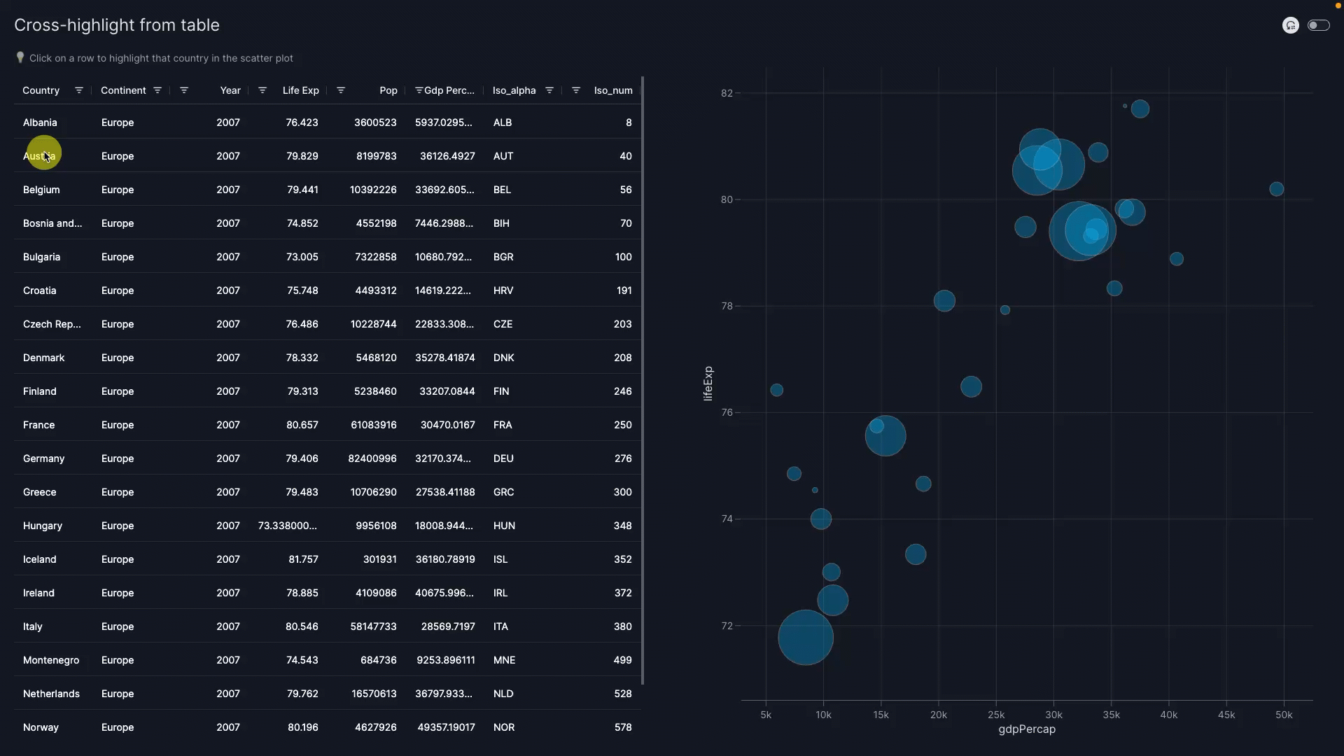
When you click on a row in the table, the corresponding point is highlighted in the scatter plot with an orange color, full opacity, and a thick border. Clicking the "Reset controls" button resets the parameter to its original value and hence clears the highlighting.
Behind the scenes mechanism
In full, what happens is as follows:
- Clicking on a row triggers the
va.set_controlaction. This uses the value of thecountrycolumn for the selected row to set the selector underlyingvm.Parameter(id="highlight_parameter"). - The change in value of
vm.Parameter(id="highlight_parameter")triggers the parameter to update thehighlight_countryargument of the target componentscatter_chartso that a highlighted graph is shown.
The mechanism for triggering the parameter when its value is set by va.set_control is an implicit actions chain.
Cross-highlight from graph
This example shows how to configure cross-highlighting where clicking on a point in a graph highlights the corresponding data in a target bump chart. The highlighting is visually shown by making the line for the selector country stronger. Since cross-highlight is a sort of cross-parameter, the method follows the same pattern as configuring a cross-parameter.
-
Create a parameter that targets the graph you would like to visually highlight.
import vizro.models as vm controls = [ vm.Parameter( id="highlight_parameter", # (1)! targets=["bump_chart.highlight_country"], # (2)! selector=vm.RadioItems(options=["NONE", ...]), # (3)! visible=False, # (4)! ) ]- We give the parameter an
idso that it can be set explicitly byva.set_control. - The parameter targets the argument
highlight_countryofvm.Graph(id="bump_chart"). - We add
"NONE"as an option, corresponding to a parameter valuehighlight_country=None. This is used so the target graph is initially unhighlighted. - We set
visible=Falseto hide the parameter selector from the user interface while keeping the functionality active.
- We give the parameter an
-
Call
set_controlin theactionsargument of the sourceGraphcomponent that triggers the cross-highlight.- Set
controlto the ID of the parameter. - Set
value. As with a cross-filter from a graph, there are two different ways to specify this. However, often the value you require is encoded by a positional dimension such asx,y,z. If the value is not encoded as a positional dimension (for example, it corresponds tocolor) then you should instead usecustom_dataas described in the instructions on cross-filtering from a graph.
- Set
-
Create a custom chart that highlights the data corresponding to
highlight_country.import vizro.plotly.express as px from vizro.models.types import capture @capture("graph") def bump_chart_with_highlight(data_frame, highlight_country): # (1)! fig = px.line(data_frame, x=..., y=..., color="country") # (2)! fig.update_traces(selector={"name": highlight_country}, line_width=3) # (3)! return fig- The
highlight_countryargument receives the selected country name fromhighlight_parameter. - We color the plot by
countryso that each country has its own trace in the resulting chart. - We use
update_tracesto modify the highlighted line's style.
- The
The full code is given below. This includes the complete code for a bump chart with more advanced styling.
Cross-highlight from graph
import vizro.plotly.express as px
import vizro.models as vm
import vizro.actions as va
from vizro.models.types import capture
from vizro import Vizro

selected_countries = [
    "Singapore",
    "Malaysia",
    "Thailand",
    "Indonesia",
    "Philippines",
    "Vietnam",
    "Cambodia",
    "Myanmar",
]

gapminder = px.data.gapminder().query("country.isin(@selected_countries)")

@capture("graph")
def bump_chart_with_highlight(data_frame, highlight_country=None):  # (1)!
    rank = data_frame.groupby("year")["lifeExp"].rank(method="dense", ascending=False)

    fig = px.line(data_frame, x="year", y=rank, color="country", markers=True)  # (2)!
    fig.update_yaxes(title="Rank (1 = Highest lifeExp)", autorange="reversed", dtick=1)  # (3)!
    fig.update_traces(opacity=0.3, line_width=2)  # (4)!

    if highlight_country is not None:  # (5)!
        fig.update_traces(selector={"name": highlight_country}, opacity=1, line_width=3)  # (6)!

    return fig


page = vm.Page(
    title="Cross-highlight from graph",
    components=[
        vm.Graph(
            figure=px.bar(
                gapminder.query("year == 2007"),
                y="country",
                x="lifeExp",
                labels={"lifeExp": "lifeExp in 2007"},
            ),
            header="💡 Click any bar to highlight that country in the bump chart",
            actions=va.set_control(control="highlight_parameter", value="y"),  # (7)!
        ),
        vm.Graph(
            id="bump_chart",  # (8)!
            figure=bump_chart_with_highlight(data_frame=gapminder),
        ),
    ],
    controls=[
        vm.Parameter(
            id="highlight_parameter",   # (9)!
            targets=["bump_chart.highlight_country"],   # (10)!
            selector=vm.RadioItems(options=["NONE", *gapminder["country"]]),   # (11)!
            visible=False,   # (12)!
        ),
    ],
)

dashboard = vm.Dashboard(pages=[page])
Vizro().build(dashboard).run()
![]() Run and edit this code in Py.Cafe
Run and edit this code in Py.Cafe
- The
highlight_countryargument receives the selected country name fromhighlight_parameter. rankis a pandas Series that gives the ranking of each country by life expectancy for every year. We color the plot bycountryso that each country has its own trace in the resulting chart.- Format the bump chart's y-axis so that it shows the rank of 1 (highest life expectancy) at the top.
- Style the lines for every country.
- When a country is highlighted, modify its line's style to make it stand out more.
update_tracesupdates only the trace selected, which is thehighlighted_countryone.- The graph's
va.set_controlsetshiglight_parameterto the country from the clicked bar. - We give the
vm.Graphanidso that it can be targeted byhighlight_parameter. - We give the parameter an
idso that it can be set explicitly byva.set_control. - The parameter targets the argument
highlight_countryofvm.Graph(id="bump_chart"). - We add
"NONE"as an option, corresponding to a parameter valuehighlight_country=None. This is used so the target graph is initially unhighlighted. - We set
visible=Falseto hide the parameter selector from the user interface while keeping the functionality active.
# Still requires a .py to add data to the data manager, define CapturedCallables, and parse YAML configuration
# More explanation in the docs on `Dashboard` and extensions.
pages:
  - components:
      - type: graph
        figure:
          _target_: bar
          data_frame: gapminder_2007
          labels:
            lifeExp: lifeExp in 2007
          x: lifeExp
          y: country
        header: 💡 Click any bar to highlight that country in the bump chart
        actions:
          - type: set_control
            control: highlight_parameter
            value: y
      - type: graph
        id: bump_chart
        figure:
          _target_: __main__.bump_chart_with_highlight
          data_frame: gapminder
    controls:
      - type: parameter
        id: highlight_parameter
        targets:
          - bump_chart.highlight_country
        selector:
          type: radio_items
          options:
            - NONE
            - Cambodia
            - Indonesia
            - Malaysia
            - Myanmar
            - Philippines
            - Singapore
            - Thailand
            - Vietnam
        visible: false
    title: Cross-highlight from graph
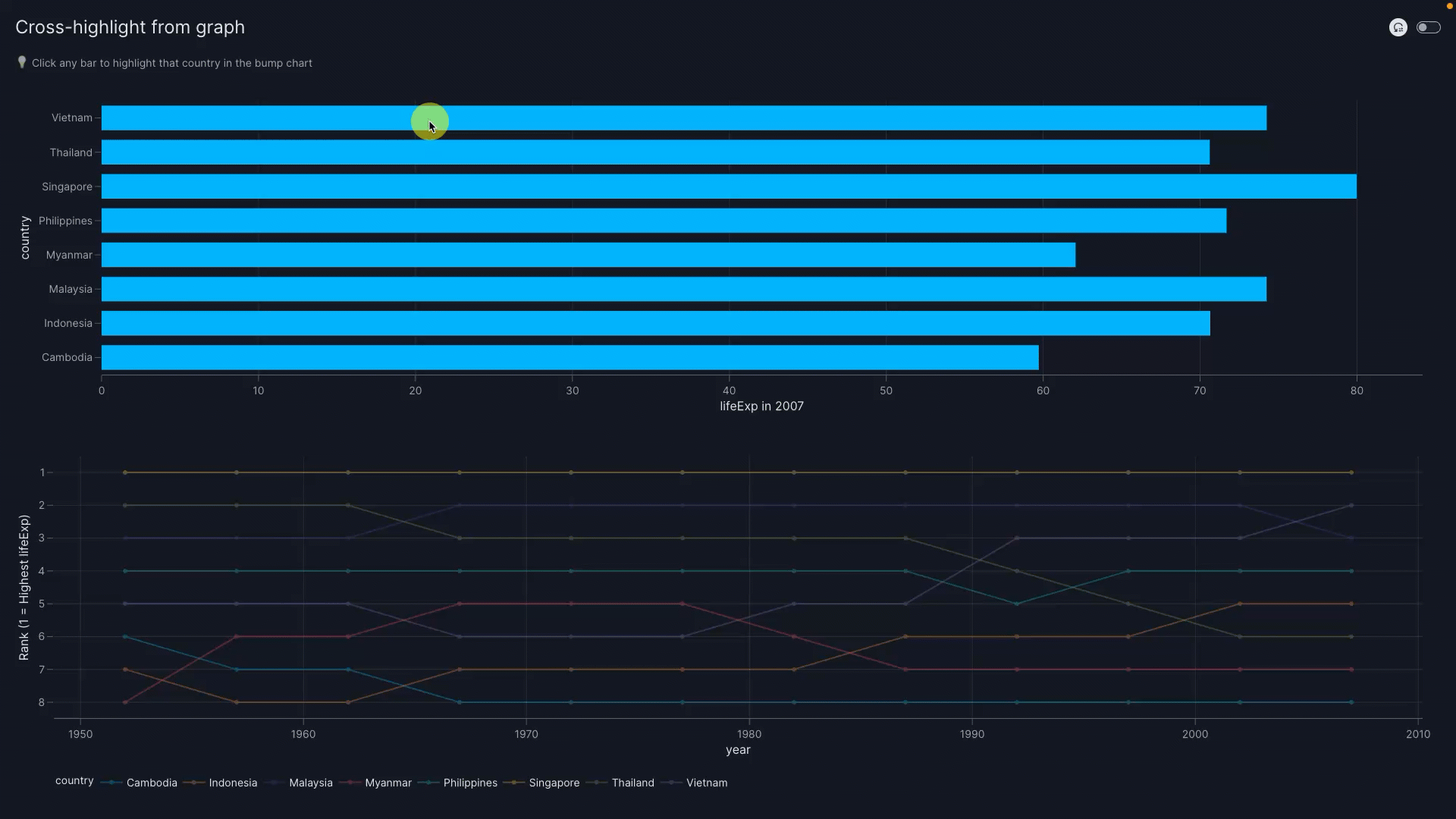
When you click on a bar in the bar chart, the corresponding line is highlighted in the bump chart with full opacity and a thicker line. Clicking the "Reset controls" button resets the parameter to its original value and hence clears the highlighting.
Behind the scenes mechanism
In full, what happens is as follows:
- Clicking on a bar triggers the
va.set_controlaction. This uses the value ofy(in other words, the country) taken from the source graph to set the value of thevm.Parameter(id="highlight_parameter"). - The change in value of
vm.Parameter(id="highlight_parameter")triggers the parameter to update thehighlight_countryargument of the target componentbump_chartso that a highlighted graph is shown.
The mechanism for triggering the parameter when its value is set by va.set_control is an implicit actions chain.