How to use selectors
This guide highlights different selectors that can be used in a dashboard. Selectors do not serve a purpose on their own, but they enable you to change how the input is given to other models, for example, the Filter or the Parameter model.
The Filter or the Parameter model accept the selector argument, where a selector model can be entered to choose how the user should input their choices for the respective models.
Categorical selectors
Within the categorical selectors, a clear distinction exists between multi-option and single-option selectors. For instance, the Checklist functions as a multi-option selector by default while the RadioItem serves as a single-option selector by default. However, the Dropdown can function as both a multi-option or single-option selector.
For more information, refer to the API reference of the selector, or the documentation of its underlying Dash component:
Dropdownbased ondcc.DropdownChecklistbased ondcc.ChecklistRadioItemsbased ondcc.RadioItems
If you have binary data (such as False/True or 0/1), you might prefer to use a dedicated boolean selector instead.
Configuring options
When configuring the options of the categorical selectors, you can either give:
- a list of values
options = ['Value A', 'Value B', 'Value C'] - or a dictionary of label-value mappings
options=[{'label': 'True', 'value': True}, {'label': 'False', 'value': False}]
The later is required if you want to provide different display labels to your option values or in case you want to provide boolean values as options. In this case, you need to provide a string label for your boolean values as boolean values cannot be displayed properly as labels in the underlying Dash components.
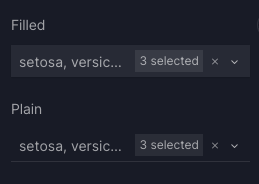
Styled dropdowns
You can customize two predefined dropdown styles that can be customized using the variant argument. If no variant is specified, the default style applied is variant="filled".
Styled dropdowns
from vizro import Vizro
import vizro.plotly.express as px
import vizro.models as vm

iris = px.data.iris()

page = vm.Page(
    title="Styled dropdown",
    components=[
        vm.Graph(figure=px.scatter(iris, x="sepal_length", y="petal_width", color="species")),
    ],
    controls=[
        vm.Filter(column="species", selector=vm.Dropdown(title="Filled")),
        vm.Filter(column="species", selector=vm.Dropdown(variant="plain", title="Plain")),
    ],
)

dashboard = vm.Dashboard(pages=[page])
Vizro().build(dashboard).run()
 Run and edit this code in Py.Cafe
# Still requires a .py to add data to the data manager and parse YAML configuration
# See yaml_version example
pages:
  - components:
      - figure:
          _target_: scatter
          data_frame: iris
          x: sepal_length
          y: petal_width
          color: species
        type: graph
    controls:
      - column: species
        selector:
          type: dropdown
          title: Plain
          variant: plain
        type: filter
      - column: species
        selector:
          type: dropdown
          title: Filled
        type: filter
    title: Styled dropdown
Numerical selectors
For more information, refer to the API reference of the selector, or the documentation of its underlying Dash component:
Sliderbased ondcc.SliderRangeSliderbased ondcc.RangeSlider
Using float values and step with an integer value
When configuring the Slider and the RangeSlider with float values, and using step with an integer value, you may notice unexpected behavior, such as the drag value being outside its indicated marks. To our knowledge, this is a current bug in the underlying dcc.Slider and dcc.RangeSlider component, which you can circumvent by adapting the step size as needed.
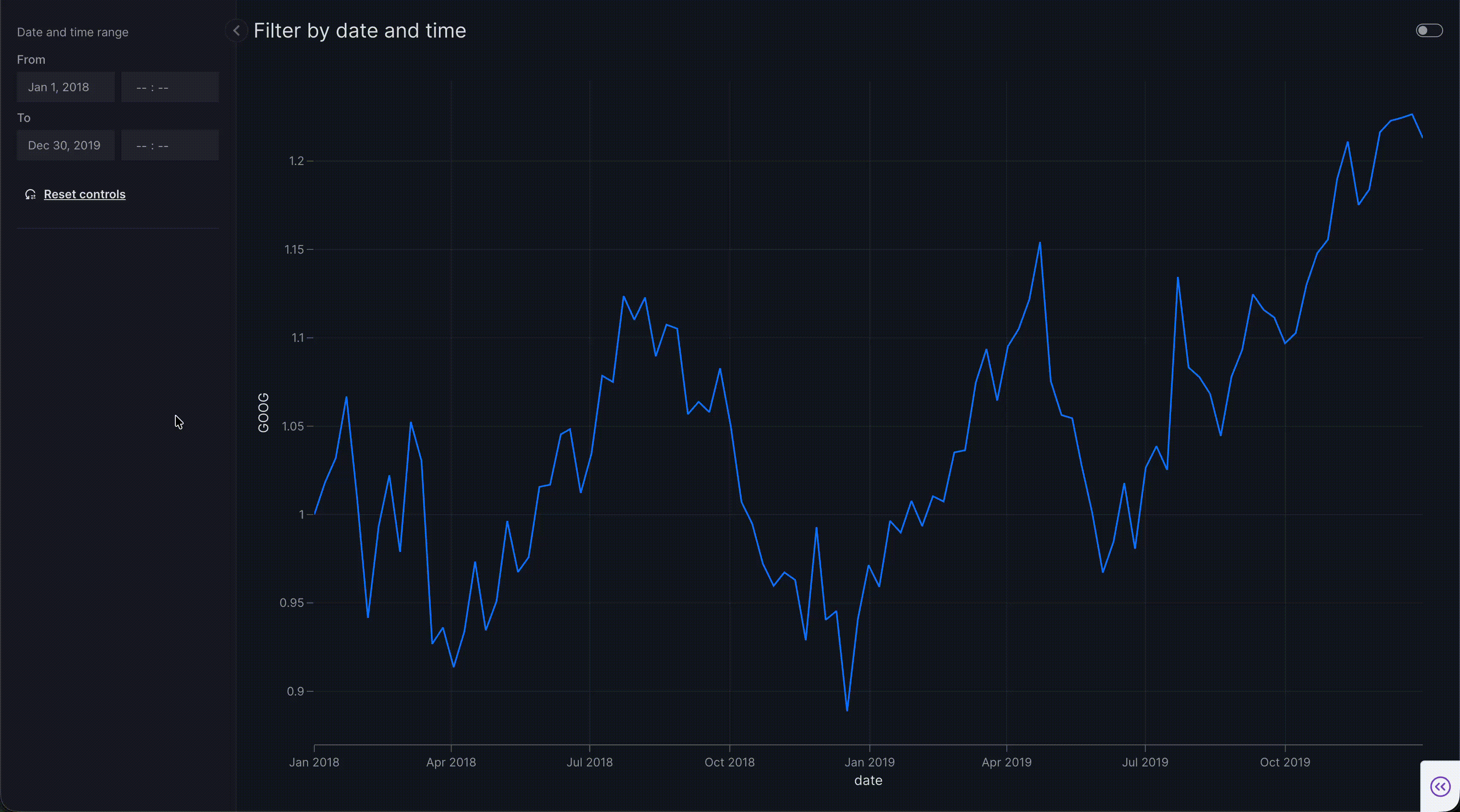
Temporal selectors
For more information, refer to the API reference of the selector, or the documentation of its underlying Dash component:
DatePickerbased ondmc.DatePickerInputTimePickerbased ondmc.TimePickerDateTimePickerbased ondmc.DatePickerInputcombined withdmc.TimePicker
All mentioned temporal selectors show a range picker by default (range=True). Set range=False for a single selection.
Which temporal selector to use depends on the target column type:
datecolumns: useDatePicker.timecolumns: useTimePicker.datetimecolumns: useDatePickerto filter by calendar date only, orDateTimePickerto filter by both date and time.DatePickerremains the default filter selector fordatetimecolumns, so setselector=vm.DateTimePicker()explicitly when you need time-of-day precision.
Note
DatePicker: providemin,maxandvalueas"yyyy-mm-dd"strings ordatetimeobjects (for example,datetime.datetime(2024, 1, 1)). For target columns, usedf["date"] = pd.to_datetime(df["date"])to get adatetime64column.TimePicker: providevalueas"HH:MM"or"HH:MM:SS"strings ordatetime.timeobjects (for example,datetime.time(10, 30)). For target columns, usedf["time"] = pd.to_datetime(df["time"]).timeto get a column ofdatetime.timeobjects.DateTimePicker: works ondatetimecolumns only. Provideminandmaxas"yyyy-mm-dd"strings ordatetimeobjects to bound the date portion of the picker, andvalueas ISO datetime strings (for example,"2024-01-01T09:00"or"2024-01-01 09:00:00") ordatetimeobjects. For target columns, usedf["datetime"] = pd.to_datetime(df["datetime"])to get adatetime64column.
Time ranges that cross midnight
When the TimePicker start time is later than the end time (for example, ["21:00", "06:00"]), the range is interpreted as wrapping around midnight. Rows are included if their time falls within ["21:00", "23:59:59.999999"] or ["00:00", "06:00"].
Clearing the time in a DateTimePicker
Each DateTimePicker input pairs a date field with a clearable time field. When the time portion is cleared (shown as --:--), the value falls back to a date-only string and the filter treats it as the whole day: start-of-day (00:00:00) for the start of a range and end-of-day (23:59:59) for the end. Clearing the time therefore widens the filter to cover the full day rather than disabling it — matching the behavior of a plain DatePicker.
DateTimePicker
import pandas as pd
import vizro.models as vm
import vizro.plotly.express as px
from vizro import Vizro

df = px.data.stocks()
# Add a deterministic time-of-day component so the column is a true `datetime` (not just `date`).
df["date"] = pd.to_datetime(df["date"]) + pd.to_timedelta(df.index % 24, unit="h")

page = vm.Page(
    title="Filter by date and time",
    components=[
        vm.Graph(figure=px.line(df, x="date", y="GOOG")),
    ],
    controls=[
        vm.Filter(column="date", selector=vm.DateTimePicker(title="Date and time range")),
    ],
)

dashboard = vm.Dashboard(pages=[page])
Vizro().build(dashboard).run()
Run and edit this code in Py.Cafe
# Still requires a .py to add data to the data manager and parse YAML configuration
# See yaml_version example
pages:
  - components:
      - figure:
          _target_: line
          data_frame: stocks
          x: date
          y: GOOG
        type: graph
    controls:
      - column: date
        selector:
          type: datetime_picker
          title: Date and time range
        type: filter
    title: Filter by date and time
Boolean selectors
For more information, refer to the API reference of the selector, or the documentation of its underlying Dash component:
Switchbased ondbc.Switch
Hierarchical selectors
For more information, refer to the API reference of the selector, or the documentation of its underlying Dash component:
Cascaderbased onvdc.Cascader
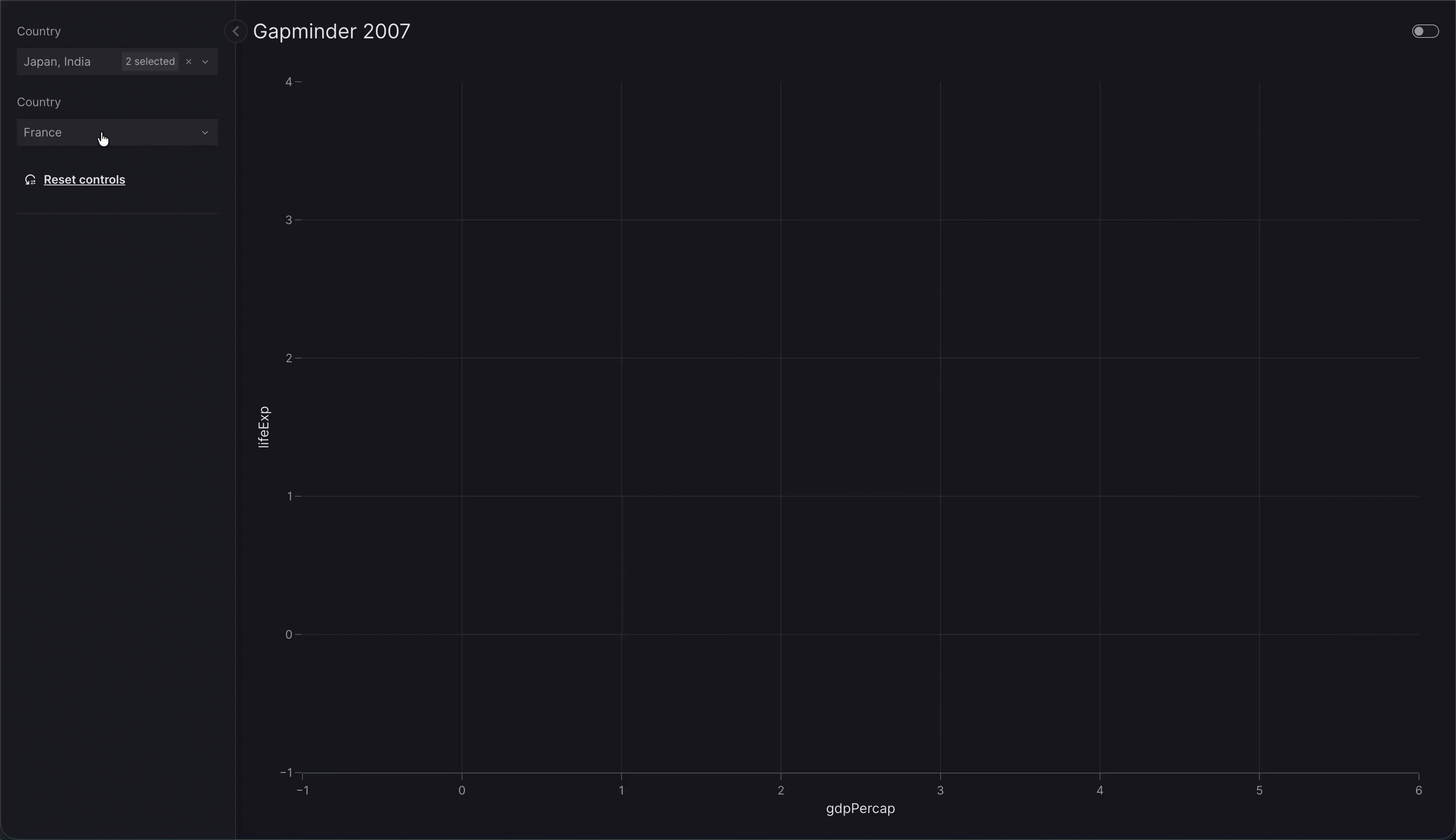
Hierarchical selectors show choices in a nested menu of groups. options gives the structure of a tree of values (the leaves of the tree), for example:
options = {
    "Asia": ["Japan", "India"],
    "Europe": {"West": ["France", "Germany"], "North": ["Norway"]},
}
By default, value is set according to the first group at the top of the tree:
- If
multi=False, by defaultvalueis the first leaf listed under the first group. Here the first group isAsia, and its first country isJapan, sovalue="Japan". - If
multi=True, by defaultvalueis all leaves listed under the first group. Here the first group isAsia, sovalue=["Japan", "India"].
You can pick a different starting selection by setting value on Cascader.
Hierarchical selector multi vs single
from vizro import Vizro
import vizro.plotly.express as px
import vizro.models as vm

gapminder = px.data.gapminder().query("year == 2007")

options = {
    "Asia": ["Japan", "India"],
    "Europe": {"West": ["France", "Germany"], "North": ["Norway"]},
}

page = vm.Page(
    title="Gapminder 2007",
    components=[
        vm.Graph(
            figure=px.scatter(
                gapminder,
                x="gdpPercap",
                y="lifeExp",
                size="pop",
                color="continent",
                hover_name="country",
            )
        ),
    ],
    controls=[
        vm.Filter(column=["continent", "country"], selector=vm.Cascader(options=options)),
        vm.Filter(column=["continent", "country"], selector=vm.Cascader(options=options, multi=False, value="France"))
    ],
)

dashboard = vm.Dashboard(pages=[page])
Vizro().build(dashboard).run()
Run and edit this code in Py.Cafe
# Still requires a .py to add data to the data manager and parse YAML configuration
# See yaml_version example
pages:
  - components:
      - figure:
          _target_: scatter
          data_frame: gapminder
          x: gdpPercap
          y: lifeExp
          size: pop
          color: continent
          hover_name: country
        type: graph
    controls:
      - column:
          - continent
          - country
        type: filter
        selector:
          type: cascader
          options: options
      - column:
          - continent
          - country
        type: filter
        selector:
          type: cascader
          options: options
          multi: false
          value: France
    title: Gapminder 2007
Hierarchical selectors can be used in hierarchical filters and parameters.
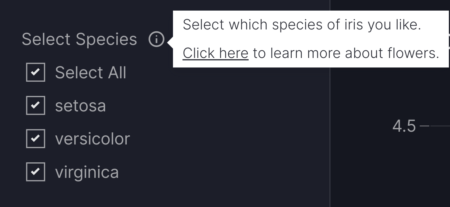
Add a tooltip
The description argument enables you to add helpful context to your selector by displaying an info icon next to its title. Hovering over the icon shows a tooltip with your provided text.
You can provide Markdown text as a string to use the default info icon or a Tooltip model to use any icon from the Google Material Icons library.
Selectors with tooltip
import vizro.models as vm
import vizro.plotly.express as px
from vizro import Vizro

iris = px.data.iris()

page = vm.Page(
    title="Selectors with icons",
    components=[
        vm.Graph(
            figure=px.scatter(iris, x="sepal_length", y="sepal_width")
        ),
    ],
    controls=[
        vm.Filter(
            column="species",
            selector=vm.Checklist(
                title="Select Species",
                description="""
                    Select which species of iris you like.

                    [Click here](https://en.wikipedia.org/wiki/Iris_flower_data_set)
                    to learn more about flowers.""",
            )
        ),
    ]
)

dashboard = vm.Dashboard(pages=[page])
Vizro().build(dashboard).run()
Run and edit this code in Py.Cafe
pages:
  - title: Selectors with icons
    components:
      - type: graph
        figure:
          _target_: scatter
          data_frame: iris
          x: sepal_length
          y: sepal_width
    controls:
      - column: species
        type: filter
        selector:
          type: checklist
          title: Select Species
          description: |
                Select which species of iris you like.

                [Click here](https://en.wikipedia.org/wiki/Iris_flower_data_set) to learn more about flowers.
The extra argument
Currently each selector is based on an underlying Dash component as mentioned in the sections above. Using the extra argument you can pass extra arguments to the underlying object in order to alter it beyond the chosen defaults. The available arguments can be found in the documentation of each underlying component that was linked in the respective sections above.
Note
Using extra is a quick and flexible way to alter a component beyond what Vizro offers. However, it is not a part of the official Vizro schema and the underlying implementation details may change. If you want to guarantee that your apps keep running, we recommend that you pin your Vizro version.
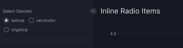
An example would be to make the RadioItem display inline instead of stacked vertically. For this you can use extra={"inline": True} argument:
Inline Radio Items
import vizro.models as vm
import vizro.plotly.express as px
from vizro import Vizro

iris = px.data.iris()

page = vm.Page(
    title="Inline Radio Items",
    components=[
        vm.Graph(
            figure=px.scatter(iris, x="sepal_length", y="sepal_width")
        ),
    ],
    controls=[
        vm.Filter(
            column="species",
            selector=vm.RadioItems(
                title="Select Species",
                extra={"inline": True}
            )
        )
    ]
)

dashboard = vm.Dashboard(pages=[page])
Vizro().build(dashboard).run()
Run and edit this code in Py.Cafe