How to use cards & buttons
This guide shows you how to use cards and buttons to visualize and interact with your data in the dashboard.
Cards
The Card is a flexible and extensible component that enables customization via markdown text.
Refer to any online guide for basic markdown usage.
You can add a Card to your dashboard by inserting the Card into the components argument of the Page.
Card
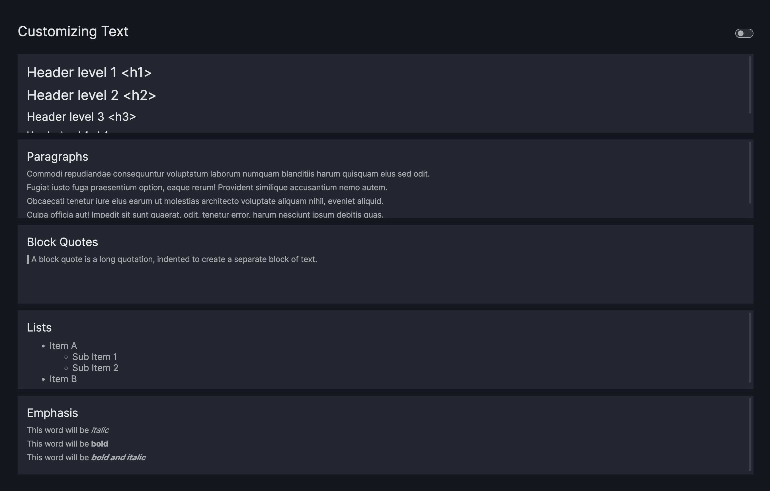
Customize card text
The Card uses the dcc.Markdown component from Dash as its underlying text component.
For more details on customizing the markdown text, refer to the dcc.Markdown component documentation.
Based on examples from Dash, the Card model supports the following:
- Headers
- Emphasis
- Lists
- Block Quotes
- Links
Card with custom text
import vizro.models as vm
from vizro import Vizro

page = vm.Page(
    title="Customizing Text",
    components=[
        vm.Card(
            text="""
                # Header level 1 <h1>

                ## Header level 2 <h2>

                ### Header level 3 <h3>

                #### Header level 4 <h4>
            """,
        ),
        vm.Card(
            text="""
                 ### Paragraphs
                 Commodi repudiandae consequuntur voluptatum laborum numquam blanditiis harum quisquam eius sed odit.

                 Fugiat iusto fuga praesentium option, eaque rerum! Provident similique accusantium nemo autem.

                 Obcaecati tenetur iure eius earum ut molestias architecto voluptate aliquam nihil, eveniet aliquid.

                 Culpa officia aut! Impedit sit sunt quaerat, odit, tenetur error, harum nesciunt ipsum debitis quas.
            """,
        ),
        vm.Card(
            text="""
                ### Block Quotes

                >
                > A block quote is a long quotation, indented to create a separate block of text.
                >
            """,
        ),
        vm.Card(
            text="""
                ### Lists

                * Item A
                    * Sub Item 1
                    * Sub Item 2
                * Item B
            """,
        ),
        vm.Card(
            text="""
                ### Emphasis

                This word will be *italic*

                This word will be **bold**

                This word will be _**bold and italic**_
            """,
        ),
    ],
)

dashboard = vm.Dashboard(pages=[page])

Vizro().build(dashboard).run()
# Still requires a .py to add data to the data manager and parse YAML configuration
# See from_yaml example
pages:
- components:
  - text: |
      # Header level 1 <h1>

      ## Header level 2 <h2>

      ### Header level 3 <h3>

      #### Header level 4 <h4>
    type: card
  - text: |
      Commodi repudiandae consequuntur voluptatum laborum numquam blanditiis harum quisquam eius sed odit.

      Fugiat iusto fuga praesentium option, eaque rerum! Provident similique accusantium nemo autem.

      Obcaecati tenetur iure eius earum ut molestias architecto voluptate aliquam nihil, eveniet aliquid.

      Culpa officia aut! Impedit sit sunt quaerat, odit, tenetur error, harum nesciunt ipsum debitis quas.
    title: Paragraphs
    type: card
  - text: |
      >
      > A block quote is a long quotation, indented to create a separate block of text.
      >
    title: Block Quotes
    type: card
  - text: |
      * Item A
        * Sub Item 1
        * Sub Item 2
      * Item B
    title: Lists
    type: card
  - text: |
      This word will be *italic*

      This word will be **bold**

      This word will be _**bold and italic**_
    title: Emphasis
    type: card
  title: Customizing Text
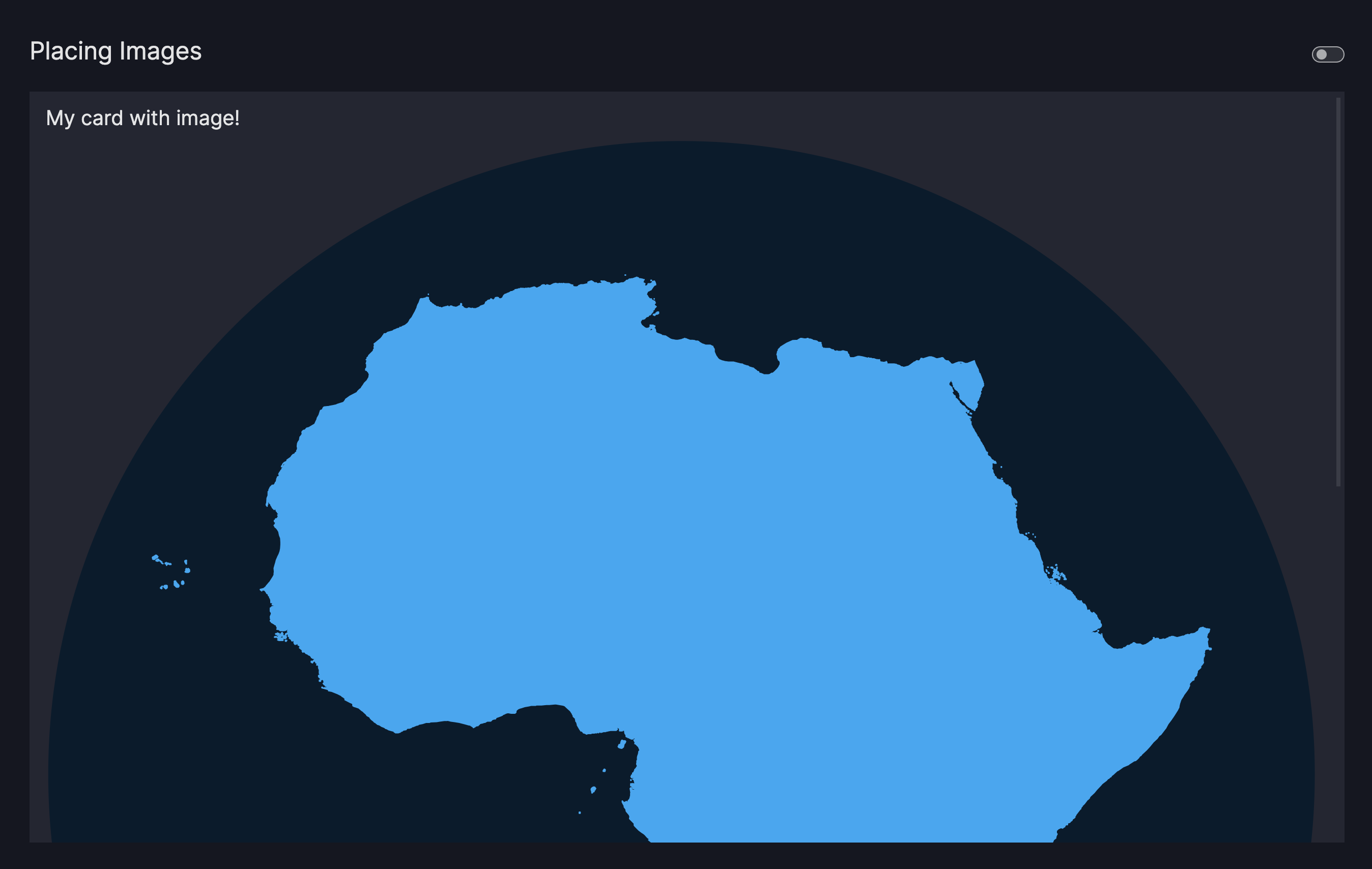
Place an image on a card
Images can be added to the text parameter by using the standard markdown syntax:

An image ALT text offers a description to your image and serves as a text placeholder or to improve the accessibility of your app. Providing an image ALT text is optional.
- To use a relative Image URL, place an image of your choice into your
assetsfolder first - Use markdown to render your image by using one of the following syntax:
- Relative Image URL:
 - Absolute Image URL:

- Relative Image URL:
Card with image
import vizro.models as vm
from vizro import Vizro
page = vm.Page(
title="Placing Images",
components=[
vm.Card(
text="""
### My card with image!

Commodi repudiandae consequuntur voluptatum laborum numquam blanditiis harum quisquam eius sed odit.
Fugiat iusto fuga praesentium option, eaque rerum! Provident similique accusantium nemo autem.
Obcaecati tenetur iure eius earum ut molestias architecto voluptate aliquam nihil, eveniet aliquid.
""",
),
],
)
dashboard = vm.Dashboard(pages=[page])
Vizro().build(dashboard).run()
# Still requires a .py to add data to the data manager and parse YAML configuration
# See from_yaml example
pages:
- components:
- text: |

Commodi repudiandae consequuntur voluptatum laborum numquam blanditiis harum quisquam eius sed odit.
Fugiat iusto fuga praesentium option, eaque rerum! Provident similique accusantium nemo autem.
Obcaecati tenetur iure eius earum ut molestias architecto voluptate aliquam nihil, eveniet aliquid.
title: My card with image!
type: card
title: Placing Images
Note
Note that inserting images using html is by default turned off by the dcc.Markdown to prevent users being exposed
to cross-site scripting attacks. If you need to turn it on, a custom component would have to be created.
You might notice that the image is quite large. You'll find out how to style images in terms of their position and size in the next section.
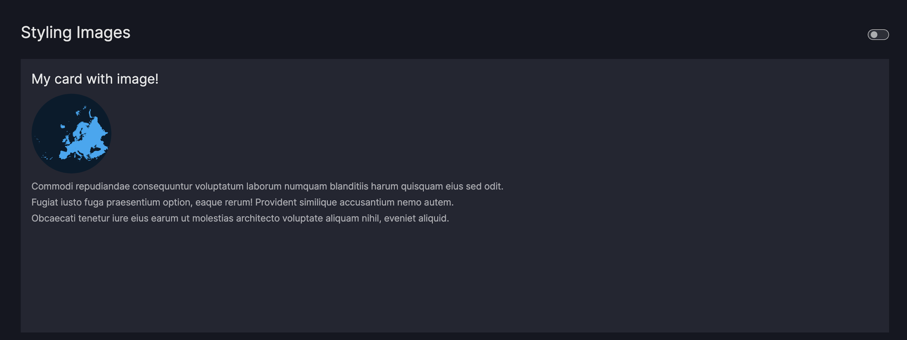
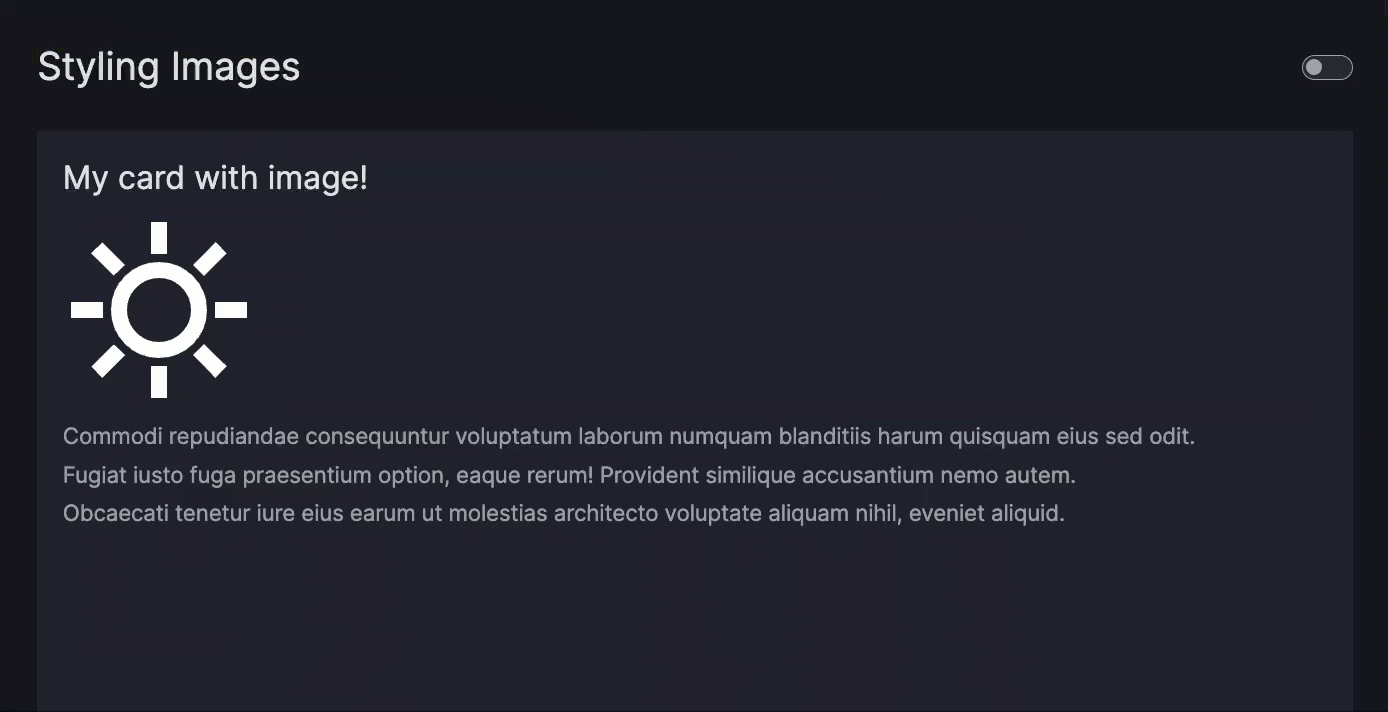
Style a card image
To change the size or position of the image, add a URL hash to your image like this:

Note the added URL hash #my-image. Now create a CSS file placed in your assets folder
and give an attribute selector to select images with that matching URL hash.
Card with styled image
import vizro.models as vm
from vizro import Vizro
page = vm.Page(
title="Styling Images",
components=[
vm.Card(
text="""
### My card with image!

Commodi repudiandae consequuntur voluptatum laborum numquam blanditiis harum quisquam eius sed odit.
Fugiat iusto fuga praesentium option, eaque rerum! Provident similique accusantium nemo autem.
Obcaecati tenetur iure eius earum ut molestias architecto voluptate aliquam nihil, eveniet aliquid.
""",
),
],
)
dashboard = vm.Dashboard(pages=[page])
Vizro().build(dashboard).run()
# Still requires a .py to add data to the data manager and parse YAML configuration
# See from_yaml example
pages:
- components:
- text: |

Commodi repudiandae consequuntur voluptatum laborum numquam blanditiis harum quisquam eius sed odit.
Fugiat iusto fuga praesentium option, eaque rerum! Provident similique accusantium nemo autem.
Obcaecati tenetur iure eius earum ut molestias architecto voluptate aliquam nihil, eveniet aliquid.
title: My card with image!
type: card
title: Styling Images
Tip
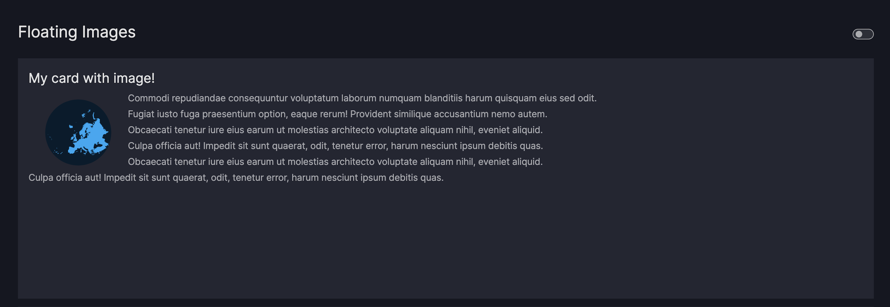
Use the following pre-defined URL hashes in your image path to have the image float next to the text:
- floating-left:
 - floating-right:
 - floating-center:

Card with floating image
import vizro.models as vm
from vizro import Vizro
page = vm.Page(
title="Floating Images",
components=[
vm.Card(
text="""
### My card with image!

Commodi repudiandae consequuntur voluptatum laborum numquam blanditiis harum quisquam eius sed odit.
Fugiat iusto fuga praesentium option, eaque rerum! Provident similique accusantium nemo autem.
Obcaecati tenetur iure eius earum ut molestias architecto voluptate aliquam nihil, eveniet aliquid.
Culpa officia aut! Impedit sit sunt quaerat, odit, tenetur error, harum nesciunt ipsum debitis quas.
Obcaecati tenetur iure eius earum ut molestias architecto voluptate aliquam nihil, eveniet aliquid.
Culpa officia aut! Impedit sit sunt quaerat, odit, tenetur error, harum nesciunt ipsum debitis quas.
""",
),
],
)
dashboard = vm.Dashboard(pages=[page])
Vizro().build(dashboard).run()
# Still requires a .py to add data to the data manager and parse YAML configuration
# See from_yaml example
pages:
- components:
- text: |

Commodi repudiandae consequuntur voluptatum laborum numquam blanditiis harum quisquam eius sed odit.
Fugiat iusto fuga praesentium option, eaque rerum! Provident similique accusantium nemo autem.
Obcaecati tenetur iure eius earum ut molestias architecto voluptate aliquam nihil, eveniet aliquid.
Culpa officia aut! Impedit sit sunt quaerat, odit, tenetur error, harum nesciunt ipsum debitis quas.
Obcaecati tenetur iure eius earum ut molestias architecto voluptate aliquam nihil, eveniet aliquid.
Culpa officia aut! Impedit sit sunt quaerat, odit, tenetur error, harum nesciunt ipsum debitis quas.
title: My card with image!
type: card
title: Floating Images
Create a navigation card
Note
This section describes how to use the Card component to create a navigation
card. To configure the navigation panel on the left hand side of the screen, refer to the
guide on navigation.
A navigation card enables you to navigate to a different page via a click on the card area. To create a navigation card, do the following:
- Insert the
Cardinto thecomponentsargument of thePage - Pass your markdown text to the
Card.text - Pass a relative or absolute URL to the
Card.href
Navigation Card
import vizro.models as vm
import vizro.plotly.express as px
from vizro import Vizro
iris = px.data.iris()
page_1 = vm.Page(
title="Homepage",
components=[
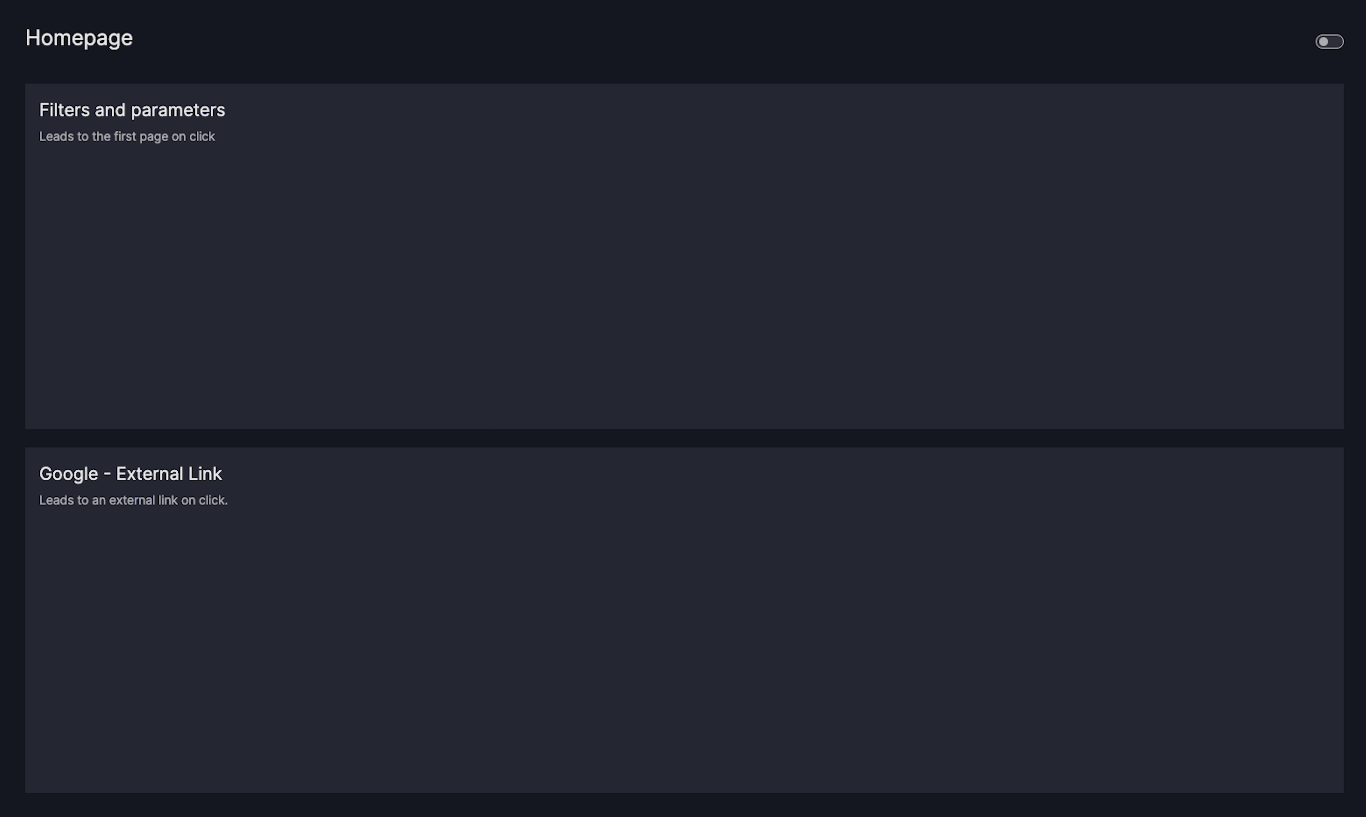
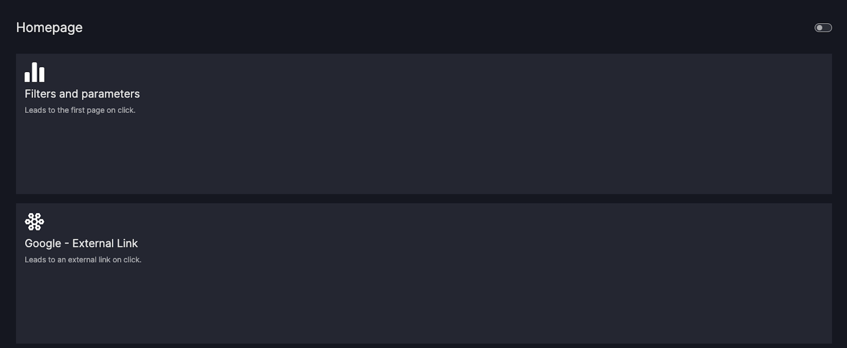
vm.Card(
text="""
### Filters and parameters
Leads to the first page on click.
""",
href="/filters-and-parameters",
),
vm.Card(
text="""
### Google - External Link
Leads to an external link on click.
""",
href="https://google.com",
),
],
)
page_2 = vm.Page(
title="Filters and parameters",
components=[
vm.Graph(id="scatter", figure=px.scatter(iris, x="sepal_length", y="petal_width", color="sepal_width")),
],
)
dashboard = vm.Dashboard(pages=[page_1, page_2])
Vizro().build(dashboard).run()
# Still requires a .py to add data to the data manager and parse YAML configuration
# See from_yaml example
pages:
- components:
    - text: |
        ### Filters and parameters

        Leads to the first page on click
      href: /filters-and-parameters
      type: card
    - text: |
        ### Google - External Link

        Leads to an external link on click.
      href: https://google.com
      type: card
  title: Homepage
- components:
    - figure:
        _target_: scatter
        color: sepal_width
        data_frame: iris
        x: sepal_length
        y: petal_width
      id: scatter
      type: graph
  title: Filters and parameters
If you now click on the card area, you should automatically be redirected to the relevant href.
Note
When using the Card, keep the following considerations in mind:
Add an icon
If you want to add an icon to your card, add your image as described in the earlier section
If you use the image URL hash icon-top, the image will be styled according to our default icon styling.
Navigation Card with Icon
import vizro.models as vm
import vizro.plotly.express as px
from vizro import Vizro
iris = px.data.iris()
page_1 = vm.Page(
title="Homepage",
components=[
vm.Card(
text="""

### Filters and parameters
Leads to the first page on click.
""",
href="/filters-and-parameters",
),
vm.Card(
text="""

### Google - External Link
Leads to an external link on click.
""",
href="https://google.com",
),
],
)
page_2 = vm.Page(
title="Filters and parameters",
components=[
vm.Graph(id="scatter", figure=px.scatter(iris, x="sepal_length", y="petal_width", color="sepal_width")),
],
)
dashboard = vm.Dashboard(pages=[page_1, page_2])
Vizro().build(dashboard).run()
# Still requires a .py to add data to the data manager and parse YAML configuration
# See from_yaml example
pages:
- components:
- text: |

### Filters and parameters
Leads to the first page on click
href: /filters-and-parameters
type: card
- text: |

### Google - External Link
Leads to an external link on click.
href: https://google.com
type: card
title: Homepage
- components:
- figure:
_target_: scatter
color: sepal_width
data_frame: iris
x: sepal_length
y: petal_width
id: scatter
type: graph
title: Filters and parameters
Note that in the above example the first Card navigates to an existing Page
in the app with path = filters-and-parameters and the second one to an external link.
Add an icon responsive to theme switch
To add an icon that is responsive to the theme switch, you will need to override the value of the filter CSS property.
The filter CSS property lets you add visual effects to elements using different functions. In our example, we're using the --inverse-color CSS variable from the Vizro theme.
It uses the CSS invert() function to flip the color of the icon when you switch themes. Note that this only works if your initial icon has a white fill color. If your icon is not white, you can change its color by adding fill="white" to the SVG code.
Assign the predefined CSS variable --inverse-color to the filter property of your selected icon.
Responsive icon
Buttons
To enhance dashboard interactions, you can use the Button component to trigger any pre-defined
action functions such as exporting chart data. Refer to the user guide on
Actions for currently available options.
To add a Button, insert it into the components argument of the
Page.
You can configure the text argument to alter the display text of the Button and the
actions argument to define which action function should be executed on button click.
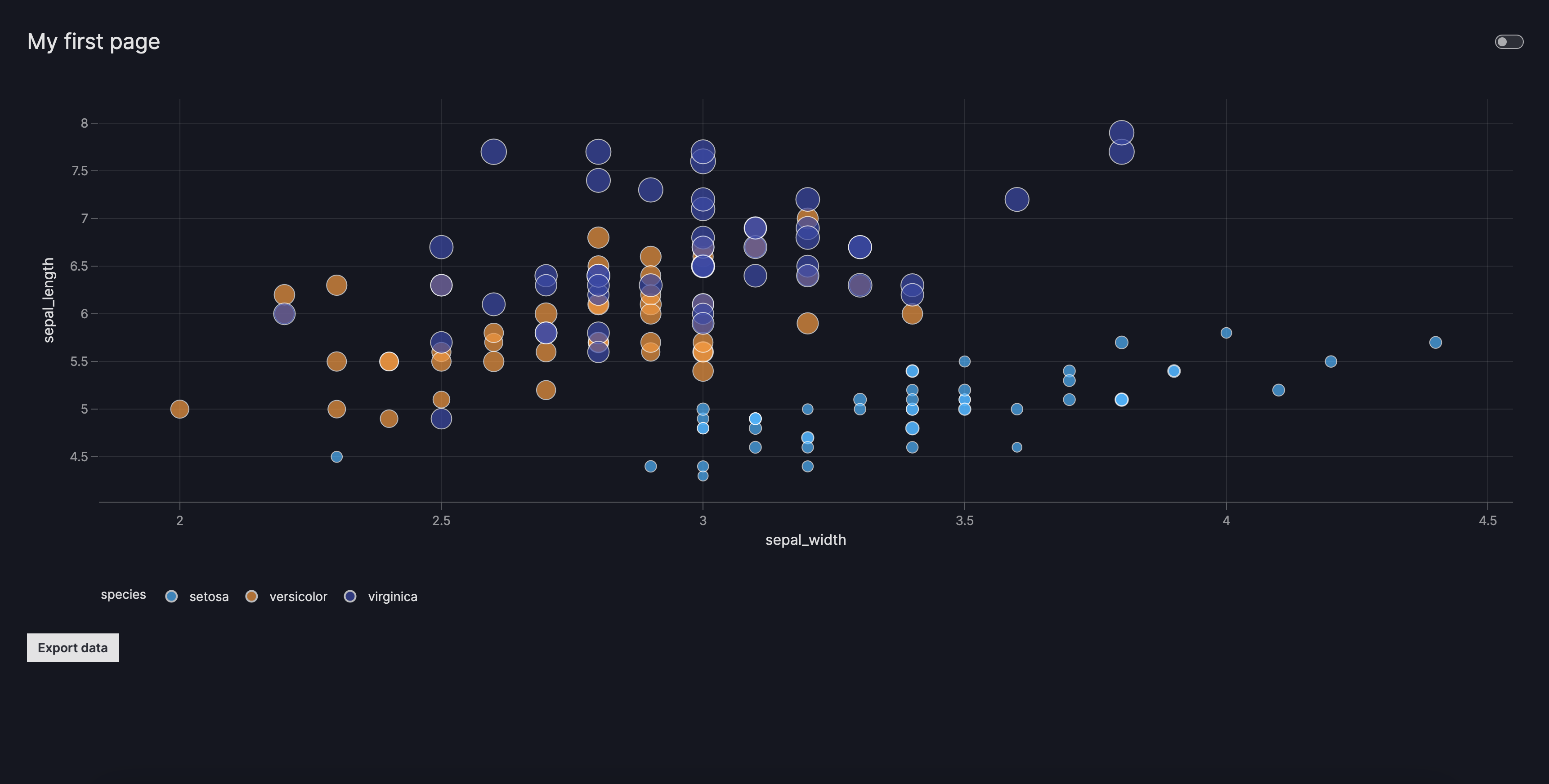
In the below example we show how to configure a button to export the filtered data of a target chart using export_data, a pre-defined action function.
Button
import vizro.models as vm
import vizro.plotly.express as px
from vizro import Vizro
from vizro.actions import export_data

df = px.data.iris()

page = vm.Page(
    title="My first page",
    layout=vm.Layout(grid=[[0], [0], [0], [0], [1]]),
    components=[
        vm.Graph(
            id="scatter_chart",
            figure=px.scatter(
                df,
                x="sepal_width",
                y="sepal_length",
                color="species",
                size="petal_length",
            ),
        ),
        vm.Button(
            text="Export data",
            actions=[vm.Action(function=export_data(targets=["scatter_chart"]))],
        ),
    ],
    controls=[vm.Filter(column="species", selector=vm.Dropdown(title="Species"))],
)

dashboard = vm.Dashboard(pages=[page])

Vizro().build(dashboard).run()
# Still requires a .py to add data to the data manager and parse YAML configuration
# See from_yaml example
pages:
  - components:
    - figure:
        _target_: scatter
        x: sepal_width
        y: sepal_length
        color: species
        size: petal_length
        data_frame: iris
      id: scatter_chart
      type: graph
    - type: button
      text: Export data
      id: export_data
      actions:
        - function:
            _target_: export_data
            targets:
              - scatter_chart
    controls:
      - column: species
        selector:
          title: Species
          type: dropdown
        type: filter
    layout:
      grid:
        - [0]
        - [0]
        - [0]
        - [0]
        - [1]
    title: My first page
The Button component is currently reserved to be used inside the main panel (right-side) of the dashboard.
However, there might be use cases where one would like to place the Button inside the control panel (left-side) with the other controls.
In this case, follow the user-guide outlined for custom components and manually add the Button as a valid type to the controls argument by running the following lines before your dashboard configurations: