How to change the layout of your page
The Page and Container models accept a layout argument that enables custom arrangement of charts and components on the screen. This guide shows how to customize the layout with:
- a grid layout using the
Gridmodel (the default if nolayoutis specified) - a flexible box layout using the
Flexmodel
Note
The Grid model used to be called Layout, and the name Layout will no longer exist in Vizro 0.2.0. See our full list of deprecations and breaking changes.
Layout options: Grid and Flex
The layout argument enables you to choose between two layout models: Grid (default) and Flex. These models provide different ways to arrange components on the page.
- Grid layout: The
Gridlayout arranges components in a structured grid where rows and columns are explicitly defined. This layout is ideal for precise control over the placement of components. - Flex layout: The
Flexlayout arranges components using a flexible box model, where items can grow, shrink, and wrap dynamically based on available space. This layout is ideal for responsive designs where components need to adapt to different screen sizes.
The default layout
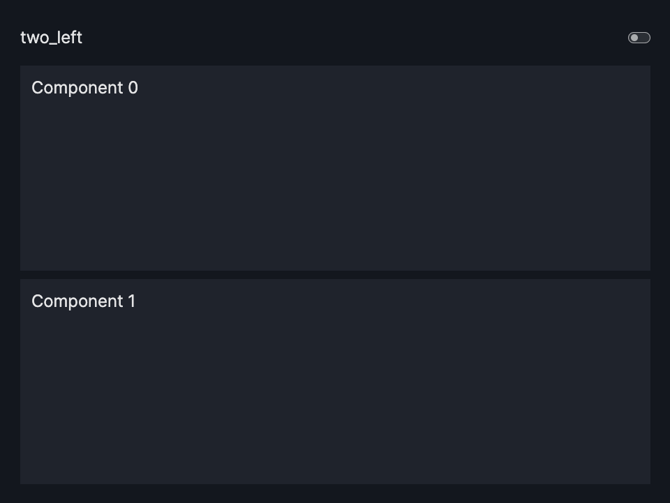
The layout argument of a Page model is optional. If no layout is specified, it will default to a grid layout - all charts/components are then automatically stacked vertically on the page in one column.
from vizro import Vizro
import vizro.models as vm

page = vm.Page(
    title="two_left",
    components=[vm.Card(text="""# Component 0"""),
                vm.Card(text="""# Component 1""")]

)

dashboard = vm.Dashboard(pages=[page])
Vizro().build(dashboard).run()
 Run and edit this code in Py.Cafe
Grid Layout
Configure the grid
To customize the grid arrangement, configure the grid parameter of the Grid model.
The example below shows an example of a valid grid:
- The
gridmust be provided aslist[list[int]](for example,grid = [[0, 1], [0, 2]]). - The integers in the
gridmust be consecutive integers starting with 0 (for example,0,1,2).- The integers correspond to the index of the chart/component inside the list of
componentsprovided toPage. - The number of integers in the
gridneeds to match the number of chart/components provided.
- The integers correspond to the index of the chart/component inside the list of
- Each sub-list corresponds to a grid row (in the example above, row 1 =
[0, 1]and row 2 =[0, 2]) - Each element inside the sub-list corresponds to a grid column (for example, column 1 =
[0, 0]and column 2 =[1, 2]) - Each chart/component will take the entire space of its grid area but you can use empty sections for extra separation.
- The area spanned by a chart/component in the grid must be rectangular.
- The grid can be arbitrarily large, allowing arbitrarily granular control of the grid.
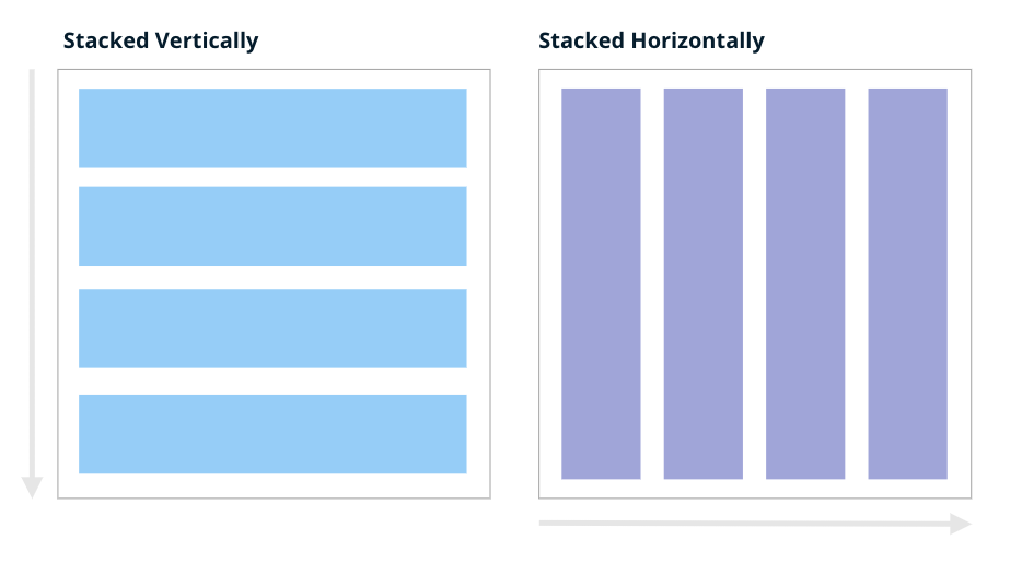
Understand stacking direction
As described above, when no layout is specified, components are presented vertically as a single-column stack using the Grid model. If you have three components, the default grid will be as follows, with three equally sized rows, each containing a component spanning the entire width:
To present components horizontally in one row:
This defines a single row that occupies the entire width and height, divided into three equal columns.
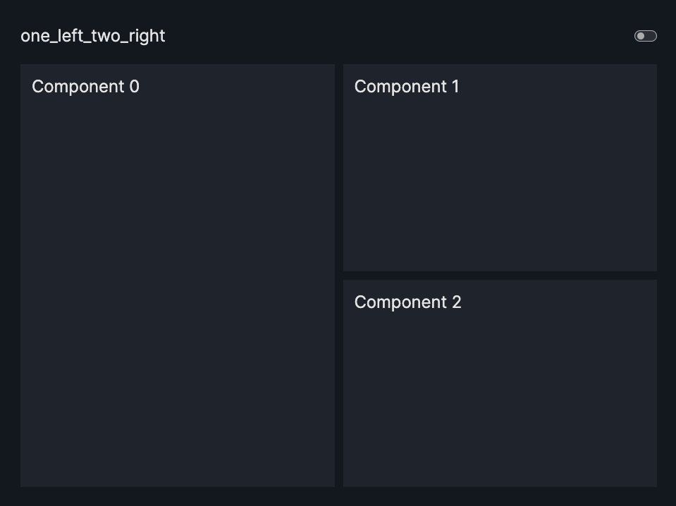
Grid - basic example
Grid Arrangement - Basic Example
import vizro.models as vm
from vizro import Vizro

page = vm.Page(
    title="one_left_two_right",
    layout=vm.Grid(grid=[[0, 1],
                         [0, 2]]),
    components=[vm.Card(text="""# Component 0"""),
                vm.Card(text="""# Component 1"""),
                vm.Card(text="""# Component 2"""),
                ],
)

dashboard = vm.Dashboard(pages=[page])
Vizro().build(dashboard).run()
Run and edit this code in Py.Cafe
# Still requires a .py to add data to the data manager and parse YAML configuration
# See yaml_version example
pages:
  - components:
      - text: |
          # Component 0
        type: card
      - text: |
          # Component 1
        type: card
      - text: |
          # Component 2
        type: card
    layout:
      grid: [[0, 1], [0, 2]]
      type: grid
    title: one_left_two_right
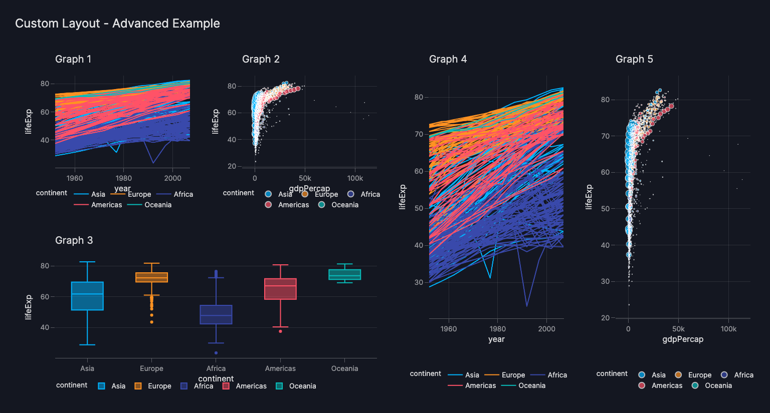
Grid - advanced example
If you need to divide the grid into subgrids for finer control or want to visually distinguish your subgrids, you can use Containers. See our section on when to use Containers vs. Page.layout for more information.
The Grid provides full control over the arrangement of top-level components within a page, allowing arbitrarily granular control of the grid by creating larger grids.
Grid Arrangement - Advanced Example
import vizro.models as vm
import vizro.plotly.express as px
from vizro import Vizro

gapminder = px.data.gapminder()

page = vm.Page(
    title="Custom Grid - Advanced Example",
    layout=vm.Grid(grid=[[0, 1, 3, 4],
                         [2, 2, 3, 4]]),
    components=[
        vm.Graph(
            figure=px.line(
                gapminder,
                title="Graph 1",
                x="year",
                y="lifeExp",
                color="continent",
            ),
        ),
        vm.Graph(
            figure=px.scatter(
                gapminder,
                title="Graph 2",
                x="gdpPercap",
                y="lifeExp",
                size="pop",
                color="continent",
            ),
        ),
        vm.Graph(
            figure=px.box(
                gapminder,
                title="Graph 3",
                x="continent",
                y="lifeExp",
                color="continent",
            ),
        ),
        vm.Graph(
            figure=px.line(
                gapminder,
                title="Graph 4",
                x="year",
                y="lifeExp",
                color="continent",
            ),
        ),
        vm.Graph(
            figure=px.scatter(
                gapminder,
                title="Graph 5",
                x="gdpPercap",
                y="lifeExp",
                size="pop",
                color="continent",
            ),
        ),
    ],
)

dashboard = vm.Dashboard(pages=[page])
Vizro().build(dashboard).run()
Run and edit this code in Py.Cafe
# Still requires a .py to add data to the data manager and parse YAML configuration
# See yaml_version example
pages:
  - components:
      - figure:
          _target_: line
          data_frame: gapminder
          x: year
          y: lifeExp
          color: continent
          title: Graph 1
        type: graph
      - figure:
          _target_: scatter
          data_frame: gapminder
          x: gdpPercap
          y: lifeExp
          size: pop
          color: continent
          title: Graph 2
        type: graph
      - figure:
          _target_: box
          data_frame: gapminder
          x: continent
          y: lifeExp
          color: continent
          title: Graph 3
        type: graph
      - figure:
          _target_: line
          data_frame: gapminder
          x: year
          y: lifeExp
          color: continent
          title: Graph 4
        type: graph
      - figure:
          _target_: scatter
          data_frame: gapminder
          x: gdpPercap
          y: lifeExp
          size: pop
          color: continent
          title: Graph 5
        type: graph
    layout:
      grid: [[0, 1, 3, 4], [2, 2, 3, 4]]
      type: grid
    title: Custom Grid - Advanced Example
Cheatsheet - grid examples
Here is a reference table of example layouts:
one row with one component, second row with two components stacked horizontally
| Grid needed | Grid | Code |
|---|---|---|
 |
![layout=vm.Grid(grid=[[0]])](../../../assets/user_guides/layout/1l_grid.png) |
layout=vm.Grid(grid=[[0]]) |
 |
 |
layout=vm.Grid(grid=[[0],[1]]) |
 |
![layout=vm.Grid(grid=[[0],[1]])](../../../assets/user_guides/layout/2t_grid.png) |
layout=vm.Grid(grid=[[0,1]]) |
 |
![layout=vm.Grid(grid=[[0],[1],[2]]](../../../assets/user_guides/layout/3l_grid.png) |
layout=vm.Grid(grid=[[0],[1],[2]]) or layout=None |
 |
![layout=vm.Grid(grid=[[0,1],[0,2]])](../../../assets/user_guides/layout/1l_2r_grid.png) |
layout=vm.Grid(grid=[[0,1],[0,2]]) |
 |
![layout=vm.Grid(grid=[[0,0],[1,2]])](../../../assets/user_guides/layout/1t_2b_grid.png) |
layout=vm.Grid(grid=[[0,0],[1,2]]) |
 |
![layout=vm.Grid(grid=[[0,1],[2,2]])](../../../assets/user_guides/layout/2t_1b_grid.png) |
layout=vm.Grid(grid=[[0,1],[2,2]]) |
 |
![layout=vm.Grid(grid=[[0,1],[0,2],[0,3]])](../../../assets/user_guides/layout/1l_3r_grid.png) |
layout=vm.Grid(grid=[[0,1],[0,2],[0,3]]) |
 |
![layout=vm.Grid(grid=[[0,1],[2,3]])](../../../assets/user_guides/layout/2t_2b_grid.png) |
layout=vm.Grid(grid=[[0,1],[2,3]]) |
 |
![layout=vm.Grid(grid=[[0,3],[1,3],[2,3]])](../../../assets/user_guides/layout/3l_1r_grid.png) |
layout=vm.Grid(grid=[[0,3],[1,3],[2,3]]) |
 |
![layout=vm.Grid(grid=[[0,0,0],[1,2,3]])](../../../assets/user_guides/layout/1t_3b_grid.png) |
layout=vm.Grid(grid=[[0,0,0],[1,2,3]]) |
 |
![layout=vm.Grid(grid=[[0,1,2],[3,3,3]])](../../../assets/user_guides/layout/3t_1b_grid.png) |
layout=vm.Grid(grid=[[0,1,2],[3,3,3]]) |
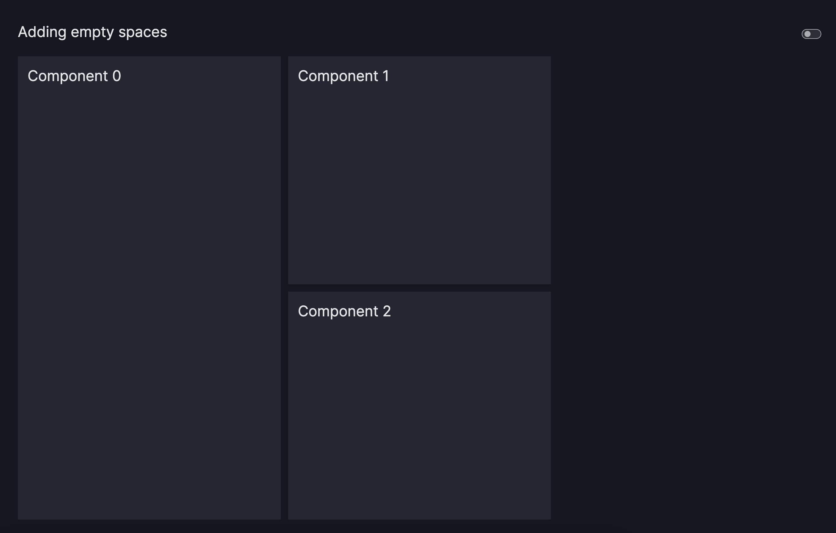
Add empty sections
One approach to organize the dashboard's layout involves integrating empty sections by specifying -1 within the grid layout.
Adding Empty Spaces
import vizro.models as vm
from vizro import Vizro

page = vm.Page(
    title="Adding empty spaces",
    layout=vm.Grid(grid=[[0, 1, -1],
                         [0, 2, -1]]),
    components=[vm.Card(text="""# Component 0"""),
                vm.Card(text="""# Component 1"""),
                vm.Card(text="""# Component 2"""),
                ],
)

dashboard = vm.Dashboard(pages=[page])
Vizro().build(dashboard).run()
Run and edit this code in Py.Cafe
# Still requires a .py to add data to the data manager and parse YAML configuration
# See yaml_version example
pages:
  - components:
      - text: |
          # Component 0
        type: card
      - text: |
          # Component 1
        type: card
      - text: |
          # Component 2
        type: card
    layout:
      grid: [[0, 1, -1], [0, 2, -1]]
      type: grid
    title: Adding empty spaces
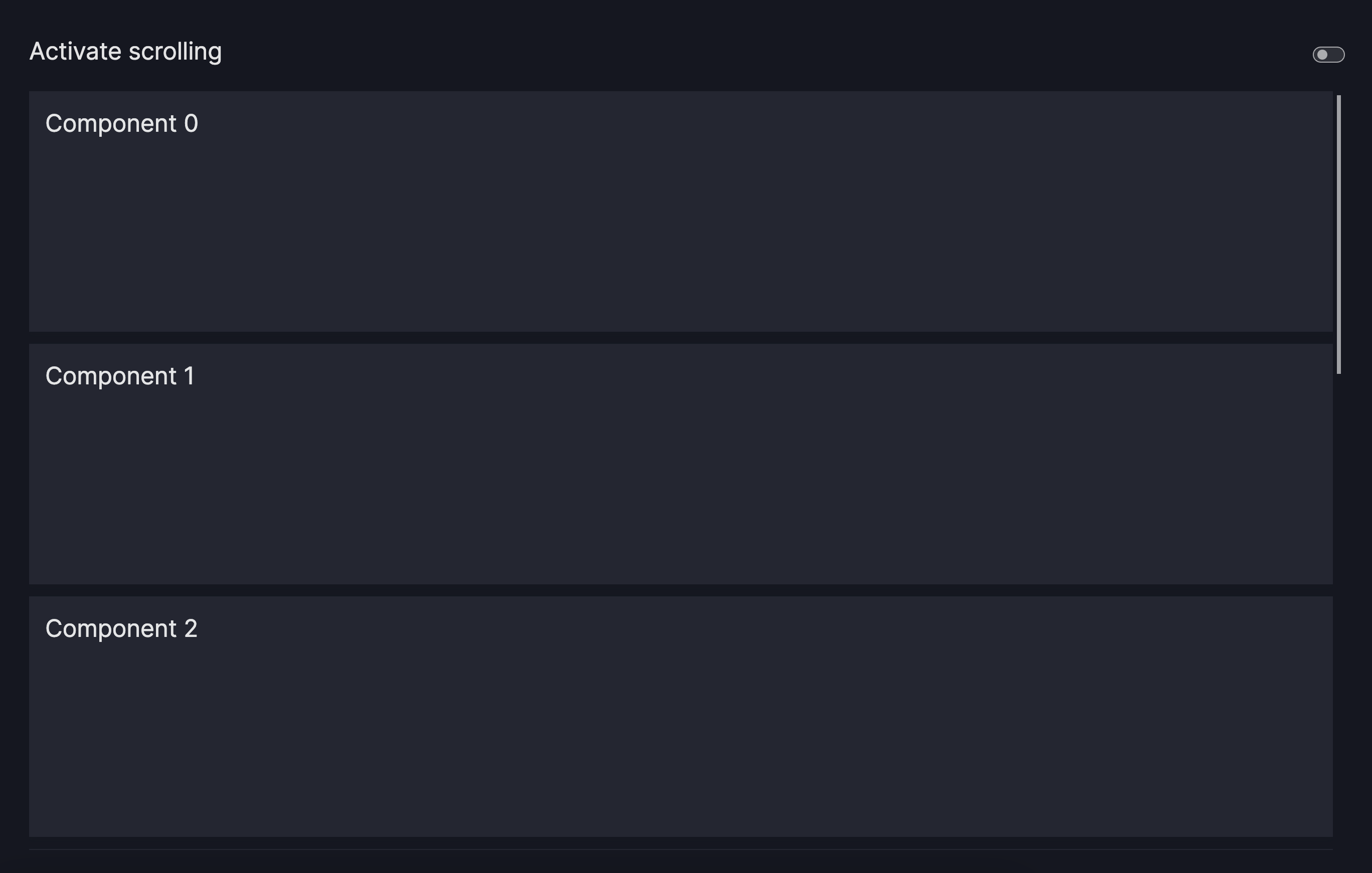
Control the scroll behavior
By default, the grid fits all charts/components on the screen. This can lead to distortions such that the chart/component looks squashed. To control the scroll behavior, you can specify the following:
row_min_height: Sets a chart/component's minimum height. Defaults to 0px.col_min_width: Sets a chart/component's minimum width. Defaults to 0px.
Activate Scrolling
import vizro.models as vm
from vizro import Vizro

page = vm.Page(
    title="Activate scrolling",
    layout=vm.Grid(
        grid=[[i] for i in range(8)],
        row_min_height="240px"
    ),
    components=[vm.Card(text="""# Component 0"""),
                vm.Card(text="""# Component 1"""),
                vm.Card(text="""# Component 2"""),
                vm.Card(text="""# Component 3"""),
                vm.Card(text="""# Component 4"""),
                vm.Card(text="""# Component 5"""),
                vm.Card(text="""# Component 6"""),
                vm.Card(text="""# Component 7"""),
                ],
)

dashboard = vm.Dashboard(pages=[page])
Vizro().build(dashboard).run()
Run and edit this code in Py.Cafe
# Still requires a .py to add data to the data manager and parse YAML configuration
# See yaml_version example
pages:
  - components:
      - text: |
          # Component 0
        type: card
      - text: |
          # Component 1
        type: card
      - text: |
          # Component 2
        type: card
      - text: |
          # Component 2
        type: card
      - text: |
          # Component 4
        type: card
      - text: |
          # Component 5
        type: card
      - text: |
          # Component 6
        type: card
      - text: |
          # Component 7
        type: card
    layout:
      grid: [[0], [1], [2], [3], [4], [5], [6], [7]]
      row_min_height: 240px
      type: grid
    title: Activate scrolling
Further customization
For further customization, such as changing the gap between row and column, refer to the documentation of the Grid model.
Flex Layout
The Flex layout offers a dynamic and flexible way to organize components within a page. Built on the CSS Flexbox (flexible box) concept, it is designed to create responsive layouts that adjust to varying screen sizes and available space.
Unlike the Grid layout, which uses a predefined row-and-column structure, the Flex layout provides greater flexibility by enabling components to resize, align, and position themselves dynamically based on the layout configuration.
If you're new to Flexbox, we strongly recommend exploring An Interactive Guide to Flexbox.
Flex - basic example
To switch to a Flex layout, simply pass vm.Flex() to the layout argument of the Page model. This replaces the default Grid layout with a Flex layout, where components (flex items) are arranged vertically (direction="column"), remain on a single line (wrap=False), and have a default spacing (gap=24px) between them.
Open the PyCafe link below to see how the Flex layout behaves. Unlike the Grid layout, the charts retain their original height and width and won’t be squeezed to fit on one page—a scrollbar appears instead. You can clearly see the difference by removing layout=vm.Flex() in your example or toggling between the two result screenshots below.
Flex - basic example
import vizro.models as vm
from vizro import Vizro
import vizro.plotly.express as px

tips = px.data.tips()

page = vm.Page(
    title="Flex - basic example",
    layout=vm.Flex(),
    components=[vm.Graph(figure=px.violin(tips, y="tip", x="day", color="day")) for i in range(5)],
)

dashboard = vm.Dashboard(pages=[page])
Vizro().build(dashboard).run()
Run and edit this code in Py.Cafe
# Still requires a .py to add data to the data manager and parse YAML configuration
# See yaml_version example
pages:
  - components:
      - figure:
          _target_: violin
          x: day
          y: tip
          color: day
          data_frame: tips
        type: graph
      - figure:
          _target_: violin
          x: day
          y: tip
          color: day
          data_frame: tips
        type: graph
      - figure:
          _target_: violin
          x: day
          y: tip
          color: day
          data_frame: tips
        type: graph
      - figure:
          _target_: violin
          x: day
          y: tip
          color: day
          data_frame: tips
        type: graph
      - figure:
          _target_: violin
          x: day
          y: tip
          color: day
          data_frame: tips
        type: graph
    layout:
      type: flex
    title: Flex - basic example


Flex - advanced example
If you want to customize the default behavior, the Flex model enables you to configure three optional arguments:
direction: Defines the layout direction of the components within the flex container, determining whether they are arranged in rows or columns.gap: Controls the spacing between components in the flex container, enabling you to set consistent horizontal and vertical spacing between items.wrap: Determines whether components should wrap onto multiple lines or remain on a single line when there isn't enough space in the container.
In this example, there isn’t enough space to fit all three graphs in a single row while preserving their original height and width. Since wrap=True, the layout automatically wraps the graphs onto a new row. If wrap=False, a horizontal scrollbar would appear instead. We've also set direction="row" and gap="40px", so the items are laid out in a horizontal row with 40px spacing between them.
Flex - advanced example
import vizro.models as vm
from vizro import Vizro
import vizro.plotly.express as px

tips = px.data.tips()

page = vm.Page(
    title="Flex - advanced example",
    layout=vm.Flex(direction="row", gap="40px", wrap=True),
    components=[vm.Graph(figure=px.violin(tips, y="tip", x="day", color="day")) for i in range(3)],
)

dashboard = vm.Dashboard(pages=[page])
Vizro().build(dashboard).run()
Run and edit this code in Py.Cafe
# Still requires a .py to add data to the data manager and parse YAML configuration
# See yaml_version example
pages:
  - components:
      - figure:
          _target_: violin
          x: day
          y: tip
          color: day
          data_frame: tips
        type: graph
      - figure:
          _target_: violin
          x: day
          y: tip
          color: day
          data_frame: tips
        type: graph
      - figure:
          _target_: violin
          x: day
          y: tip
          color: day
          data_frame: tips
        type: graph
    layout:
      type: flex
      direction: row
      gap: 40px
      wrap: true
    title: Flex - advanced example

Align and position flex items
For more advanced control over the flex layout behavior, use the extra argument to pass additional properties to the underlying dmc.Flex component. This is particularly useful for controlling how flex items are aligned and positioned.
Common properties you can pass through extra include:
justify: Controls how flex items are positioned along the main axis given bydirection, for example"flex-start","center","space-between"align: Controls how flex items are positioned perpendicular to the main axis given bydirection, for example"flex-start","center","flex-end","stretch"
Flex with justify and align
import vizro.models as vm
from vizro import Vizro

page = vm.Page(
    title="Flex with custom alignment",
    layout=vm.Flex(direction="row", wrap=True, extra={"justify": "space-between", "align": "stretch"}),
    components=[
        vm.Card(text="Card 1", extra={"style": {"width": "200px"}}),
        vm.Card(text="Card 2", extra={"style": {"width": "200px"}}),
        vm.Card(text="Card 3", extra={"style": {"width": "200px"}}),
    ],
)

dashboard = vm.Dashboard(pages=[page])
Vizro().build(dashboard).run()
Run and edit this code in Py.Cafe
# Still requires a .py to add data to the data manager and parse YAML configuration
# See yaml_version example
pages:
  - title: Flex with custom alignment
    layout:
      type: flex
      direction: row
      wrap: true
      extra:
        justify: space-between
        align: stretch
    components:
      - type: card
        text: Card 1
        extra:
          style:
            width: 200px
      - type: card
        text: Card 2
        extra:
          style:
            width: 200px
      - type: card
        text: Card 3
        extra:
          style:
            width: 200px
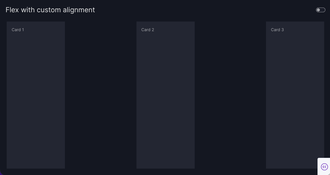
The cards are distributed with equal space between them (justify="space-between") and are stretched to fill the container height (align="stretch").
Change the size of flex items
There may be times when resizing your flex items is necessary, such as when designing for different screen sizes or combining elements with diverse content types (for example, charts, text, or images).
You can achieve this by:
Change size via arguments
The syntax for setting width and height varies between components. Refer to the component's documentation for the correct syntax and usage, such as:
Graph: See the documentation on Plotly - Adjust Graph Size in Python. For example,vm.Graph(figure=px.violin(..., width=300)).AgGrid: See the documentation on Dash - Change Grid Size. For example,vm.AgGrid(figure=dash_ag_grid(tips, style={"width": 1000})).DataTable: See the documentation on Dash - Setting Table Height. For example,vm.Table(figure=dash_data_table(tips, style_table={"width": "1000px"})).Card: See our documentation on Card - The extra argument. For example,vm.Card(..., extra={"style": {"height": "200px"}}).
We will reuse the example from the previous section, but this time we set width=400 within the Plotly function to control the graph width. This changes how many graphs can fit on a single row, as reducing the width allows more graphs to fit before wrapping to the next line. To see the difference in results, compare the screenshots from this section with those in the previous one.
Change the width for Graph
import vizro.models as vm
from vizro import Vizro
import vizro.plotly.express as px

tips = px.data.tips()

page = vm.Page(
    title="Change the width for Graph",
    layout=vm.Flex(direction="row", gap="40px", wrap=True),
    components=[vm.Graph(figure=px.violin(tips, y="tip", x="day", color="day", width=400)) for i in range(5)],
)

dashboard = vm.Dashboard(pages=[page])
Vizro().build(dashboard).run()
Run and edit this code in Py.Cafe
# Still requires a .py to add data to the data manager and parse YAML configuration
# See yaml_version example
pages:
  - components:
      - figure:
          _target_: violin
          x: day
          y: tip
          color: day
          data_frame: tips
          width: 400
        type: graph
      - figure:
          _target_: violin
          x: day
          y: tip
          color: day
          data_frame: tips
          width: 400
        type: graph
      - figure:
          _target_: violin
          x: day
          y: tip
          color: day
          data_frame: tips
          width: 400
        type: graph
      - figure:
          _target_: violin
          x: day
          y: tip
          color: day
          data_frame: tips
          width: 400
        type: graph
      - figure:
          _target_: violin
          x: day
          y: tip
          color: day
          data_frame: tips
          width: 400
        type: graph
    layout:
      type: flex
      direction: row
      gap: 40px
      wrap: true
    title: Change the width for Graph

Change size via CSS
Custom CSS is often a preferred choice over using component arguments for setting sizes when you need to apply a consistent height and/or width across multiple elements, as it doesn't require repeating code. This is especially helpful for ensuring uniform sizing of all flex items.
Each item within the Flex layout is wrapped in a <div class="flex-item">, which can be targeted with CSS. To learn how to identify the correct selectors, refer to our user guide on custom CSS.
Change the width of all flex items with CSS
import vizro.models as vm
from vizro import Vizro

page = vm.Page(
    id="page-with-uniform-flex-items",
    title="Change the width via CSS",
    layout=vm.Flex(direction="row", wrap=True),
    components=[
        vm.Card(
            text="""
               # Lorem Ipsum

               Lorem ipsum dolor sit amet, consectetur adipiscing elit. Aliquam sed elementum ligula.
               In ultricies est ac mauris vehicula fermentum. Curabitur faucibus elementum lectus.
               Name ut ipsum tortor. Praesent ut nulla risus. Praesent in dignissim nulla.
           """
        )
        for i in range(12)
    ],
)

dashboard = vm.Dashboard(pages=[page])

Combine Flex and Grid
You can also combine the Flex and Grid layout to benefit from both. The Grid layout is ideal for defining the overall page structure, while the Flex layout enables flexibility within individual sections.
For example, in the layout below, we use the Grid layout to arrange two charts at the top and a Container at the bottom with multiple cards. Within the Container, we apply the Flex layout so that the cards automatically adjust their positioning based on the available space. If you have not worked with a Container before, refer to our user guide on how to use Container.
Grid with Flex container
import vizro.models as vm
import vizro.plotly.express as px
from vizro import Vizro

tips = px.data.tips()

page = vm.Page(
    title="Combine Flex and Grid",
    layout=vm.Grid(grid=[[0, 1], [2, 2]]),
    components=[
        vm.Graph(figure=px.violin(tips, y="tip", x="day", color="day", box=True)),
        vm.Graph(figure=px.histogram(tips, x="total_bill")),
        vm.Container(
            title="Flexbox with Cards",
            layout=vm.Flex(direction="row", wrap=True),
            components=[
                vm.Card(
                    text="""
                            # Lorem Ipsum

                            Lorem ipsum dolor sit amet, consectetur adipiscing elit. Aliquam sed elementum ligula, in pharetra velit.
                            In ultricies est ac mauris vehicula fermentum. Curabitur faucibus elementum lectus, vitae luctus libero fermentum.
                            Name ut ipsum tortor. Praesent ut nulla risus. Praesent in dignissim nulla. In quis blandit ipsum.
                        """,
                    extra={"style": {"width": "240px"}},
                )
                for i in range(6)
            ],
        ),
    ],
)

dashboard = vm.Dashboard(pages=[page])
Vizro().build(dashboard).run()
Run and edit this code in Py.Cafe

Alternative layout approaches
In general, any arbitrarily granular layout can already be achieved using either the Grid (default) and/or the Flex model and is our recommended approach if you want to arrange components on a page with consistent row and column spacing.
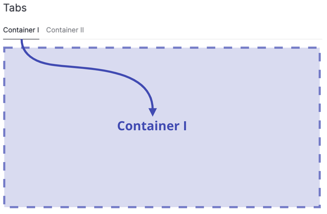
Alternative layout approaches: Tabs and Containers
Tabs and Containers provide alternative methods for customizing your page layout. For instance, if you need more granular control, want to break the overall page grid into subgrids, or wish to visually distinguish your subgrid, you may want to use one of these components.