How to use tables
This guide shows you how to visualize tables in Vizro.
There are two ways to visualize tables in Vizro, using either AG Grid or Dash DataTable. In general, AG Grid is Vizro's recommended table implementation, but sometimes it may make sense to use the Dash DataTable instead.
Choose between AG Grid and Dash DataTable
Vizro offers two models - the AgGrid model and the Table model - for the above two approaches respectively. They both visualize tabular data in similar ways.
The main difference between the two is that the AgGrid model is based on Plotly's Dash AG Grid component, while the Table model is based on the Dash DataTable component.
Both approaches have similar base features, and are configurable in similar ways. However, the AG Grid offers more advanced features out-of-the-box, is more customizable and also ships a powerful enterprise version. This is why it is Vizro's recommended table implementation. At the same time, the Dash DataTable can be used if developers are already familiar with it, or if some custom functionality is easier to implement using the Dash DataTable.
AG Grid
AG Grid is an interactive table/grid component designed for viewing, editing, and exploring large datasets. It is Vizro's recommended table implementation.
The Vizro AgGrid model is based on the Dash AG Grid, which is in turn based the original Javascript implementation.
More examples of AG Grid
If you would like to see more examples on what can be done with AG Grid, head to the Dash AG Grid documentation. Almost anything you see there is possible in Vizro by creating a custom AG Grid callable.
Basic usage
To add a AgGrid to your page, do the following:
- Insert the
AgGridmodel into thecomponentsargument of thePagemodel. - Enter the
dash_ag_gridfunction under thefigureargument (imported viafrom vizro.tables import dash_ag_grid).
The Vizro version of this AG Grid differs in one way from the original Dash AG Grid: it requires the user to pass a pandas DataFrame as the source of data. As explained in our guide to using data in Vizro, this must be entered under the argument data_frame. Most other parameters of the Dash AG Grid can be entered as keyword arguments. Note that some defaults are set for some arguments (for example, for columnDefs) to help with styling and usability. Sometimes a parameter may not work because it requires a callback to function. In that case you can try creating a custom AG Grid callable.
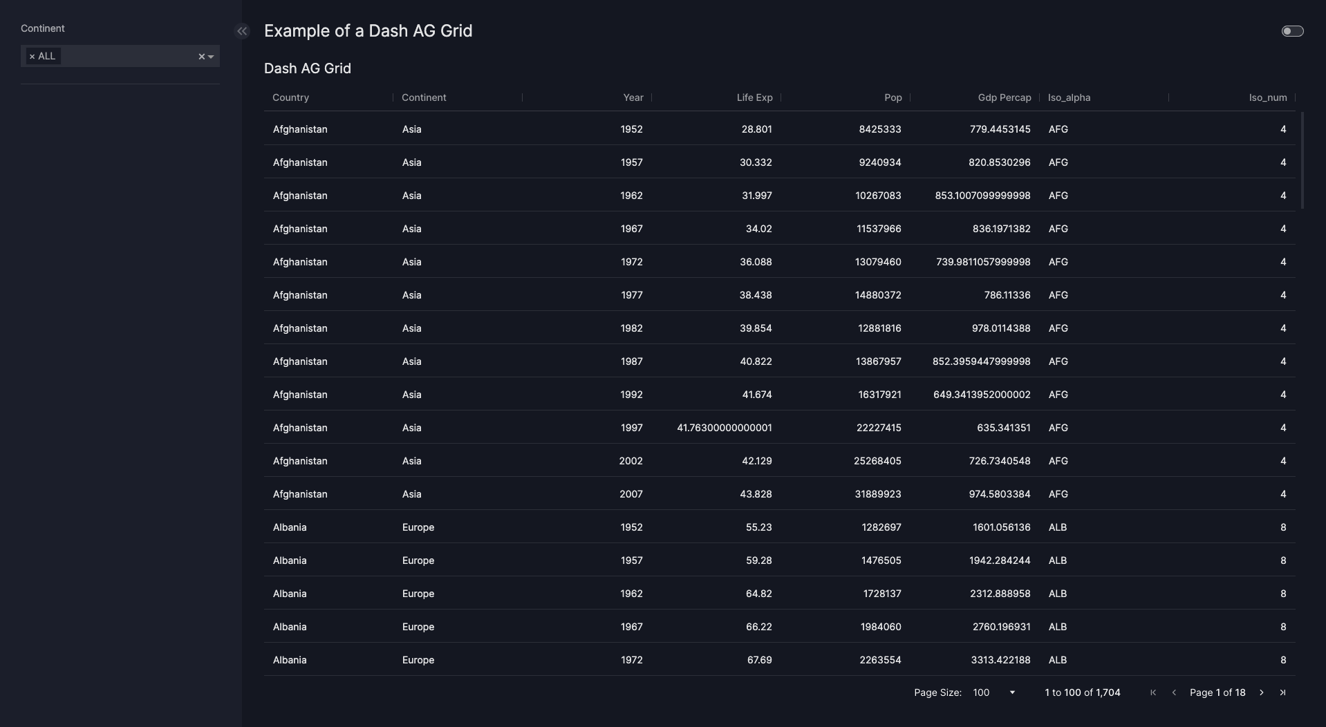
Basic Dash AG Grid
import vizro.models as vm
import vizro.plotly.express as px
from vizro import Vizro
from vizro.tables import dash_ag_grid

df = px.data.gapminder()

page = vm.Page(
    title="Default Dash AG Grid",
    components=[vm.AgGrid(figure=dash_ag_grid(data_frame=df))]
)

dashboard = vm.Dashboard(pages=[page])
Vizro().build(dashboard).run()
![]() Run and edit this code in Py.Cafe
Run and edit this code in Py.Cafe
Interact with other graphs and tables
An AG Grid can act as a source for interactions with other components, for example to cross-filter another graph or table when the user clicks on a point.
Disable pagination
By default, pagination is enabled in AG Grid to improve performance and usability with large datasets. If you prefer to show all rows in a single scrollable table (for example, to allow users to scroll vertically through all data), you can disable pagination by setting dashGridOptions={"pagination": False}.
Dash AG Grid without pagination
import vizro.models as vm
import vizro.plotly.express as px
from vizro import Vizro
from vizro.tables import dash_ag_grid

df = px.data.gapminder()

page = vm.Page(
    title="Dash AG Grid with pagination",
    components=[vm.AgGrid(figure=dash_ag_grid(data_frame=df, dashGridOptions={"pagination": False}))]
)

dashboard = vm.Dashboard(pages=[page])
Vizro().build(dashboard).run()
![]() Run and edit this code in Py.Cafe
Run and edit this code in Py.Cafe
Formatting columns
Numbers
One of the most common tasks when working with tables is to format the columns so that displayed numbers are more readable. To do this, you can use the native functionality of value formatters or the Vizro custom cell data types as shown below.
The available custom cell types for Vizro are dollar, euro, percent and numeric.
To use these, define your desired <COLUMN> alongside the chosen cellDataType in the columnDefs argument of your dash_ag_grid function:
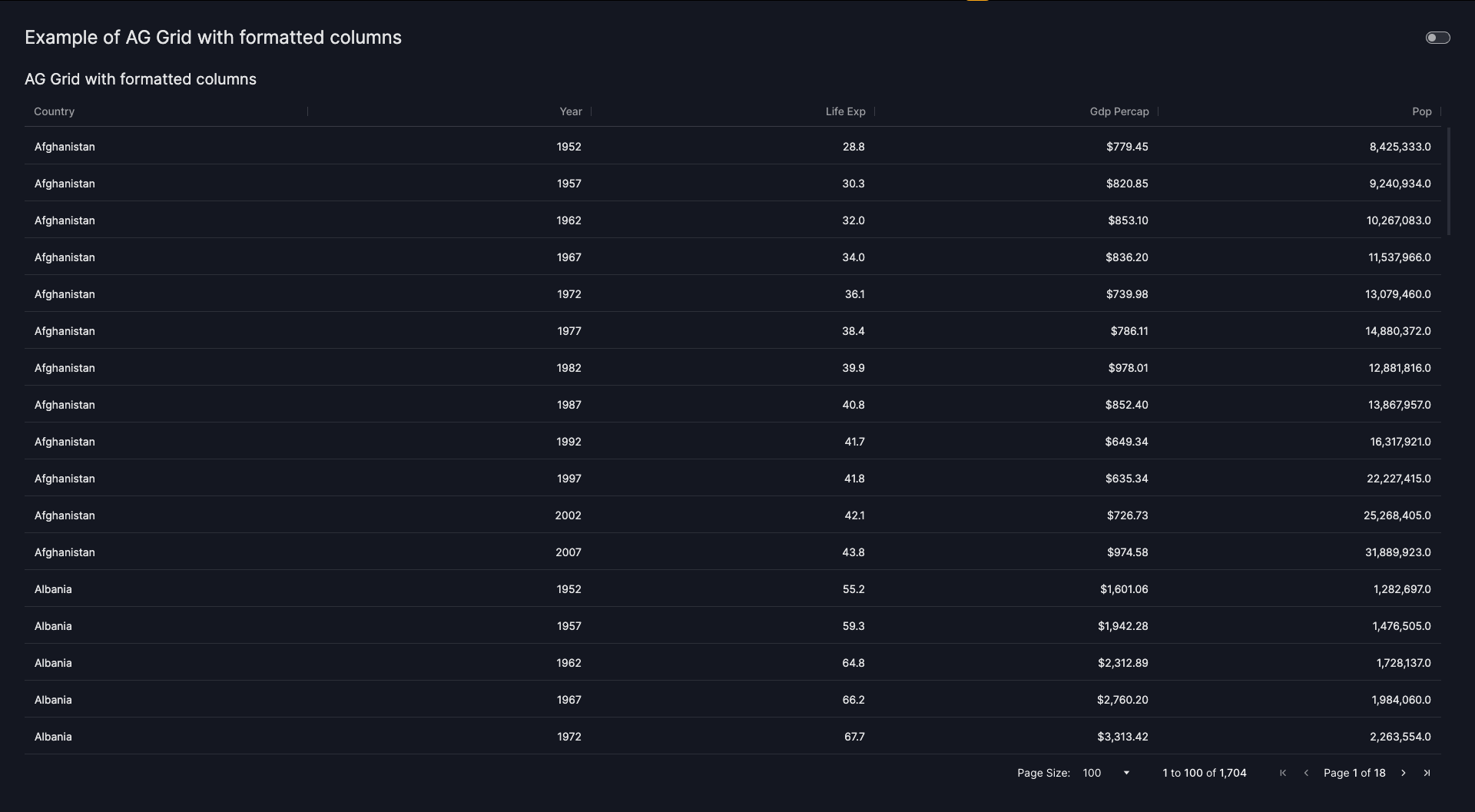
In the example below we select and format some columns of the gapminder data.
AG Grid with formatted columns
import vizro.models as vm
import vizro.plotly.express as px
from vizro import Vizro
from vizro.tables import dash_ag_grid

df = px.data.gapminder()

columnDefs = [{"field": "country"}, {"field": "year"}, {"field": "lifeExp", "cellDataType": "numeric"},
              {"field": "gdpPercap", "cellDataType": "dollar"}, {"field": "pop", "cellDataType": "numeric"}]

page = vm.Page(
    title="Example of AG Grid with formatted columns",
    components=[
        vm.AgGrid(
            title="AG Grid with formatted columns",
            figure=dash_ag_grid(
                data_frame=df,
                columnDefs=columnDefs,
            ),
        )
    ],
)

dashboard = vm.Dashboard(pages=[page])
Vizro().build(dashboard).run()
![]() Run and edit this code in Py.Cafe
Run and edit this code in Py.Cafe
# Still requires a .py to add data to the data manager and parse YAML configuration
# See yaml_version example
pages:
  - components:
      - figure:
          _target_: dash_ag_grid
          data_frame: gapminder
          columnDefs:
            - field: country
            - field: year
            - field: lifeExp
              cellDataType: numeric
            - field: gdpPercap
              cellDataType: dollar
            - field: pop
              cellDataType: numeric
        title: AG Grid with formatted columns
        type: ag_grid
    title: Example of AG Grid with formatted columns
Dates
For the AgGrid model to sort and filter dates correctly, the date must either be of string format yyyy-mm-dd (see Dash AG Grid docs) or a pandas datetime object. Any pandas datetime column will be transformed into the yyyy-mm-dd format automatically.
Objects and strings
No specific formatting is available for custom objects and strings, however you can make use of Value Formatters to format displayed strings automatically.
Resizing columns
The AgGrid provides automatic column sizing options through the columnSize property. This feature allows you to control how columns are sized within the grid to optimize the display of your data.
You can configure column sizing by setting the columnSize parameter in your dash_ag_grid function call. By default, the columnSize is set to responsiveSizeToFit within the vm.AgGrid. The available options are:
-
autoSize: Automatically adjusts column widths to fit their content. This is particularly useful when you have varying content lengths and want each column to be sized appropriately for readability. -
sizeToFit: Resizes all columns proportionally to fill the entire width of the grid container. This ensures no horizontal scrolling is needed and the AgGrid uses all available space. -
responsiveSizeToFit: CombinessizeToFitwith automatic readjustment of the columns' widths when the grid container or columns change (such as when the browser window is resized or when filters are applied). -
None: Maintains the default column widths without automatic resizing.
For more advanced column sizing configurations, you can use the columnSizeOptions parameter in combination with columnSize.
AG Grid with column sizing
import vizro.models as vm
import vizro.plotly.express as px
from vizro import Vizro
from vizro.tables import dash_ag_grid

df = px.data.gapminder()

page = vm.Page(
    title="AG Grid with Column Sizing",
    components=[vm.AgGrid(id="ag-grid", figure=dash_ag_grid(data_frame=df, columnSize="responsiveSizeToFit"))],
    controls=[
        vm.Parameter(
            targets=["ag-grid.columnSize"],
            selector=vm.RadioItems(
                title="Select ColumnSize",
                options=[
                    {"value": "autoSize", "label": "autoSize"},
                    {"value": "responsiveSizeToFit", "label": "responsiveSizeToFit"},
                    {"value": "sizeToFit", "label": "sizeToFit"},
                    {"value": "NONE", "label": "None"},
                ],
                value="responsiveSizeToFit"
            ),
        )
    ],
)

dashboard = vm.Dashboard(pages=[page])
Vizro().build(dashboard).run()
![]() Run and edit this code in Py.Cafe
Run and edit this code in Py.Cafe
# Still requires a .py to add data to the data manager and parse YAML configuration
# See yaml_version example
pages:
  - components:
      - figure:
          _target_: dash_ag_grid
          data_frame: gapminder
          columnSize: responsiveSizeToFit
        id: ag-grid
        type: ag_grid
    controls:
      - selector:
            # Automatically adjusts column widths
          options: [{value: autoSize, label: autoSize},
            # Resizes all columns proportionally
             {value:responsiveSizeToFit: null, label: responsiveSizeToFit},
            # Combines `sizeToFit` with automatic readjustment of the columns' widths
             {value:sizeToFit: null, label: sizeToFit},
            # Maintains the default column widths
             {value: NONE, label:None: null}]
          value: responsiveSizeToFit
          title: Select ColumnSize
          type: radio_items
        targets:
          - ag-grid.columnSize
        type: parameter
    title: AG Grid with Column Sizing

For detailed information about column sizing options and advanced configurations, refer to the Dash AG Grid column sizing documentation.
Styling and changing the AG Grid
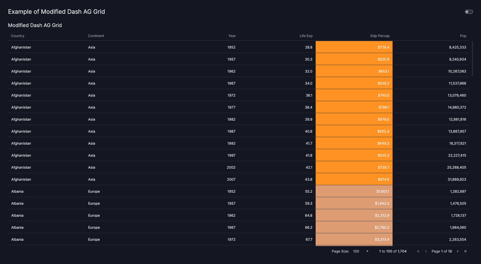
As mentioned above, all parameters of the Dash AG Grid can be entered as keyword arguments. Below you can find an example of a styled AG Grid where some conditional formatting is applied, and where the columns are editable, but not filterable or resizable. There are more ways to alter the grid beyond this showcase. AG Grid, like any other Vizro component, can be customized using custom CSS. You can find information in the guide to overwriting CSS properties.
Styled and modified Dash AG Grid
import vizro.models as vm
import vizro.plotly.express as px
from vizro import Vizro
from vizro.tables import dash_ag_grid

df = px.data.gapminder()

cellStyle = {
    "styleConditions": [
        {
            "condition": "params.value < 1045",
            "style": {"backgroundColor": "#ff9222"},
        },
        {
            "condition": "params.value >= 1045 && params.value <= 4095",
            "style": {"backgroundColor": "#de9e75"},
        },
        {
            "condition": "params.value > 4095 && params.value <= 12695",
            "style": {"backgroundColor": "#aaa9ba"},
        },
        {
            "condition": "params.value > 12695",
            "style": {"backgroundColor": "#00b4ff"},
        },
    ]
}

columnDefs = [
    {"field": "country"},
    {"field": "continent"},
    {"field": "year"},
    {
        "field": "lifeExp",
        "valueFormatter": {"function": "d3.format('.1f')(params.value)"},
    },
    {
        "field": "gdpPercap",
        "valueFormatter": {"function": "d3.format('$,.1f')(params.value)"},
        "cellStyle": cellStyle,
    },
    {
        "field": "pop",
        "valueFormatter": {"function": "d3.format(',.0f')(params.value)"},
    },
]

page = vm.Page(
    title="Example of Modified Dash AG Grid",
    components=[
        vm.AgGrid(
            title="Modified Dash AG Grid",
            figure=dash_ag_grid(
                data_frame=df,
                columnDefs=columnDefs,
                defaultColDef={"resizable": False, "filter": False, "editable": True},
            ),
        )
    ],
)

dashboard = vm.Dashboard(pages=[page])
Vizro().build(dashboard).run()
![]() Run and edit this code in Py.Cafe
Run and edit this code in Py.Cafe
# Still requires a .py to add data to the data manager and parse YAML configuration
# See yaml_version example
pages:
  - components:
      - figure:
          _target_: dash_ag_grid
          data_frame: gapminder
          columnDefs:
            - field: country
            - field: continent
            - field: year
            - field: lifeExp
              valueFormatter:
                function: d3.format('.1f')(params.value)
            - field: gdpPercap
              valueFormatter:
                function: d3.format('$,.1f')(params.value)
              cellStyle:
                styleConditions:
                  - condition: params.value < 1045
                    style:
                      backgroundColor: '#ff9222'
                  - condition: params.value >= 1045 && params.value <= 4095
                    style:
                      backgroundColor: '#de9e75'
                  - condition: params.value > 4095 && params.value <= 12695
                    style:
                      backgroundColor: '#aaa9ba'
                  - condition: params.value > 12695
                    style:
                      backgroundColor: '#00b4ff'
            - field: pop
              type: rightAligned
              valueFormatter:
                function: d3.format(',.0f')(params.value)
          defaultColDef:
            resizable: false
            filter: false
            editable: true
        title: Dash AG Grid
        type: ag_grid
    title: Example of a Dash AG Grid
If the available arguments are not sufficient, there is always the option to create a custom AG Grid callable.
Add sticky headers
To add sticky headers to your AG Grid, add the following CSS to your custom CSS file within your local assets folder.
If your dashboard contains multiple AG Grids, you can scope this CSS to a specific grid by assigning an ID to the corresponding vm.AgGrid model and targeting it in your CSS. For example:
#my-aggrid .ag-header {
    position: fixed !important;
    z-index: 1;
}

#my-aggrid .ag-body {
    top: 40px;
}
Note
This approach works reliably only when the AgGrid is positioned in the non-scrollable page.
Dash DataTable
Similar to AG Grid, the Dash DataTable is an interactive table/grid component designed for viewing, editing, and exploring large datasets.
In general, we recommend using AG Grid for tables unless you have a particular reason to prefer Dash DataTable.
The Vizro Table model is based on the Dash DataTable.
More examples of Dash DataTable
If you would like to see more examples on what can be done with Dash DataTable, head to the Dash DataTable documentation. Almost anything you see there is possible in Vizro by creating a custom Dash DataTable callable.
Basic usage
To add a Table model to your page, do the following:
- Insert the
Tablemodel into thecomponentsargument of thePagemodel. - Enter the
dash_data_tablefunction under thefigureargument (imported viafrom vizro.tables import dash_data_table).
The Vizro version of this table differs in one way from the original table: it requires the user to pass a pandas DataFrame as the source of data. As explained in our guide to using data in Vizro, this must be entered under the argument data_frame.
All other parameters of the Dash DataTable can be entered as keyword arguments. Note that we are setting some defaults for some arguments to help with styling.
Dash DataTable
import vizro.models as vm
import vizro.plotly.express as px
from vizro import Vizro
from vizro.tables import dash_data_table

df = px.data.gapminder().query("year == 2007")

page = vm.Page(
    title="Example of a Dash DataTable",
    components=[
        vm.Table(title="Dash DataTable", figure=dash_data_table(data_frame=df)),
    ],
)

dashboard = vm.Dashboard(pages=[page])
Vizro().build(dashboard).run()
![]() Run and edit this code in Py.Cafe
Run and edit this code in Py.Cafe
Styling and changing the Dash DataTable
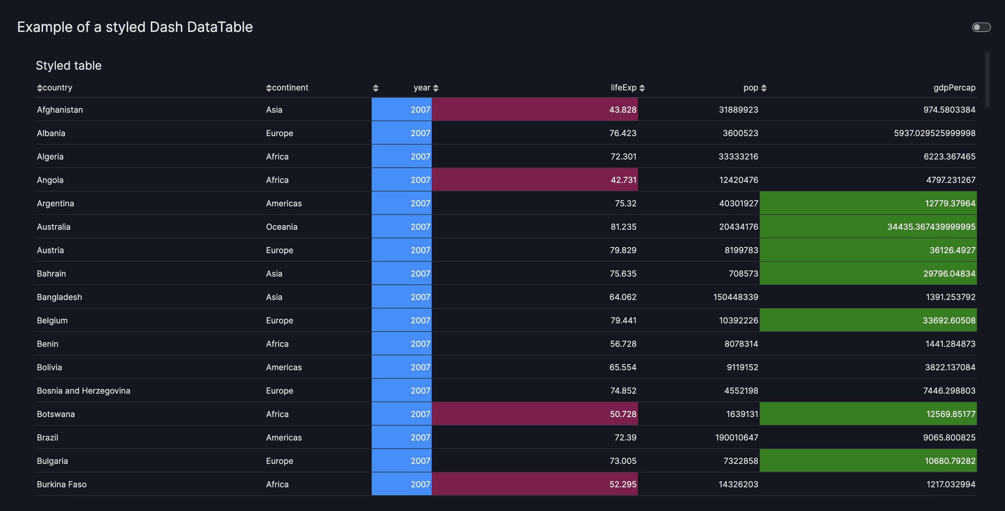
As mentioned above, all parameters of the Dash DataTable can be entered as keyword arguments. Below you can find an example of a styled table where some conditional formatting is applied. There are many more ways to alter the table beyond this showcase.
Styled Dash DataTable
import vizro.models as vm
import vizro.plotly.express as px
from vizro import Vizro
from vizro.tables import dash_data_table

df = px.data.gapminder().query("year == 2007")

column_definitions = [
    {"name": "country", "id": "country", "type": "text", "editable": False},
    {"name": "continent", "id": "continent", "type": "text"},
    {"name": "year", "id": "year", "type": "datetime"},
    {"name": "lifeExp", "id": "lifeExp", "type": "numeric"},
    {"name": "pop", "id": "pop", "type": "numeric"},
    {"name": "gdpPercap", "id": "gdpPercap", "type": "numeric"},
]

style_data_conditional = [
    {
        "if": {
            "column_id": "year",
        },
        "backgroundColor": "dodgerblue",
        "color": "white",
    },
    {"if": {"filter_query": "{lifeExp} < 55", "column_id": "lifeExp"}, "backgroundColor": "#85144b", "color": "white"},
    {
        "if": {"filter_query": "{gdpPercap} > 10000", "column_id": "gdpPercap"},
        "backgroundColor": "green",
        "color": "white",
    },
    {"if": {"column_type": "text"}, "textAlign": "left"},
    {
        "if": {"state": "active"},
        "backgroundColor": "rgba(0, 116, 217, 0.3)",
        "border": "1px solid rgb(0, 116, 217)",
    },
]

style_header_conditional = [{"if": {"column_type": "text"}, "textAlign": "left"}]

page = vm.Page(
    title="Example of a styled Dash DataTable",
    components=[
        vm.Table(
            title="Styled table",
            figure=dash_data_table(
                data_frame=df,
                columns=column_definitions,
                sort_action="native",
                editable=True,
                style_data_conditional=style_data_conditional,
                style_header_conditional=style_header_conditional,
            ),
        ),
    ],
)

dashboard = vm.Dashboard(pages=[page])
Vizro().build(dashboard).run()
![]() Run and edit this code in Py.Cafe
Run and edit this code in Py.Cafe
# Still requires a .py to add data to the data manager and parse YAML configuration
# See yaml_version example
pages:
  - components:
      - figure:
          _target_: dash_data_table
          data_frame: gapminder_2007
          sort_action: native
          editable: true
          columns:
            - name: country
              id: country
              type: text
              editable: false
            - name: continent
              id: continent
              type: text
            - name: year
              id: year
              type: datetime
            - name: lifeExp
              id: lifeExp
              type: numeric
            - name: pop
              id: pop
              type: numeric
            - name: gdpPercap
              id: gdpPercap
              type: numeric
          style_data_conditional:
            - if:
                column_id: year
              backgroundColor: dodgerblue
              color: white
            - if:
                filter_query: '{lifeExp} < 55'
                column_id: lifeExp
              backgroundColor: '#85144b'
              color: white
            - if:
                filter_query: '{gdpPercap} > 10000'
                column_id: gdpPercap
              backgroundColor: green
              color: white
            - if:
                column_type: text
              textAlign: left
            - if:
                state: active
              backgroundColor: rgba(0, 116, 217, 0.3)
              border: 1px solid rgb(0, 116, 217)
        type: table
    title: Dash DataTable
If the available arguments are not sufficient, there is always the option to create a custom Dash DataTable.
Add additional text
The Table and the AgGrid models accept title, header, footer and description arguments. These are useful for providing additional context on the table.
- title: Displayed as an H3 header, useful for summarizing the main topic or insight of the component.
- header: Accepts Markdown text, ideal for extra descriptions, subtitles, or detailed data insights.
- footer: Accepts Markdown text, commonly used for citing data sources, providing information on the last update, or adding disclaimers.
- description: Displayed as an icon that opens a tooltip containing Markdown text when hovered over. You can provide a string to use the default info icon or a
Tooltipmodel to use any icon from the Google Material Icons library.
Formatted AgGrid
Formatted AgGrid
import vizro.models as vm
import vizro.plotly.express as px
from vizro import Vizro
from vizro.tables import dash_ag_grid

gapminder_2007 = px.data.gapminder().query("year == 2007")

page = vm.Page(
    title="Formatted AgGrid",
    components=[
        vm.AgGrid(
            figure=dash_ag_grid(data_frame=gapminder_2007, dashGridOptions={"pagination": True}),
            title="Gapminder Data Insights",
            header="""#### An Interactive Exploration of Global Health, Wealth, and Population""",
            footer="""SOURCE: **Plotly gapminder data set, 2024**""",
            description="""
                The Gapminder dataset tracks the development of countries over time using indicators like life expectancy, income per person, and population size.

                It helps reveal broad global trends, such as how health and wealth have improved in many regions, although progress hasn’t been even across all countries.
            """,
        )
    ],
)

dashboard = vm.Dashboard(pages=[page])
Vizro().build(dashboard).run()
![]() Run and edit this code in Py.Cafe
Run and edit this code in Py.Cafe
# Still requires a .py to add data to the data manager and parse YAML configuration
# See yaml_version example
pages:
  - components:
      - figure:
          _target_: dash_ag_grid
          data_frame: gapminder_2007
          dashGridOptions:
            pagination: true
        title: Gapminder Data Insights
        header: |
          #### An Interactive Exploration of Global Health, Wealth, and Population
        footer: |
          SOURCE: **Plotly gapminder data set, 2024**
        description: |
          The Gapminder dataset tracks the development of countries over time using indicators like life expectancy, income per person, and population size.

          It helps reveal broad global trends, such as how health and wealth have improved in many regions, although progress hasn’t been even across all countries.
        type: ag_grid
    title: Formatted AgGrid

Formatted DataTable
Formatted DataTable
import vizro.models as vm
import vizro.plotly.express as px
from vizro import Vizro
from vizro.tables import dash_data_table

gapminder_2007 = px.data.gapminder().query("year == 2007")

page = vm.Page(
    title="Formatted DataTable",
    components=[
        vm.Table(
            figure=dash_data_table(data_frame=gapminder_2007),
            title="Gapminder Data Insights",
            header="""#### An Interactive Exploration of Global Health, Wealth, and Population""",
            footer="""SOURCE: **Plotly gapminder data set, 2024**""",
            description="""
                The Gapminder dataset tracks the development of countries over time using indicators like life expectancy, income per person, and population size.

                It helps reveal broad global trends, such as how health and wealth have improved in many regions, although progress hasn’t been even across all countries.
            """,
        )
    ],
)

dashboard = vm.Dashboard(pages=[page])
Vizro().build(dashboard).run()
![]() Run and edit this code in Py.Cafe
Run and edit this code in Py.Cafe
# Still requires a .py to add data to the data manager and parse YAML configuration
# See yaml_version example
pages:
  - components:
      - figure:
          _target_: dash_data_table
          data_frame: gapminder_2007
        title: Gapminder Data Insights
        header: |
          #### An Interactive Exploration of Global Health, Wealth, and Population
        footer: |
          SOURCE: **Plotly gapminder data set, 2024**
        description: |
          The Gapminder dataset tracks the development of countries over time using indicators like life expectancy, income per person, and population size.

          It helps reveal broad global trends, such as how health and wealth have improved in many regions, although progress hasn’t been even across all countries.
        type: table
    title: Formatted DataTable
