How to create custom charts
This guide shows you how to create custom charts and how to add them to your dashboard. The Graph model accepts the figure argument, where you can enter any plotly.express chart as explained in the user guide on graphs.
When to use a custom chart
In general, you should use the custom chart decorator @capture("graph") if your plotly chart needs any post-update calls or customization. For example:
- You want to use any of the post figure update calls by
plotlysuch asupdate_layout,update_xaxes,update_traces(for more details, see the docs on plotly's update calls) - You want to use a custom-created
plotly.graph_objects.Figure()object (in short,go.Figure()) and add traces yourself viaadd_trace
Steps to create a custom chart
- Define a function that returns a
go.Figure(). - Decorate it with
@capture("graph"). - The function must accept a
data_frameargument (of typepandas.DataFrame). - The visualization should be derived from and require only one
pandas.DataFrame. Dataframes from other arguments will not react to dashboard controls such asFilter. - Pass your function to the
figureargument of theGraphmodel.
The minimal example below can be used as a base to build more sophisticated charts.
from vizro.models.types import capture
import pandas as pd
import plotly.graph_objects as go

@capture("graph")
def minimal_example(data_frame:pd.DataFrame=None):
    return go.Figure()
Building on the above, there are several routes one can take. The following examples are guides on the most common custom requests, but also serve as an illustration of more general principles.
To alter the data in the data_frame argument, consider using a Filter or parametrized data loading and dynamic data. The data_frame argument input to a custom chart contains the data after filters and parameters have been applied.
Note
Custom charts can be targeted by Filters or Parameters without any extra configuration. We will showcase both possibilities in the following examples.
Interact with other graphs and tables
A custom graph can act as a source for interactions with other components, for example to cross-filter another graph or table when the user clicks on a point.
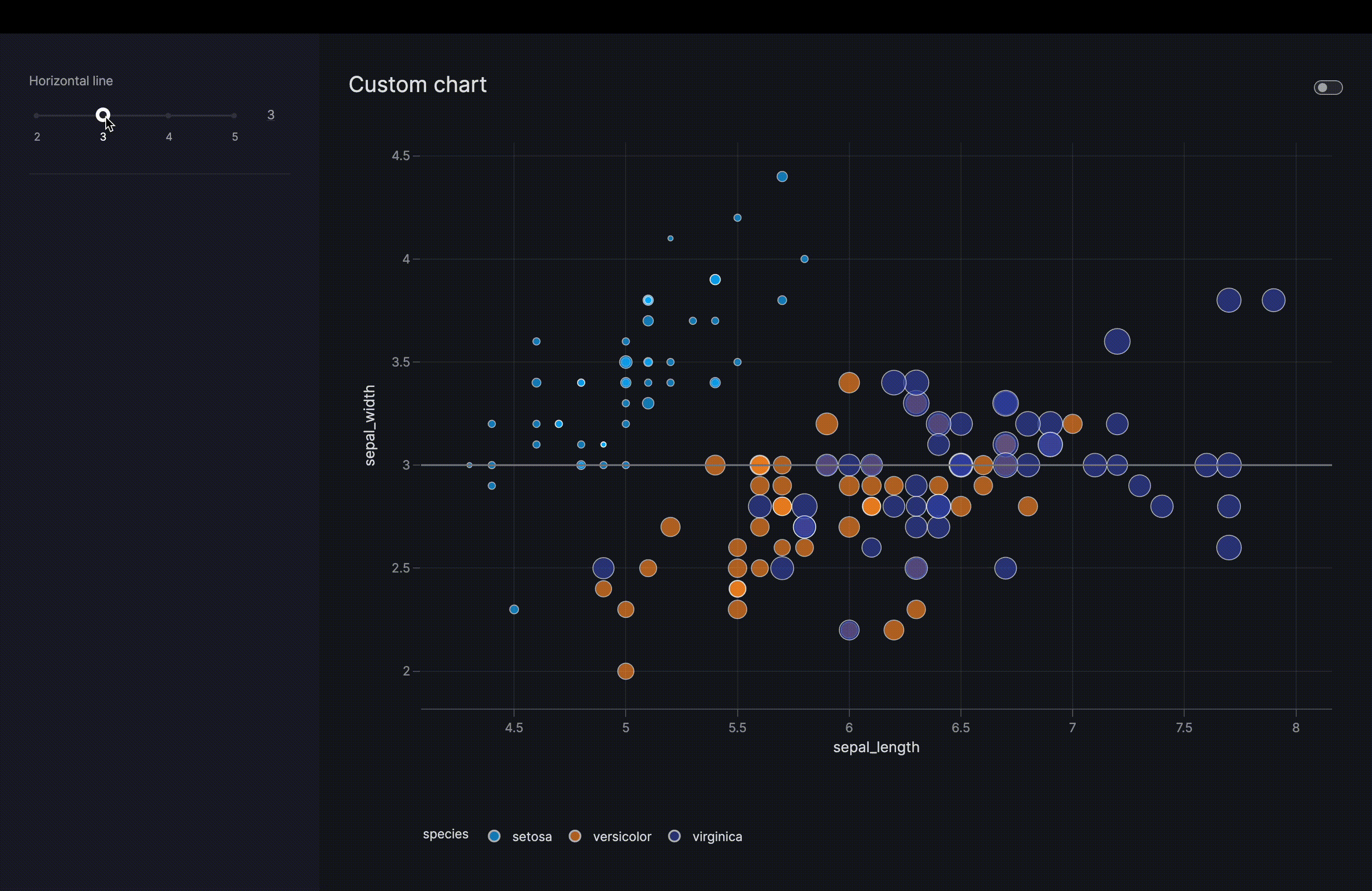
Enhanced plotly.express chart with reference line
The below examples shows a case where we enhance an existing plotly.express chart. We add a new argument (hline), that is used to draw a gray reference line at the height determined by the value of hline. The important thing to note is that we then add a Parameter that enables the dashboard user to interact with the argument, and hence move the line in this case. See the Result tab for an animation.
Custom plotly.express scatter chart with a Parameter
import vizro.models as vm
import vizro.plotly.express as px
from vizro import Vizro
from vizro.managers import data_manager
from vizro.models.types import capture


data_manager["iris"] = px.data.iris()

@capture("graph")
def scatter_with_line(data_frame, x, y, color=None, size=None, hline=None): # (1)!
    fig = px.scatter(data_frame=data_frame, x=x, y=y, color=color, size=size)
    fig.add_hline(y=hline, line_color="gray")
    return fig


page = vm.Page(
    title="Custom chart",
    components=[
        vm.Graph(
            id="enhanced_scatter",
            figure=scatter_with_line(
                data_frame="iris",
                x="sepal_length",
                y="sepal_width",
                color="species",
                size="petal_width",
                hline=3,
            ),
        ),
    ],
    controls=[
        vm.Parameter( # (2)!
            targets=["enhanced_scatter.hline"],
            selector=vm.Slider(min=2, max=5, step=1, value=3, title="Horizontal line"),
        ),
    ],
)

dashboard = vm.Dashboard(pages=[page])
Vizro().build(dashboard).run()
![]() Run and edit this code in Py.Cafe
Run and edit this code in Py.Cafe
- Note that arguments of the custom chart can be parametrized. Here we choose to parametrize the
hlineargument (see below). - Here we parametrize the
hlineargument, but any other argument can be parametrized as well. Since there is complete flexibility regarding what can be derived from such arguments, the dashboard user has a wide range of customization options.
# Still requires a .py to add data to the data manager, define CapturedCallables, and parse YAML configuration
# More explanation in the docs on `Dashboard` and extensions.
pages:
  - components:
      - figure:
          _target_: __main__.scatter_with_line
          color: species
          data_frame: iris
          hline: 3
          size: petal_width
          x: sepal_length
          y: sepal_width
        id: enhanced_scatter
        type: graph
    controls:
      - selector:
          max: 5.0
          min: 2.0
          step: 1.0
          title: Horizontal line
          type: slider
          value: 3.0
        targets:
          - enhanced_scatter.hline
        type: parameter
    title: Custom chart
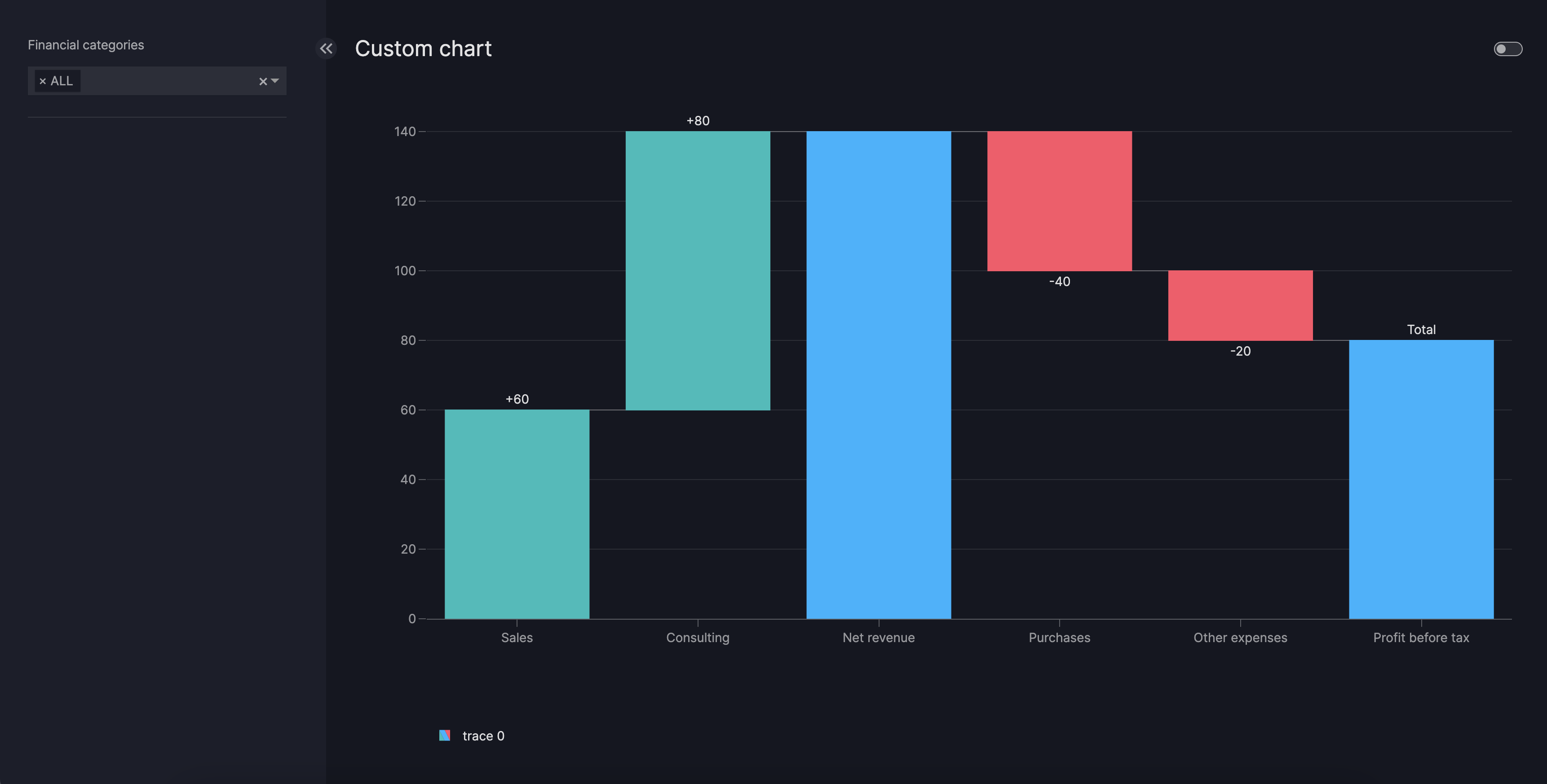
New Waterfall chart based on go.Figure()
The below examples shows a more involved use-case. We create and style a waterfall chart, and add it alongside a filter to the dashboard. The example is based on a plotly waterfall chart tutorial.
Custom go.Figure() waterfall chart with a Parameter
import pandas as pd
import plotly.graph_objects as go

import vizro.models as vm
from vizro import Vizro
from vizro.managers import data_manager
from vizro.models.types import capture


def waterfall_data():
    return pd.DataFrame(
        {
            "measure": ["relative", "relative", "total", "relative", "relative", "total"],
            "x": ["Sales", "Consulting", "Net revenue", "Purchases", "Other expenses", "Profit before tax"],
            "text": ["+60", "+80", "", "-40", "-20", "Total"],
            "y": [60, 80, 0, -40, -20, 0],
        }
    )

data_manager["waterfall_data"] = waterfall_data()


@capture("graph")
def waterfall(data_frame, measure, x, y, text, title=None):
    fig = go.Figure()
    fig.add_traces(
        go.Waterfall(
            measure=data_frame[measure],
            x=data_frame[x],
            y=data_frame[y],
            text=data_frame[text],
            decreasing={"marker": {"color": "#ff5267"}},
            increasing={"marker": {"color": "#08bdba"}},
            totals={"marker": {"color": "#00b4ff"}},
        ),
    )

    fig.update_layout(title=title)
    return fig


page = vm.Page(
    title="Custom chart",
    components=[
        vm.Graph(
            figure=waterfall(data_frame="waterfall_data", measure="measure", x="x", y="y", text="text"),
        ),
    ],
    controls=[
        vm.Filter(column="x", selector=vm.Dropdown(title="Financial categories")),
    ],
)

dashboard = vm.Dashboard(pages=[page])
Vizro().build(dashboard).run()
![]() Run and edit this code in Py.Cafe
Run and edit this code in Py.Cafe
# Still requires a .py to add data to the data manager, define CapturedCallables, and parse YAML configuration
# More explanation in the docs on `Dashboard` and extensions.
pages:
  - components:
      - figure:
          _target_: __main__.waterfall
          data_frame: waterfall_data
          measure: measure
          text: text
          x: x
          y: y
        type: graph
    controls:
      - column: x
        selector:
          title: Financial categories
          type: dropdown
        type: filter
    title: Custom chart