How to use selectors
This guide highlights different selectors that can be used in a dashboard. Selectors do not serve a purpose on their own, but they enable you to change how the input is given to other models, for example, the Filter or the Parameter model.
The Filter or the Parameter model accept the selector argument, where a selector model can be entered to choose how the user should input their choices for the respective models.
Categorical selectors
Within the categorical selectors, a clear distinction exists between multi-option and single-option selectors.
For instance, the Checklist functions as a multi-option selector by default while
the RadioItem serves as a single-option selector by default. However, the
Dropdown can function as both a multi-option or single-option selector.
For more information, refer to the API reference of the selector, or the documentation of its underlying Dash component:
Dropdownbased ondcc.DropdownChecklistbased ondcc.ChecklistRadioItemsbased ondcc.RadioItems
Note
When configuring the options of the categorical selectors, you can either provide:
- a list of values
options = ['Value A', 'Value B', 'Value C'] - or a dictionary of label-value mappings
options=[{'label': 'True', 'value': True}, {'label': 'False', 'value': False}]
The later is required if you want to provide different display labels to your option values or in case you want to provide boolean values as options. In this case, you need to provide a string label for your boolean values as boolean values cannot be displayed properly as labels in the underlying Dash components.
Numerical selectors
For more information, refer to the API reference of the selector, or the documentation of its underlying Dash component:
Sliderbased ondcc.SliderRangeSliderbased ondcc.RangeSlider
Note
When configuring the Slider and the RangeSlider with float values, and using step with an integer value, you may notice
unexpected behavior, such as the drag value being outside its indicated marks.
To our knowledge, this is a current bug in the underlying dcc.Slider and
dcc.RangeSlider component, which you can circumvent by adapting the step size accordingly.
Temporal selectors
For more information, refer to the API reference of the selector, or the documentation of its underlying Dash component:
DatePickerbased ondmc.DateRangePickeranddmc.DatePicker
Note
When the DatePicker is configured with range=True (the default), the underlying component is dmc.DateRangePicker. When range=False the underlying component is dmc.DatePicker.
When configuring the DatePicker make sure to provide your dates for min, max and value arguments in "yyyy-mm-dd" format or as datetime type (for example, datetime.datetime(2024, 01, 01)).
Default selectors
If you don't specify a selector, a default selector is applied based on the data type of the provided column.
Default selectors for:
- categorical data:
Dropdown - numerical data:
RangeSlider - temporal data:
DatePicker(range=True)
Categorical selectors can be used independently of the data type of the column being filtered.
To use numerical Filter selectors, the filtered column must be of numeric format,
indicating that pandas.api.types.is_numeric_dtype() must return True for the filtered column.
To use temporal Filter selectors, the filtered column must be of datetime format,
indicating that pandas.api.types.is_datetime64_any_dtype() must return True for the filtered column.
Tip
pd.DataFrame column types can be changed to datetime using pandas.to_datetime() or
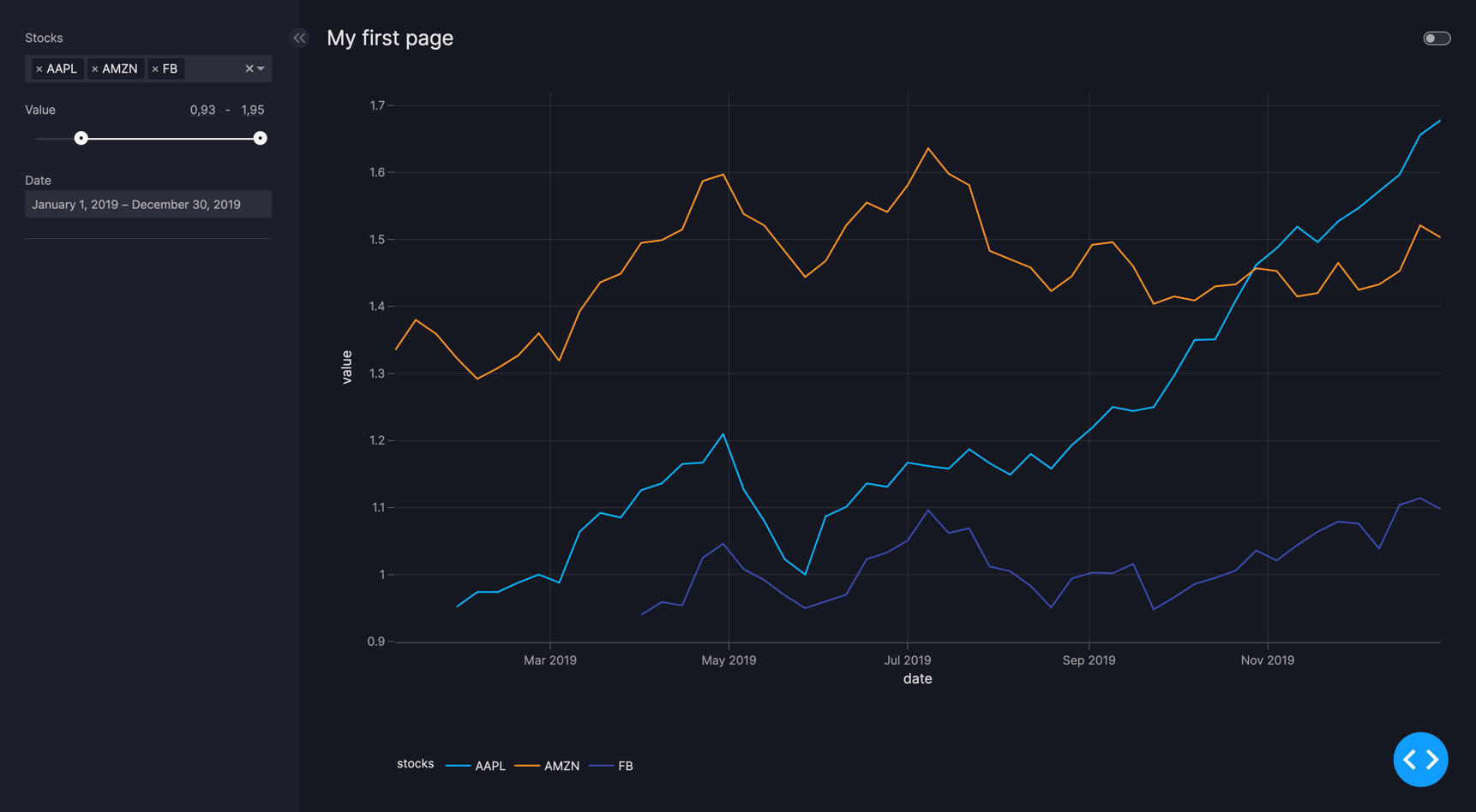
Example of default Filter selectors
Default Filter selectors
import pandas as pd
from vizro import Vizro
import vizro.plotly.express as px
import vizro.models as vm

df_stocks = px.data.stocks(datetimes=True)

df_stocks_long = pd.melt(
    df_stocks,
    id_vars='date',
    value_vars=['GOOG', 'AAPL', 'AMZN', 'FB', 'NFLX', 'MSFT'],
    var_name='stocks',
    value_name='value'
)

df_stocks_long['value'] = df_stocks_long['value'].round(3)

page = vm.Page(
    title="My first page",
    components=[
        vm.Graph(figure=px.line(df_stocks_long, x="date", y="value", color="stocks")),
    ],
    controls=[
        vm.Filter(column="stocks"),
        vm.Filter(column="value"),
        vm.Filter(column="date"),
    ],
)

dashboard = vm.Dashboard(pages=[page])

Vizro().build(dashboard).run()
# Still requires a .py to add data to the data manager and parse YAML configuration
# See yaml_version example
pages:
  - components:
      - figure:
          _target_: line
          data_frame: df_stocks_long
          x: date
          y: value
          color: stocks
        type: graph
    controls:
      - column: stocks
        type: filter
      - column: value
        type: filter
      - column: date
        type: filter
    title: My first page
To enhance existing selectors, see our how-to-guide on creating custom components.
