How to create custom components
The number of built-in Vizro models is deliberately kept quite small to enable quick and easy configuration of a dashboard. However, Vizro is also extensible, so that you can modify any model or create an entirely new one. This guide shows you how to do so.
In general, you can create a custom component based on a Dash component from any Dash component library, for example:
General principles
Can you use extra instead of creating a custom component?
If you want to modify an existing component, you may not even need to create a custom component. Many of our models have an extra argument to pass arguments to the underlying Dash component directly, for example to make the RadioItem inline instead of stacked.
To create a custom component:
- Subclass the relevant model:
- To extend an existing model such as
RangeSlider, subclass it. - To create a new component, subclass
VizroBaseModel.
- To extend an existing model such as
- Write the subclass:
- To extend an existing model you could, for example, add or change model fields or override the
buildmethod. - To create a new component, you need to define fields and the
buildmethod from scratch.
- To extend an existing model you could, for example, add or change model fields or override the
- Look at the field where your component will be used in the API reference and check whether it is described as a discriminated union. For example, in the
Filtermodel theselectorfield of typeSelectorTypeis a discriminated union but theoptionsfield of typeOptionsTypeis not. If the field is a discriminated union, then:- You must ensure your model has a
typefield. - You must register the new type with its parent model with
add_type.
- You must ensure your model has a
We will refer back to these steps in the examples below.
Extend an existing component
You may want to use this strategy to:
- Extend an existing component, for example to add a button to a
Card. - Change default configuration of a Dash component set by a Vizro model, for example to set
allowCross=FalseinRangeSlider. - Change the fields of a models, for example to change the
titlefield fromOptionalto have a default.
You can extend an existing component by subclassing the component you want to modify. Remember that when subclassing a component you have access to all fields of its parent model, but you can choose to overwrite any field or method or define entirely new ones.
In this example, we modify the RangeSlider model so that
one slider handle cannot cross the other, and to have a permanent tooltip showing the current value. It is often easier to call super() and modify the result when overriding a complex method
such as the build method instead of writing it from scratch.
In this case, the general three steps translate into:
- Subclass
RangeSlider:
- Modify the component by changing the underlying parent's
dcc.RangeSliderDash component in thebuildmethod:
class TooltipNonCrossRangeSlider(vm.RangeSlider):
    def build(self):
        ...
        allowCross=False,
        tooltip={"placement": "bottom", "always_visible": True}
build method.
-
Since the new model will be inserted into the
selectorsargument of theFiltermodel orParametermodel, it will be part of the discriminated union describing the allowed types for that argument, in this case theSelectorType. Hence we must:- define a new type:
class TooltipNonCrossRangeSlider(vm.RangeSlider):
    type: Literal["other_range_slider"] = "other_range_slider"
    ...
vm.Filter.add_type("selector", TooltipNonCrossRangeSlider)
vm.Parameter.add_type("selector", TooltipNonCrossRangeSlider)
Example based on existing component
from typing_extensions import Literal

import vizro.models as vm
import vizro.plotly.express as px
from vizro import Vizro

iris = px.data.iris()


class TooltipNonCrossRangeSlider(vm.RangeSlider):
    """Custom numeric multi-selector `TooltipNonCrossRangeSlider`."""

    type: Literal["other_range_slider"] = "other_range_slider"  # (1)!

    def build(self):  # (2)!
        range_slider_build_obj = super().build()  # (3)!
        range_slider_build_obj[self.id].allowCross = False  # (4)!
        range_slider_build_obj[self.id].tooltip = {"always_visible": True, "placement": "bottom"}  # (5)!
        return range_slider_build_obj


vm.Filter.add_type("selector", TooltipNonCrossRangeSlider)  # (6)!
vm.Parameter.add_type("selector", TooltipNonCrossRangeSlider)  # (7)!

page = vm.Page(
    title="Custom Component",
    components=[
        vm.Graph(
            id="for_custom_chart",
            figure=px.scatter(iris, title="Iris Dataset", x="sepal_length", y="petal_width", color="sepal_width"),
        ),
    ],
    controls=[
        vm.Filter(
            column="sepal_length",
            targets=["for_custom_chart"],
            selector=TooltipNonCrossRangeSlider(),
        ),
        vm.Parameter(
            targets=["for_custom_chart.range_x"],
            selector=TooltipNonCrossRangeSlider(title="Select x-axis range", min=0, max=10),  # (8)!
        ),
    ],
)

dashboard = vm.Dashboard(pages=[page])

Vizro().build(dashboard).run()
 Run and edit this code in Py.Cafe
- Here we provide a new type for the new component, so it can be distinguished in the discriminated union.
- Here we override the
buildmethod by altering the output ofsuper().build(). Alternatively one could copy the source code of the build method and alter it directly. range_slider_build_obj[self.id]then fetches the underlyingdcc.RangeSliderobject.- This change prevents the
RangeSliderfrom crossing itself when moving the handle. - This change displays the tooltip below the handle.
- Remember! If part of a discriminated union, you must add the new component to the parent model where it will be inserted. In this case the new
TooltipNonCrossRangeSliderwill be inserted into theselectorargument of theFiltermodel, and thus must be added as an allowed type. - Remember! If part of a discriminated union, you must add the new component to the parent model where it will be inserted. In this case the new
TooltipNonCrossRangeSliderwill be inserted into theselectorargument of theParametermodel, and thus must be added as an allowed type. - The new component can now be inserted into a regular dashboard.

Create a new component
You may want to use this strategy to:
- Create a new component that does not exist as a built-in Vizro model.
- Make extensive changes to an existing component.
- Combine multiple components into a single higher-level component, similar to a Dash All-in-One component.
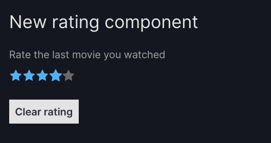
We will create a new Rating component based on the Dash Mantine Component Rating. This produces a form component that shows a set of 5 stars for the dashboard user to give a rating. We also include html.Legend in our custom component to label the form component.
-
Create the new component by subclassing
VizroBaseModel: -
Build the component in the
buildmethod:- This can return any Dash component but is often a "container" component such as
html.Divthat includes multiple Dash components. - Typically you use
id=self.idfor the "core" component, in this casedmc.Rating. - Typically you prefix with
self.idtheidfor a component that is not the core one.
from dash import html import dash_mantine_components as dmc class Rating(vm.VizroBaseModel): ... def build(self): return html.Div( # (1)! [ html.Legend(id=f"{self.id}_title", ...), # (2)! dmc.Rating(id=self.id, ...) # (3)! ] )- In this example, for simplicity we use
html.Divto provide the outer container. You could also usehtml.Fieldset, which is specifically designed for grouping a form legend with a set of controls. - This is not the core component but we will later address it with an action, so it must have an
idset. We prefix itsidwithself.id. - This is the core component, and so it has
id=self.id.
- This can return any Dash component but is often a "container" component such as
-
Since the new model will be inserted into the
componentsargument of thePagemodel, it will be part of the discriminated unionComponentType. Hence we must:- define a new type:
- register the type with the parent model:
Here is the full code for Rating and a simple app containing it.
New component creation
from typing import Literal

from dash import html
import dash_mantine_components as dmc
import vizro.models as vm
from vizro import Vizro


class Rating(vm.VizroBaseModel):
    type: Literal["rating"] = "rating"
    title: str # (1)!
    color: str = "#00b4ff" # (2)!

    def build(self):
        return html.Div( # (3)!
            [
                html.Legend(id=f"{self.id}_title", children=self.title, className="form-label"),
                dmc.Rating(id=self.id, color=self.color),
            ]
        )


vm.Page.add_type("components", Rating)  # (4)!

page = vm.Page(
    title="New rating component",
    layout=vm.Flex(),
    components=[
        Rating(title="Rate the last movie you watched"),  # (5)!
    ],
)

dashboard = vm.Dashboard(pages=[page])
Vizro().build(dashboard).run()
Run and edit this code in Py.Cafe
- You can optionally define other Pydantic fields to configure our custom component. Here we define a mandatory
titlefield that must be a string. - This field
coloris optional and has a default value. Here we specify the field to be a string, but there also exists a specialColortype in thepydantic-extra-typespackage that would perform stricter validation and additional functionality. - We use the values of the Pydantic fields
id(inherited fromvm.VizroBaseModel),titleandcolorin the Dash components. - Don't forget! If part of a discriminated union, you must add the new component to the parent model where it will be inserted. In this case the new
Ratingwill be inserted into thecomponentsargument of thePagemodel, and thus must be added as an allowed type. - The
titlefield is mandatory;idandcolorare optional and not specified here.

Use custom components with actions
Custom components can be used with both built-in actions and custom actions. Here we demonstrate how the above Rating component can be used with actions.
Dash properties as input and output
To use your custom component as an input or output for an action, you must explicitly specify an id when using the component, for example Rating(id="my_rating").
It is then immediately possible to address the properties of Dash components built by the custom component. For example, we could use "my_rating.value" as the input or output of an action to target the value property of the dmc.Rating component. Here is an example button that triggers a custom action to set this Dash property by including outputs="my_rating.value".
Use custom component Dash properties as an action output
from typing import Literal

from dash import html
import dash_mantine_components as dmc
import vizro.models as vm
from vizro.models.types import capture
from vizro import Vizro


class Rating(vm.VizroBaseModel):
    type: Literal["rating"] = "rating"
    title: str
    color: str = "#00b4ff"

    def build(self):
        return html.Div(
            [
                html.Legend(id=f"{self.id}_title", children=self.title, className="form-label"),
                dmc.Rating(id=self.id, color=self.color),
            ]
        )


vm.Page.add_type("components", Rating)


@capture("action") # (1)!
def clear_rating():
    return 0


page = vm.Page(
    title="New rating component",
    layout=vm.Flex(),
    components=[
        Rating(id="my_rating", title="Rate the last movie you watched"), # (2)!
        vm.Button(
            text="Clear rating",
            actions=vm.Action(function=clear_rating(), outputs="my_rating.value"), # (3)!
        ),
    ],
)

dashboard = vm.Dashboard(pages=[page])
Vizro().build(dashboard).run()
Run and edit this code in Py.Cafe
- We write a custom action
clear_ratingthat has no inputs and returns0. - To use our
Ratingcomponent in a custom action, we must explicitly specify anid. - We attach the
clear_ratingaction to the button so that it is triggered when the button is clicked. The output ofclear_ratingsets the value of"my_rating.value", which corresponds to thevalueproperty of thedmc.Ratingcomponent produced by our customRatingcomponent.
Model ID as input and output
Note
You do not need to follow these steps if any of these conditions holds:
- Your custom component is an extension of an existing component, in which case your model inherits the
_action_inputsand_action_outputsproperties automatically. - You are happy to use Dash properties as input and output.
Generally when we use actions and built-in Vizro components, we refer only to the id (in this example "my_rating") rather than a Dash component property such as "my_rating.value". To enable this, we must define some extra information in the custom component using _action_inputs and _action_outputs. Here we define a mapping that tells actions to map "my_rating" onto "my_rating.value".
class Rating(vm.VizroBaseModel):
    ...

    @property
    def _action_inputs(self):
        return {"__default__": f"{self.id}.value"}  # (1)!

    @property
    def _action_outputs(self):
        return {"__default__": f"{self.id}.value"}
- The
"__default__"key corresponds to the Dash component property used when an action input or output specifies only theidof"my_rating". Typically this maps onto the most commonly used property of the core component produced by your custom component, which hasid=self.id.
This enables you to replace in your dashboard configuration all action input and output references to "my_rating.value" with just "my_rating". The full code is given below.
Use custom component model ID as an action output
from typing import Literal

from dash import html
import dash_mantine_components as dmc
import vizro.models as vm
from vizro.models.types import capture
from vizro import Vizro


class Rating(vm.VizroBaseModel):
    type: Literal["rating"] = "rating"
    title: str
    color: str = "#00b4ff"

    @property
    def _action_inputs(self):
        return {"__default__": f"{self.id}.value"}

    @property
    def _action_outputs(self):
        return {"__default__": f"{self.id}.value"}

    def build(self):
        return html.Div(
            [
                html.Legend(id=f"{self.id}_title", children=self.title, className="form-label"),
                dmc.Rating(id=self.id, color=self.color),
            ]
        )


vm.Page.add_type("components", Rating)


@capture("action")
def clear_rating():
    return 0


page = vm.Page(
    title="New rating component",
    layout=vm.Flex(),
    components=[
        Rating(id="my_rating", title="Rate the last movie you watched"),
        vm.Button(
            text="Clear rating",
            actions=vm.Action(function=clear_rating(), outputs="my_rating"),  # (1)!
        ),
    ],
)

dashboard = vm.Dashboard(pages=[page])
Vizro().build(dashboard).run()
Run and edit this code in Py.Cafe
- We replace
outputs="my_rating.value"withoutputs="my_rating". This will look up the"__default__"key in the_action_outputsmapping defined for the the model withid="my_rating".
Model fields as input and output
Note
You do not need to follow these steps if any of these conditions holds:
- You do not wish to address anything other than your custom component's core component.
- You are happy to use Dash properties as input and output.
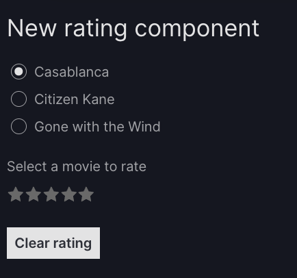
To map your model's fields onto Dash component properties you can define further entries in _action_inputs and _action_outputs. For example, let's say we wanted to add a radio items model so the user can select which movie to rate. When the movie is selected, it will trigger an action that updates the title of our custom Rating component. This corresponds to the following Dash component produced in the Rating model's build method:
We can already address this Dash property by using "my_rating_title.children" as an action input or output. To enable us to instead address the field with "my_rating.title", we must add an additional mapping to _action_inputs and/or _action_outputs:
@property
def _action_outputs(self):
    return {"__default__": f"{self.id}.value", "title": f"{self.id}_title.children"}
This enables you to replace in your dashboard configuration all references to output="my_rating_title.children" with output="my_rating.title". The full code is given below.
Use custom component model field as an action output
from typing import Literal

from dash import html
import dash_mantine_components as dmc
import vizro.models as vm
from vizro.models.types import capture
from vizro import Vizro


class Rating(vm.VizroBaseModel):
    type: Literal["rating"] = "rating"
    title: str
    color: str = "#00b4ff"

    @property
    def _action_inputs(self):
        return {"__default__": f"{self.id}.value"}

    @property
    def _action_outputs(self):
        return {"__default__": f"{self.id}.value", "title": f"{self.id}_title.children"}

    def build(self):
        return html.Div(
            [
                html.Legend(id=f"{self.id}_title", children=self.title, className="form-label"),
                dmc.Rating(id=self.id, color=self.color),
            ]
        )


vm.Page.add_type("components", Rating)
vm.Page.add_type("components", vm.RadioItems) # (1)!


@capture("action")
def clear_rating():
    return 0


@capture("action") # (2)!
def set_movie_title(title):
    return f"Rate the movie {title}"


page = vm.Page(
    title="New rating component",
    layout=vm.Flex(),
    components=[
        vm.RadioItems( # (3)!
            id="movie_title",
            options=["Casablanca", "Citizen Kane", "Gone with the Wind"],
            actions=vm.Action(
                function=set_movie_title(title="movie_title"), # (4)!
                outputs="my_rating.title" # (5)!
            ),
        ),
        Rating(id="my_rating", title="Select a movie to rate"),
        vm.Button(
            text="Clear rating",
            actions=vm.Action(function=clear_rating(), outputs="my_rating"),
        ),
    ],
)

dashboard = vm.Dashboard(pages=[page])
Vizro().build(dashboard).run()
Run and edit this code in Py.Cafe
- Currently
RadioItemsis designed to be used as a control selector. In future, Vizro will have a dedicatedFormmodel for the creation of forms. For now, we add form components directly ascomponentsinside thePage. For this to be a valid configuration we must first doadd_typeas for a custom component. - We write a custom action
set_movie_titlethat takes in thetitlespecified and returns a string "Rate the movie ...". - We attach the
set_movie_titleaction to the radio items, so that it is triggered when an option is selected. - The input
"movie_title"corresponds to the value selected in the radio items and sets thetitleargument of theset_movie_titleaction. - The output of
set_movie_titlesets the value of"my_rating.title", which maps onto the contents of the legend in theRating(id="my_rating")component.
Trigger actions
Note
You do not need to follow these steps if your custom component is an extension of an existing component, in which case your model inherits the _action_triggers property automatically.
To enable your custom component to trigger one or multiple actions:
- Add a field
actionsof typeActionsType. - Set the action trigger using
make_actions_chainand_action_triggers. - When the custom component is used, attach one or more built-in actions or custom actions to it by setting the
actionsfield.
For example, let's make our Rating component trigger an action when the user clicks on the stars. Clicking the stars updates the value property, and so this must be linked to the "__default__" key in the _action_triggers mapping as follows:
from pydantic import model_validator
from vizro.models._models_utils import make_actions_chain
from vizro.models.types import ActionsType


class Rating(vm.VizroBaseModel):
    ...
    actions: ActionsType

    _make_actions_chain = model_validator(mode="after")(make_actions_chain)

    @property
    def _action_triggers(self):
        return {"__default__": f"{self.id}.value"}
In our dashboard configuration we would then attach the actions to trigger when we configure the Rating component:
A full example is given below.
Trigger actions with a custom component
from typing import Literal

from dash import html
import dash_mantine_components as dmc
from pydantic import model_validator
import vizro.models as vm
from vizro.models._models_utils import make_actions_chain
from vizro.models.types import capture, ActionsType
from vizro import Vizro


class Rating(vm.VizroBaseModel):
    type: Literal["rating"] = "rating"
    title: str
    color: str = "#00b4ff"
    actions: ActionsType

    _make_actions_chain = model_validator(mode="after")(make_actions_chain)

    @property
    def _action_triggers(self):
        return {"__default__": f"{self.id}.value"}

    @property
    def _action_inputs(self):
        return {"__default__": f"{self.id}.value"}

    @property
    def _action_outputs(self):
        return {"__default__": f"{self.id}.value", "title": f"{self.id}_title.children"}

    def build(self):
        return html.Div(
            [
                html.Legend(id=f"{self.id}_title", children=self.title, className="form-label"),
                dmc.Rating(id=self.id, color=self.color),
            ]
        )


vm.Page.add_type("components", Rating)
vm.Page.add_type("components", vm.RadioItems)


@capture("action")
def clear_rating():
    return 0


@capture("action")
def set_movie_title(title):
    return f"Rate the movie {title}"


@capture("action")
def update_rating_text(rating_value): # (1)!
    if rating_value:
        return f"You gave a rating of {rating_value} out of 5 stars"
    return "You have not provided a rating"


page = vm.Page(
    title="New rating component",
    layout=vm.Flex(),
    components=[
        vm.RadioItems(
            id="movie_title",
            options=["Casablanca", "Citizen Kane", "Gone with the Wind"],
            actions=vm.Action(
                function=set_movie_title("movie_title"),
                outputs="my_rating.title"
            ),
        ),
        Rating(
            id="my_rating",
            title="Select a movie to rate",
            actions=vm.Action(
                function=update_rating_text("my_rating"), # (2)!
                outputs="rating_text" # (3)!
            ),
        ),
        vm.Text(id="rating_text", text="You have not provided a rating"),
        vm.Button(
            text="Clear rating",
            actions=vm.Action(function=clear_rating(), outputs="my_rating"),
        ),
    ],
)

dashboard = vm.Dashboard(pages=[page])
Vizro().build(dashboard).run()
Run and edit this code in Py.Cafe
- We write a custom action
update_rating_textthat takes in therating_value(an integer between 1 and 5) and returns a string "You gave a rating of ...". - We attach the
update_rating_textaction to our customRatingcomponent, so that it is triggered when the rating stars are clicked. The input"my_rating"(which also maps onto"my_rating.value") sets therating_valueargument of theupdate_rating_textaction. - The output of
update_rating_textsets the value of"rating_text", which maps onto the contents of thevm.Text(id="rating_text")component.

Persistence
By default, all Dash components in Vizro that persist clientside data set persistence_type="session" to use window.SessionStorage, which is cleared upon closing the browser.
Be careful when using any custom components that persist data beyond this scope: it is your responsibility to ensure compliance with any legal requirements affecting jurisdictions in which your app operates.