How to use containers
This guide shows you how to use containers to group your components into sections and subsections within the page.
A Container complements a Page: both models share nearly identical arguments. While Page.layout provides a method for structuring the overall page layout, a Container offers more detailed control within a particular section of the page. The Container is based on the underlying Dash component dbc.Container.
Unlike Page, the Container model offers additional visual customization options:
variant: Enables you to select a visual style for the container, making it stand out from the rest of the page content.collapsed: Enables collapsible behavior. You can define whether the container's contents are initially shown or hidden.
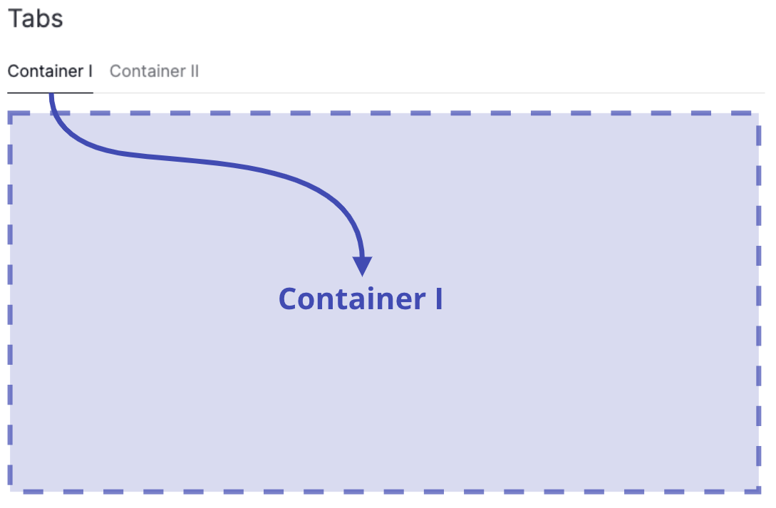
Displaying multiple containers inside Tabs
An alternative way to display multiple containers on one page is to place them inside Tabs.
Tabs organize and separate groups of related content in a dashboard, letting users switch between different sections or views. They are a way of putting multiple containers into the same screen space, and letting the user switch between them.
When to use containers
In general, any arbitrarily granular layout can already be achieved by using Page.layout alone, which is our recommended approach if you want to arrange components on a page with consistent row and/or column spacing.
Both Page.layout and Container.layout now accept either a Grid (default) or a Flex layout model, giving you full flexibility when arranging components.
Page.layoutdefines the overall layout of the page using eitherGridorFlex.Container.layoutallows you to insert a nestedGridorFlexlayout within the page layout, offering more granular control by breaking the page into independently arranged sublayouts.
Here are a few cases where you might want to use a Container instead of Page.layout:
- Split up your sections into subsections to organize components together
- Add a title to your section
- Different row and column spacing between sections
- Apply a background color or borders to visually distinguish your content
- Make your content collapsible
- Apply controls to selected sections
Basic containers
To add a Container to your page, do the following:
- Insert the
Containerinto thecomponentsargument of thePage - Configure your
components, read the overview page for various options - (optional) Set a
titlefor yourContainer - (optional) Configure your
layout, see the guide on layouts - (optional) Configure container specific
controls
Container
import vizro.models as vm
import vizro.plotly.express as px
from vizro import Vizro
iris = px.data.iris()
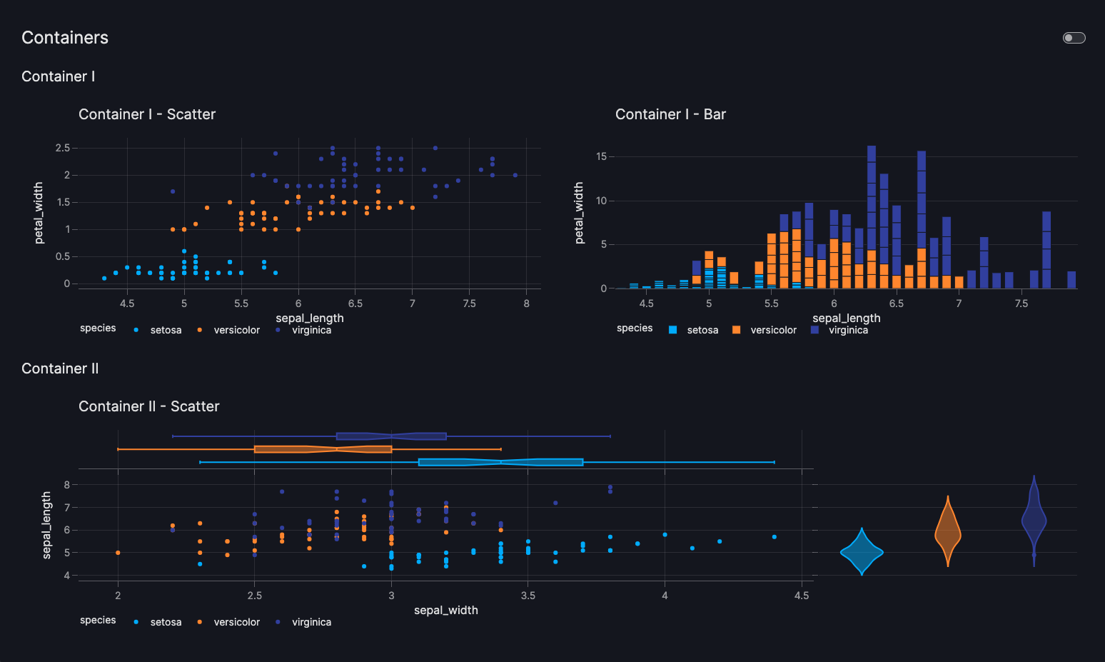
page = vm.Page(
title="Containers",
components=[ # (1)!
vm.Container(
title="Container I",
layout=vm.Grid(grid=[[0, 1]]), # (2)!
components=[
vm.Graph(
figure=px.scatter(
iris,
x="sepal_length",
y="petal_width",
color="species",
title="Container I - Scatter"
)
),
vm.Graph(
figure=px.bar(
iris,
x="sepal_length",
y="sepal_width",
color="species",
title="Container I - Bar"
)
),
],
),
vm.Container(
title="Container II",
components=[
vm.Graph(
figure=px.scatter(
iris,
x="sepal_width",
y="sepal_length",
color="species",
marginal_y="violin",
marginal_x="box",
title="Container II - Scatter",
)
),
],
),
],
)
dashboard = vm.Dashboard(pages=[page])
Vizro().build(dashboard).run()
 Run and edit this code in Py.Cafe
- Note that the
Page.layoutargument is not specified here and will therefore defaults to[[0], [1]], meaning the containers will be vertically stacked down the page in one column. - Horizontally stack the components side-by-side inside this
Containerin one row.
# Still requires a .py to add data to the data manager and parse YAML configuration
# See yaml_version example
pages:
  - components:
      - components:
          - figure:
              _target_: scatter
              data_frame: iris
              x: sepal_length
              y: petal_width
              color: species
              title: Container I - Scatter
            type: graph
          - figure:
              _target_: bar
              data_frame: iris
              x: sepal_length
              y: petal_width
              color: species
              title: Container I - Bar
            type: graph
        layout:
          grid: [[0, 1]]
          type: grid
        type: container
        title: Container I
      - components:
          - figure:
              _target_: scatter
              data_frame: iris
              x: sepal_width
              y: sepal_length
              color: species
              marginal_y: violin
              marginal_x: box
              title: Container II - Scatter
            type: graph
        type: container
        title: Container II
    title: Containers
Note that an almost identical layout can also be achieved using solely the Page.layout by configuring the Page.layout as vm.Grid(grid = [[0, 1], [2, 2]]).
Nested containers
Containers can be nested, providing a hierarchical structure for organizing components. This nesting capability enables users to create more complex layouts and manage related components at any level of granularity.
To create nested containers, add a Container to the components argument of another Container.
vm.Container(
    title="Parent Container",
    components=[
        vm.Container(
            title="Child Container",
            components=[vm.Button()],
        )
    ],
)
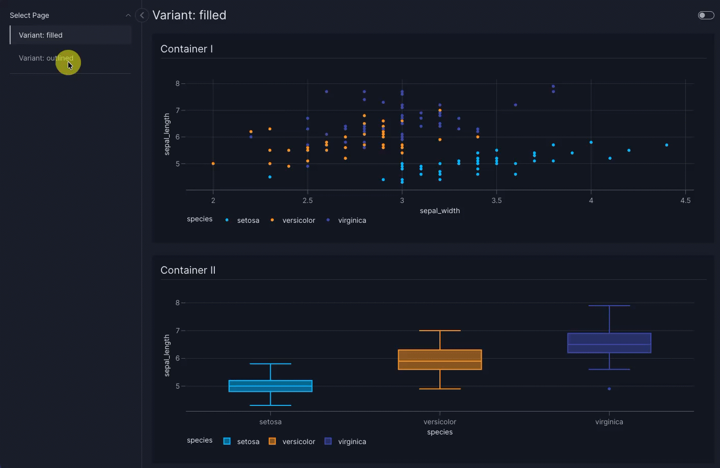
Styled containers
To make the Container stand out as a distinct section in your dashboard, you can select from the predefined styles available in its variant argument. This can be set to "plain" (the default), "filled" or "outlined".
Using filled containers
When you use "filled" containers on a Page, the page background adjusts so that content inside those containers is best visible. We recommend using "filled" for all containers on that page rather than mixing variants. Using a single variant across the page keeps the layout visually consistent, avoids distracting contrast between container styles, and ensures that visual components (such as graphs and charts) are best visible in every container.
Container with different styles
import vizro.models as vm
import vizro.plotly.express as px
from vizro import Vizro

iris = px.data.iris()

filled = vm.Page(
    title="Variant: filled",
    components=[
        vm.Container(
            title="Container I",
            components=[vm.Graph(figure=px.scatter(iris, x="sepal_width", y="sepal_length", color="species"))],
            variant="filled",
        ),
        vm.Container(
            title="Container II",
            components=[vm.Graph(figure=px.box(iris, x="species", y="sepal_length", color="species"))],
            variant="filled",
        ),
    ],
)

outlined = vm.Page(
    title="Variant: outlined",
    components=[
        vm.Container(
            title="Container I",
            components=[vm.Graph(figure=px.scatter(iris, x="sepal_width", y="sepal_length", color="species"))],
            variant="outlined",
        ),
        vm.Container(
            title="Container II",
            components=[vm.Graph(figure=px.box(iris, x="species", y="sepal_length", color="species"))],
            variant="outlined",
        ),
    ],
)

dashboard = vm.Dashboard(pages=[filled, outlined])

Vizro().build(dashboard).run()
Run and edit this code in Py.Cafe
# Still requires a .py to add data to the data manager and parse YAML configuration
# See yaml_version example
pages:
  - title: Variant: filled
    components:
      - type: container
        title: Container I
        components:
          - type: graph
            figure:
              _target_: scatter
              data_frame: iris
              x: sepal_width
              y: sepal_length
              color: species
        variant: filled
      - type: container
        title: Container II
        components:
          - type: graph
            figure:
              _target_: box
              data_frame: iris
              x: species
              y: sepal_length
              color: species
        variant: filled
  - title: Variant: outlined
    components:
      - type: container
        title: Container I
        components:
          - type: graph
            figure:
              _target_: scatter
              data_frame: iris
              x: sepal_width
              y: sepal_length
              color: species
        variant: outlined
      - type: container
        title: Container II
        components:
          - type: graph
            figure:
              _target_: box
              data_frame: iris
              x: species
              y: sepal_length
              color: species
        variant: outlined
If you want to style your Container beyond the styling options available inside variant, please refer to our user guide on overwriting CSS for selected components.
Collapsible containers
To make a Container collapsible, use the collapsed argument:
- Set
collapsed=Trueto have the container start in a collapsed (hidden) state. - Set
collapsed=Falseto have it expanded (visible) by default.
Once defined, dashboard users can toggle the container’s visibility interactively.
By default, a collapsible container is styled with variant="outlined" to make its border visible.
Collapsible containers are supported in both Grid and Flex layouts. However, we recommend using them within a Flex layout for optimal behavior, as Flex is better suited to dynamic sizing and more efficient use of space when content is shown or hidden.
Collapsible container inside Flex
import vizro.models as vm
import vizro.plotly.express as px
from vizro import Vizro

iris = px.data.iris()

page = vm.Page(
    title="Collapsible containers",
    layout=vm.Flex(),  # (1)!
    components=[
        vm.Container(
            title="Initially collapsed container",
            components=[vm.Graph(figure=px.scatter(iris, x="sepal_width", y="sepal_length", color="species"))],
            collapsed=True,
        ),
        vm.Container(
            title="Initially expanded container",
            components=[vm.Graph(figure=px.box(iris, x="species", y="sepal_length", color="species"))],
            collapsed=False,
        )
    ],
)

dashboard = vm.Dashboard(pages=[page])
Vizro().build(dashboard).run()
Run and edit this code in Py.Cafe
- We use a
Flexlayout to make sure theContaineronly occupy as much space as they need, regardless of their collapsed state.
# Still requires a .py to add data to the data manager and parse YAML configuration
# See yaml_version example
pages:
  - title: Collapsible containers
    layout:
      type: flex
    components:
      - type: container
        title: Initially collapsed container
        components:
          - type: graph
            figure:
              _target_: scatter
              data_frame: iris
              x: sepal_width
              y: sepal_length
              color: species
        collapsed: true
      - type: container
        title: Initially expanded container
        components:
          - type: graph
            figure:
              _target_: box
              data_frame: iris
              x: species
              y: sepal_length
              color: species
        collapsed: false

Collapsible containers can be used in Grid layout as well.
Collapsible container inside Grid
import vizro.models as vm
import vizro.plotly.express as px
from vizro import Vizro

iris = px.data.iris()

page = vm.Page(
    title="Collapsible containers",
    layout=vm.Grid(grid=[[0, 1]]),
    components=[
        vm.Container(
            title="Initially collapsed container",
            components=[vm.Graph(figure=px.scatter(iris, x="sepal_width", y="sepal_length", color="species"))],
            collapsed=True,
        ),
        vm.Container(
            title="Initially expanded container",
            components=[vm.Graph(figure=px.box(iris, x="species", y="sepal_length", color="species"))],
            collapsed=False,
        )
    ],
)

dashboard = vm.Dashboard(pages=[page])
Vizro().build(dashboard).run()
Run and edit this code in Py.Cafe
# Still requires a .py to add data to the data manager and parse YAML configuration
# See yaml_version example
pages:
  - title: Collapsible containers
    layout:
      grid: [[0, 1]]
      type: grid
    components:
      - type: container
        title: Initially collapsed container
        components:
          - type: graph
            figure:
              _target_: scatter
              data_frame: iris
              x: sepal_width
              y: sepal_length
              color: species
        collapsed: true
      - type: container
        title: Initially expanded container
        components:
          - type: graph
            figure:
              _target_: box
              data_frame: iris
              x: species
              y: sepal_length
              color: species
        collapsed: false

Add a tooltip
The description argument enables you to add helpful context to your container by displaying an info icon next to its title. Hovering over the icon shows a tooltip with your chosen text.
You can provide Markdown text as a string to use the default info icon or a Tooltip model to use any icon from the Google Material Icons library.
Container with tooltip
import vizro.models as vm
import vizro.plotly.express as px
from vizro import Vizro

iris = px.data.iris()

page = vm.Page(
    title="Container with tooltip",
    layout=vm.Grid(grid=[[0, 1]]),
    components=[
        vm.Container(
            title="Container with tooltip",
            components=[vm.Graph(figure=px.scatter(iris, x="sepal_width", y="sepal_length", color="species"))],
            description="""
                The Iris dataset includes measurements of 150 iris flowers across three types: Setosa, Versicolor, and Virginica.

                While all samples are labeled by type, they can appear similar when looking at just some features—making it a useful dataset for exploring patterns and challenges in classification.
            """,
        ),
        vm.Container(
            title="Container title",
            components=[vm.Graph(figure=px.box(iris, x="species", y="sepal_length", color="species"))],
        )
    ],
)

dashboard = vm.Dashboard(pages=[page])
Vizro().build(dashboard).run()
Run and edit this code in Py.Cafe
# Still requires a .py to add data to the data manager and parse YAML configuration
# See yaml_version example
pages:
  - title: Container with tooltip
    layout:
      grid: [[0, 1]]
      type: grid
    components:
      - type: container
        title: Container with tooltip
        components:
          - type: graph
            figure:
              _target_: scatter
              data_frame: iris
              x: sepal_width
              y: sepal_length
              color: species
        collapsed: true
        description: |
          The Iris dataset includes measurements of 150 iris flowers across three types: Setosa, Versicolor, and Virginica.

          While all samples are labeled by type, they can appear similar when looking at just some features—making it a useful dataset for exploring patterns and challenges in classification.
      - type: container
        title: Container title
        components:
          - type: graph
            figure:
              _target_: box
              data_frame: iris
              x: species
              y: sepal_length
              color: species
        collapsed: false
Add controls to container
The Container has a controls argument where you can define container-specific controls such as filters and parameters. This groups together controls with their target components for better interaction. Controls can only target components inside their own container.
Here are a few cases where you might want to use controls within a Container:
- displaying multiple datasets on the same page
- isolating container-specific data without affecting the rest of the page
- providing detailed views that don't influence page-level data
Container with controls
import vizro.models as vm
import vizro.plotly.express as px
from vizro import Vizro

iris = px.data.iris()
gapminder = px.data.gapminder()

page = vm.Page(
    title="Containers with controls",
    layout=vm.Grid(grid=[[0, 1]]),
    components=[
        vm.Container(
            title="Container with gapminder data",
            components=[vm.Graph(id="bar_chart", figure=px.bar(gapminder, x="country", y="gdpPercap"))],
            controls=[vm.Filter(column="continent", selector=vm.RadioItems())],
        ),
        vm.Container(
            title="Container with iris data",
            components=[vm.Graph(figure=px.box(iris, x="species", y="sepal_length", color="species"))],
            controls=[vm.Filter(column="species", selector=vm.Checklist())],
        )
    ],
)

dashboard = vm.Dashboard(pages=[page])
Vizro().build(dashboard).run()
Run and edit this code in Py.Cafe
# Still requires a .py to add data to the data manager and parse YAML configuration
# See yaml_version example
pages:
  - title: Containers with controls
    layout:
      grid: [[0, 1]]
      type: grid
    components:
      - type: container
        title: Container with gapminder data
        components:
          - type: graph
            figure:
              _target_: bar
              data_frame: gapminder
              x: country
              y: gdpPercap
        controls:
          - column: continent
            selector:
              type: radioitems
            type: filter
      - type: container
        title: Container with iris data
        components:
          - type: graph
            figure:
              _target_: box
              data_frame: iris
              x: species
              y: sepal_length
              color: species
        controls:
          - column: species
            selector:
              type: checklist
            type: filter

Container styles
When you have multiple adjacent containers with controls, consider using styled containers to make the separations between sections of your page clear. Containers with controls also work with collapsible containers and inside nested containers.
The extra argument
The Container is based on the underlying Dash component dbc.Container. Using the extra argument you can pass extra arguments to dbc.Container in order to alter it beyond the chosen defaults.
Note
Using extra is a quick and flexible way to alter a component beyond what Vizro offers. However, it is not a part of the official Vizro schema and the underlying implementation details may change. If you want to guarantee that your apps keep running, we recommend that you pin your Vizro version.
For examples of how to use the extra argument, see an example in the documentation of Card.