How to use graphs
This guide shows you how to use graphs to visualize your data in the dashboard.
The Graph model is the most used component in many dashboards, allowing you to visualize data in a variety of ways. It is based on dcc.Graph.
To add a Graph model to your page, do the following:
- insert a
Graphmodel into thecomponentsargument of thePagemodel - enter any of the currently available charts of the open source library
plotly.expressinto thefigureargument
Note
To use the plotly.express chart in a Vizro dashboard, you need to import it as import vizro.plotly.express as px. This leaves any of the plotly.express functionality untouched yet enables direct insertion into the Graph model as is.
Note also that the plotly.express chart needs to have a data_frame argument. In case you require a chart without a data_frame argument (for example, the imshow chart), refer to our guide on custom charts.
Insert Plotly chart
Graph
import vizro.models as vm
import vizro.plotly.express as px
from vizro import Vizro
df = px.data.iris()
page = vm.Page(
title="My first page",
components=[
vm.Graph(
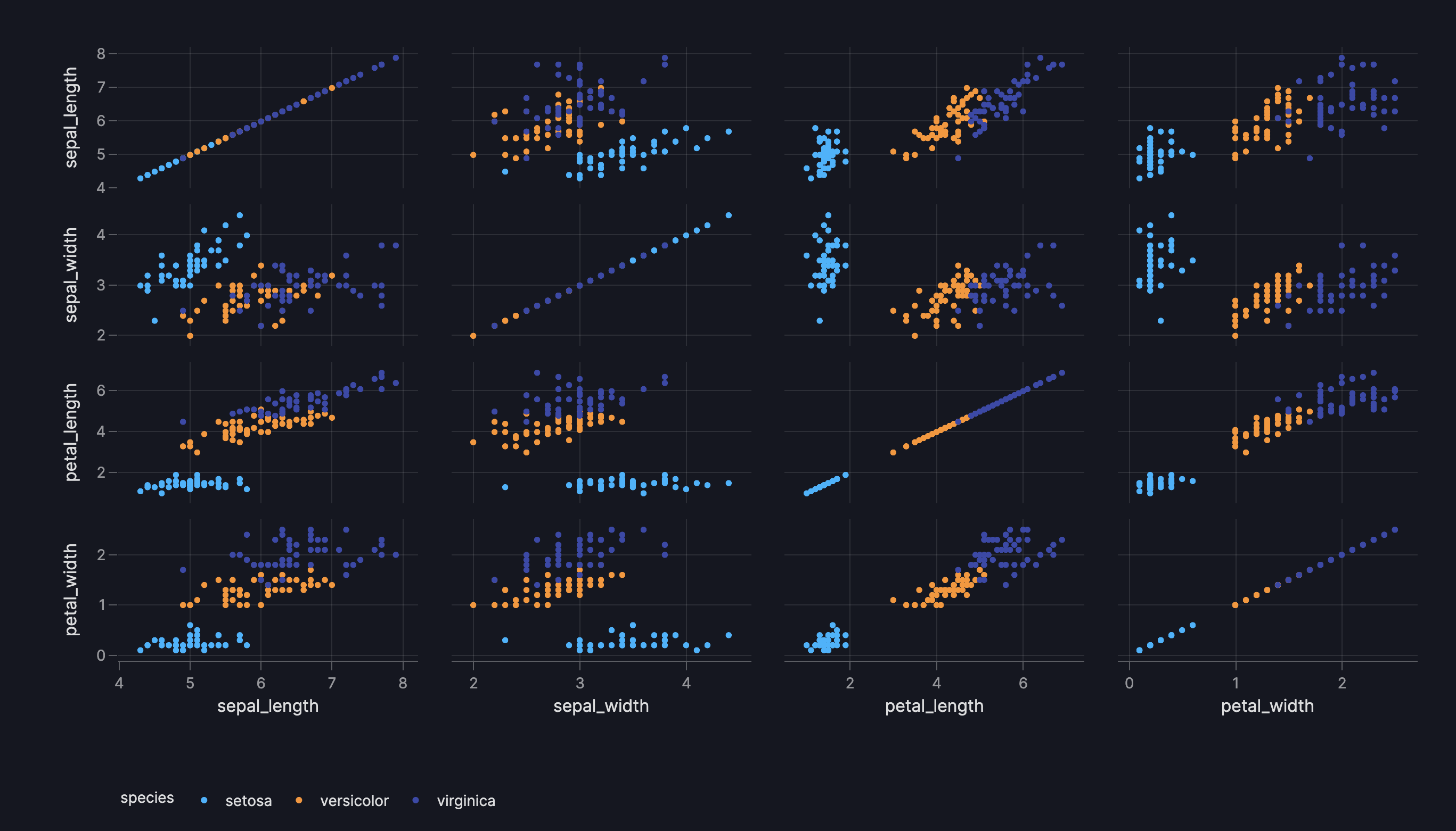
figure=px.scatter_matrix(
df, dimensions=["sepal_length", "sepal_width", "petal_length", "petal_width"], color="species"
),
),
],
)
dashboard = vm.Dashboard(pages=[page])
Vizro().build(dashboard).run()
![]() Run and edit this code in Py.Cafe
Run and edit this code in Py.Cafe
In the Python example we directly inserted the pandas DataFrame df into figure=px.scatter_matrix(df, ...). This is one way to supply data to a chart. For the YAML version, we refer to the data source by name as data_frame: iris. For a full explanation of the different methods you can use to send data to your dashboard, see our guide to using data in Vizro.
Customize Plotly chart
You will need to create a custom chart if you want to customize the Plotly chart beyond a function call, for example by:
- using post-update methods like
update_layout,update_xaxes,update_traces, or - by creating a custom
plotly.graph_objects.Figure()object and manually adding traces withadd_trace.
For more details, refer to our user guide on custom chart and the Plotly documentation on updating figures.
Control height and width of the Plotly chart
By default, graphs in a flex-row layout have a width of 450px, regardless of available space.
You can increase the width by providing a width argument in the px chart, but decreasing it below 450px requires specifying both width and height.
Limitations of fixed dimensions
Setting both width and height makes the chart use fixed, non-responsive dimensions. This can reduce flexibility in responsive layouts, may cause overflow on smaller screens, and can limit Plotly’s ability to automatically adjust the plot area or aspect ratio.
Interact with other graphs and tables
A graph can act as a source for interactions with other components, for example to cross-filter another graph or table when the user clicks on a point.
Add additional text
The Graph model accepts title, header, footer and description arguments. These are useful for providing additional context on the chart.
- title: Displayed as an H3 header, useful for summarizing the main topic or insight of the component.
- header: Accepts Markdown text, ideal for extra descriptions, subtitles, or detailed data insights.
- footer: Accepts Markdown text, commonly used for citing data sources, providing information on the last update, or adding disclaimers.
- description: Displayed as an icon that opens a tooltip containing Markdown text when hovered over. You can provide a string to use the default info icon or a
Tooltipmodel to use any icon from the Google Material Icons library.
Use Graph.title instead of the Plotly Express chart title
Although you can directly give a title to the Plotly Express chart, we recommend using Graph.title for proper alignment with other components on the screen.
Formatted Graph
import vizro.models as vm
import vizro.plotly.express as px
from vizro import Vizro

iris = px.data.iris()

page = vm.Page(
    title="Formatted Graph",
    components=[
        vm.Graph(
            figure=px.scatter(iris, x="sepal_width", y="sepal_length", color="species"),
            title="Relationships between Sepal Width and Sepal Length",
            header="""
                Each point in the scatter plot represents one of the 150 iris flowers, with colors indicating their
                types. The Setosa type is easily identifiable by its short and wide sepals.

                However, there is still overlap between the Versicolor and Virginica types when considering only sepal
                width and length.
                """,
            footer="""SOURCE: **Plotly iris data set, 2024**""",
            description="""
                The Iris dataset includes measurements of 150 iris flowers across three types: Setosa, Versicolor, and Virginica.

                While all samples are labeled by type, they can appear similar when looking at just some features. It's a useful dataset for exploring patterns and challenges in classification.
            """,
        ),
    ],
)
dashboard = vm.Dashboard(pages=[page])
Vizro().build(dashboard).run()
![]() Run and edit this code in Py.Cafe
Run and edit this code in Py.Cafe
# Still requires a .py to add data to the data manager and parse YAML configuration
# See yaml_version example
pages:
  - components:
      - figure:
          _target_: scatter
          x: sepal_width
          y: sepal_length
          color: species
          data_frame: iris
        title: Relationships between Sepal Width and Sepal Length
        header: |
          Each point in the scatter plot represents one of the 150 iris flowers, with colors indicating their
          types. The Setosa type is easily identifiable by its short and wide sepals.

          However, there is still overlap between the Versicolor and Virginica types when considering only sepal
          width and length.
        footer: |
          SOURCE: **Plotly iris data set, 2024**
        description: |
          The Iris dataset includes measurements of 150 iris flowers across three types: Setosa, Versicolor, and Virginica.

          While all samples are labeled by type, they can appear similar when looking at just some features. It's a useful dataset for exploring patterns and challenges in classification.
        type: graph
    title: Formatted Graph

The extra argument
The Graph is based on the underlying Dash component dcc.Graph. Using the extra argument you can pass extra arguments to dcc.Graph in order to alter it beyond the chosen defaults.
Note
Using extra is a quick and flexible way to alter a component beyond what Vizro offers. However, it is not a part of the official Vizro schema and the underlying implementation details may change. If you want to guarantee that your apps keep running, we recommend that you pin your Vizro version.
An example use would be to remove the plotly mode bar. For this, you can use extra={"config": {"displayModeBar": False}}.
Graph with extra
import vizro.models as vm
import vizro.plotly.express as px
from vizro import Vizro

iris = px.data.iris()

page = vm.Page(
    title="Graph without ModeBar",
    components=[
        vm.Graph(
            figure=px.scatter(iris, x="sepal_width", y="sepal_length", color="species"),
            title="Relationships between Sepal Width and Sepal Length",
            extra={"config": {"displayModeBar": False}},
        ),
    ],
)
dashboard = vm.Dashboard(pages=[page])
Vizro().build(dashboard).run()
![]() Run and edit this code in Py.Cafe
Run and edit this code in Py.Cafe
# Still requires a .py to add data to the data manager and parse YAML configuration
# See yaml_version example
pages:
  - components:
      - figure:
          _target_: scatter
          x: sepal_width
          y: sepal_length
          color: species
          data_frame: iris
        title: Relationships between Sepal Width and Sepal Length
        extra:
          config:
            displayModeBar: false
        type: graph
    title: Graph without ModeBar
