How to use buttons
This guide shows you how to use buttons to interact with your data in the dashboard.
The Button component is commonly used for dashboard interactions such as form submissions, navigation links, and other action triggers. It is based on the underlying Dash component dbc.Button.
To add a Button, insert it into the components argument of the Page model.
Customize button text
You can configure the text argument to alter the display text of the Button.
Customize text
import vizro.models as vm
from vizro import Vizro

page = vm.Page(
    title="Button with text",
    components=[vm.Button(text="I'm a button!")],
)

dashboard = vm.Dashboard(pages=[page])
Vizro().build(dashboard).run()
 Run and edit this code in Py.Cafe

Create a link button
To navigate to a different page using a button with an anchor tag, assign an absolute or relative URL to the Button.href.
import vizro.models as vm

vm.Button(text="Leave us a star! ⭐", href="https://github.com/mckinsey/vizro")
Trigger an action
You can use the Button to trigger actions. These actions could be built-in or custom. Use the Button.actions argument to configure the action that executes when the button is clicked.
The example below shows how to configure a button that exports the filtered data from a target chart using the export_data action.
If your app includes several action buttons, consider adding icons. You can also use icon-only buttons without text, but keep in mind that these work best when the icon is universally recognizable (for example, a download arrow for exports). For less common actions, you should include text on your button to make it clear what it does.
Button with action
import vizro.models as vm
import vizro.plotly.express as px
from vizro import Vizro
import vizro.actions as va
df = px.data.iris()
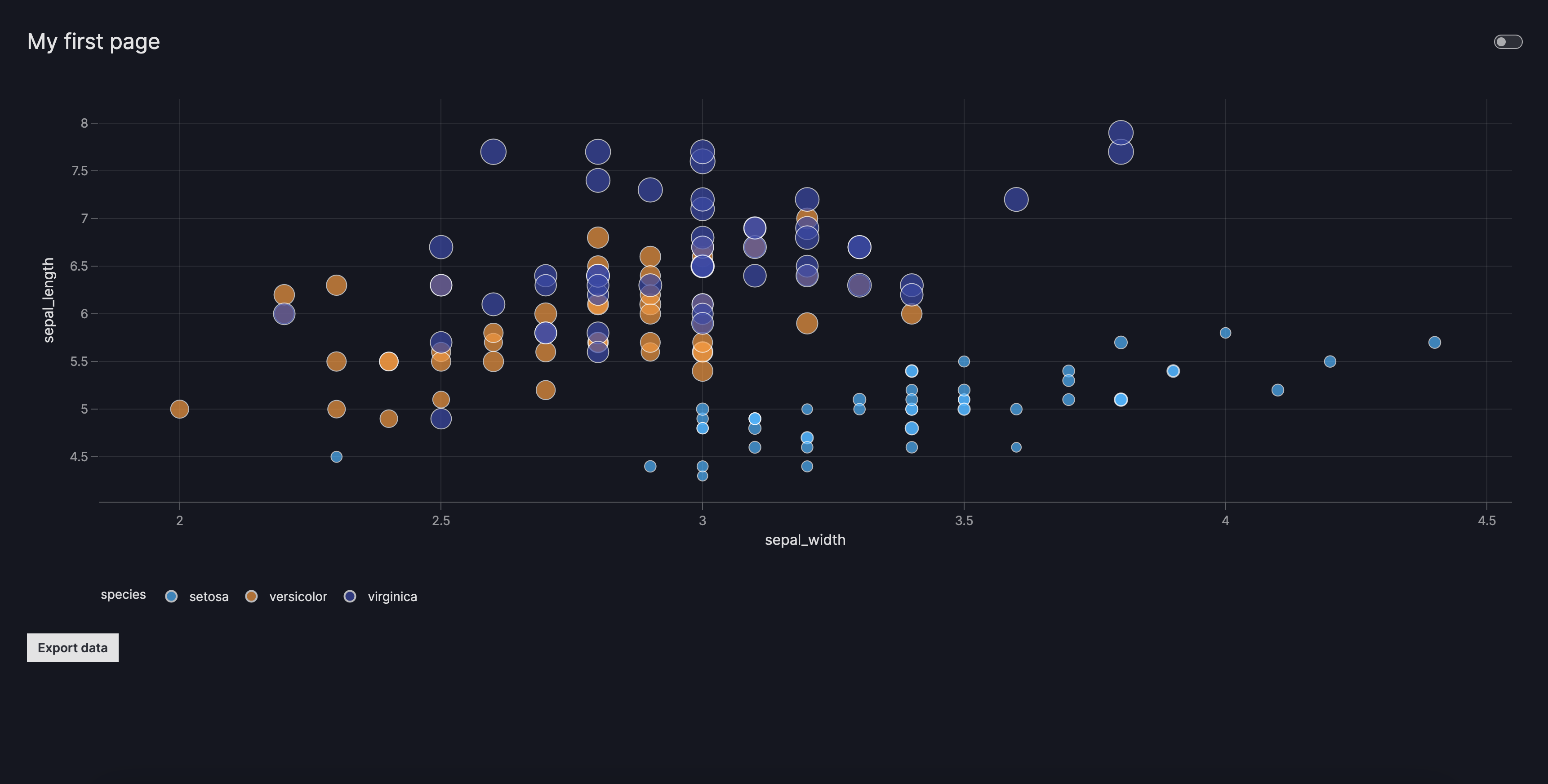
page = vm.Page(
title="My first page",
layout=vm.Flex(), # (1)!
components=[
vm.Graph(
figure=px.scatter(
df,
x="sepal_width",
y="sepal_length",
color="species",
size="petal_length",
),
),
vm.Button(
text="Export data",
actions=va.export_data(),
),
]
)
dashboard = vm.Dashboard(pages=[page])
Vizro().build(dashboard).run()
Run and edit this code in Py.Cafe
- We use a
Flexlayout to make sure theGraphandButtononly occupy as much space as they need, rather than being distributed evenly.
# Still requires a .py to add data to the data manager and parse YAML configuration
# See yaml_version example
pages:
  - components:
      - figure:
          _target_: scatter
          x: sepal_width
          y: sepal_length
          color: species
          size: petal_length
          data_frame: iris
        type: graph
      - type: button
        text: Export data
        id: export_data
        actions:
          - type: export_data
    layout:
      type: flex
    title: My first page
Use as a control
The Button component is currently reserved to be used inside the main panel (right-side) of the dashboard. However, there might be use cases where one would like to place the Button inside the control panel (left-side) with the other controls.
In this case, follow the user-guide outlined for creating custom components and manually add the Button as a valid type to the controls argument by running the following lines before your dashboard configurations:
from vizro import Vizro
import vizro.models as vm

vm.Page.add_type("controls", vm.Button)

# Add dashboard configurations below
...
Styled buttons
There are three predefined button styles that can be customized using the variant argument. If no variant is specified, the default style applied is variant="filled".
Button with different styles
import vizro.models as vm
from vizro import Vizro

page = vm.Page(
    title="Buttons with different styles",
    layout=vm.Flex(direction="row"),  # (1)!
    components=[
        vm.Button(text="filled"),
        vm.Button(text="outlined", variant="outlined"),
        vm.Button(text="plain", variant="plain"),
    ],
)

dashboard = vm.Dashboard(pages=[page])
Vizro().build(dashboard).run()
Run and edit this code in Py.Cafe
- We use a
Flexlayout withdirection="row"to ensure theButtoncomponents are placed side by side and only take up as much space as needed.
# Still requires a .py to add data to the data manager and parse YAML configuration
# See yaml_version example
pages:
  - title: Buttons with different styles
    layout:
      direction: row
      type: flex
    components:
      - type: button
        text: filled
      - type: button
        text: outlined
        variant: outlined
      - type: button
        text: plain
        variant: plain

Add a tooltip
The description argument enables you to add helpful context to your button by displaying an info icon next to its text. Hovering over the icon shows a tooltip with your chosen text.
You can provide Markdown text as a string to use the default info icon or a Tooltip model to use any icon from the Google Material Icons library.
Button with a tooltip
import vizro.models as vm
from vizro import Vizro

page = vm.Page(
    title="Buttons with tooltip",
    components=[
        vm.Button(
            text="Click me!",
            description="Once you click this button, the process will start.",
        ),
    ],
)

dashboard = vm.Dashboard(pages=[page])
Vizro().build(dashboard).run()
Run and edit this code in Py.Cafe

Add an icon
The icon argument enables you to add an icon to your button, using any icon from the Google Material Icons library.
You can use it alongside the text argument, or on its own to create a circular icon-only button.
Button with an icon
import vizro.models as vm
import vizro.plotly.express as px
from vizro import Vizro

iris = px.data.iris()

page = vm.Page(
    title="Buttons with an icon",
    layout=vm.Flex(),
    components=[
        vm.Button(
            icon="Download",
            description="Download the data!",
            variant="outlined",
        ),
        vm.Graph(
            figure=px.scatter(
                iris,
                x="sepal_width",
                y="sepal_length",
                color="species",
                size="petal_length",
            ),
        ),
        vm.Button(
            text="View Data Source",
            href="https://www.kaggle.com/datasets/uciml/iris",
            icon="Link",
            variant="outlined",
        ),
    ],
)

dashboard = vm.Dashboard(pages=[page])
Vizro().build(dashboard).run()
Run and edit this code in Py.Cafe
pages:
  - title: Buttons with an icon
    components:
      - type: button
        icon: Download
        description: Download the data!
        actions:
          - type: export_data
      - figure:
          _target_: scatter
          x: sepal_width
          y: sepal_length
          color: species
          size: petal_length
          data_frame: iris
        type: graph
      - type: button
        text: Visit link to learn more!
        href: https://www.kaggle.com/datasets/uciml/iris
        icon: Link
        variant: outlined
The extra argument
The Button is based on the underlying Dash component dbc.Button. Using the extra argument you can pass more arguments to dbc.Button in order to alter it beyond the chosen defaults.
Warning
Using extra is a quick and flexible way to alter a component beyond what Vizro offers. However, it is not a part of the official Vizro schema and the underlying implementation details may change. If you want to guarantee that your apps keep running, we recommend that you pin your Vizro version.
An example use would be to create an outlined success button. For this, you can use extra={"color": "success", "outline": True}. This would be a shortcut to using custom CSS in the assets folder as explained in our guide on CSS.
Button with custom style
import vizro.models as vm
from vizro import Vizro

page = vm.Page(
    title="Button with custom style",
    components=[
        vm.Button(
            text="Success button",
            extra={"color": "success", "outline": True},
        ),
    ],
)

dashboard = vm.Dashboard(pages=[page])
Vizro().build(dashboard).run()
Run and edit this code in Py.Cafe
