How to use cards
This guide shows you how to use cards in your dashboard.
Card and Text components
The Card component and Text component both enable you to add text to your page using Markdown syntax through the underlying Dash component dcc.Markdown.
You should use Text to display plain Markdown text without any extra styling like borders or background, for example to add an introductory paragraph to your page.
You should use Card to display Markdown text that needs attention drawn to it. Generally, this would be relatively short portions of text. Unlike Text, a Card can also be used for navigation.
You can add a Card to your dashboard by inserting the Card into the components argument of the Page or Container models.
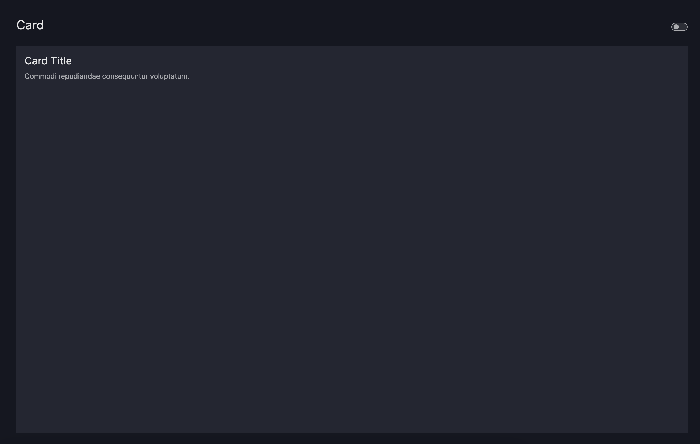
Card
import vizro.models as vm
from vizro import Vizro

page = vm.Page(
    title="Card",
    layout=vm.Flex(),  # (1)!
    components=[
        vm.Card(
            text="""
                ### Card Title
                Commodi repudiandae consequuntur voluptatum.
            """,
        ),
    ],
)

dashboard = vm.Dashboard(pages=[page])
Vizro().build(dashboard).run()
 Run and edit this code in Py.Cafe
- We use a
Flexlayout to ensure theCardonly occupies the vertical space it needs. Without this, it would default to filling the entire available space.
Customize card text
The Card uses the vdc.Markdown component as its underlying text component. vdc.Markdown is a clone of dcc.Markdown that additionally uses dmc.CodeHighlight and dmc.InlineCodeHighlight for rendering code blocks and inline code. For more details on customizing the Markdown text, refer to the dcc.Markdown component documentation. Based on examples from Dash, the Card model supports the following:
- Headers
- Emphasis
- Lists
- Block Quotes
- Images
- Links
Card using markdown
import vizro.models as vm
from vizro import Vizro
page = vm.Page(
title="Customizing Text", # (1)!
components=[
vm.Card(
text="""
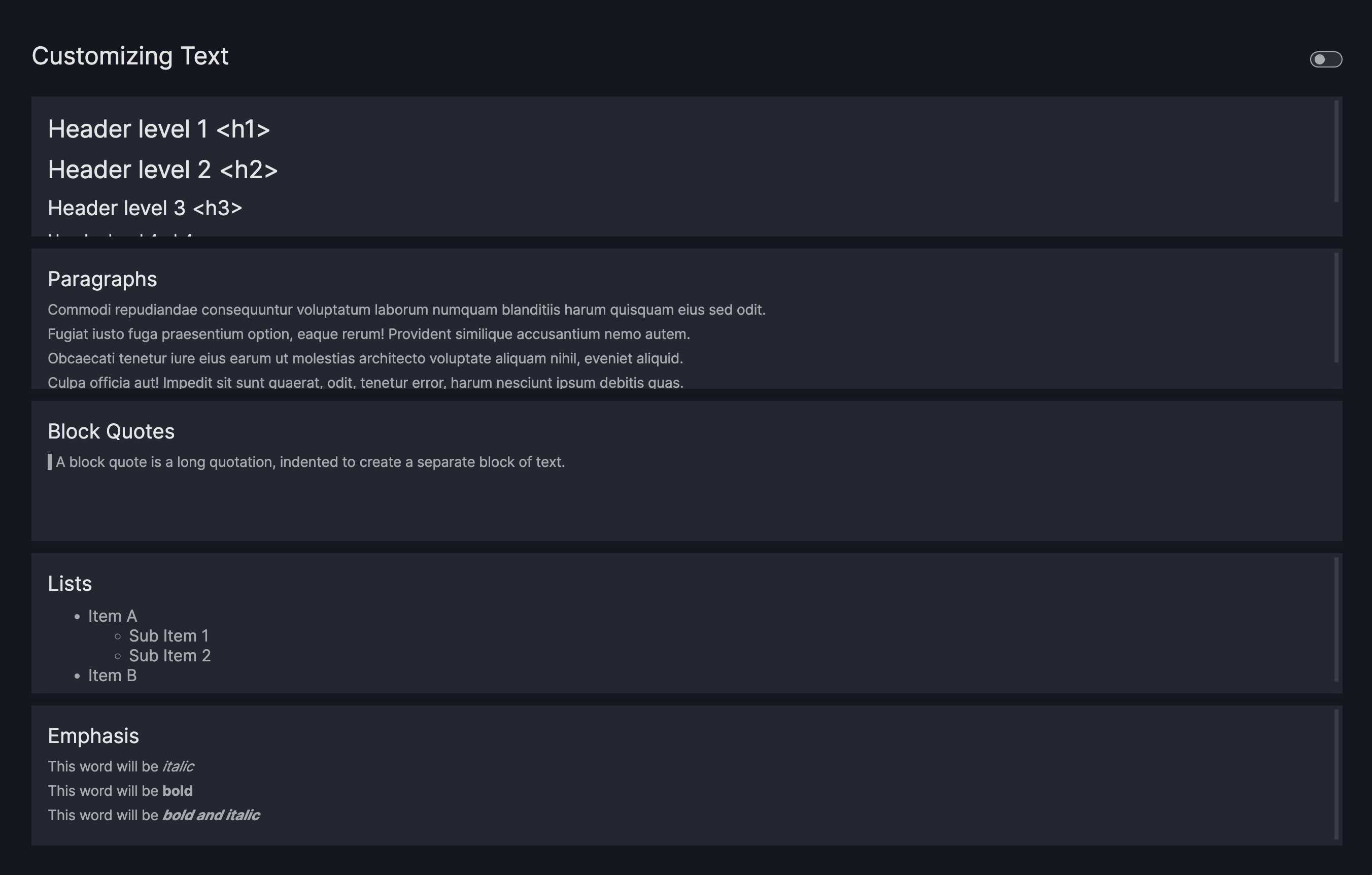
# Header level 1 <h1>
## Header level 2 <h2>
### Header level 3 <h3>
#### Header level 4 <h4>
""",
),
vm.Card(
text="""
### Paragraphs
Commodi repudiandae consequuntur voluptatum laborum numquam blanditiis harum quisquam eius sed odit.
Fugiat iusto fuga praesentium option, eaque rerum! Provident similique accusantium nemo autem.
Obcaecati tenetur iure eius earum ut molestias architecto voluptate aliquam nihil, eveniet aliquid.
Culpa officia aut! Impedit sit sunt quaerat, odit, tenetur error, harum nesciunt ipsum debitis quas.
""",
),
vm.Card(
text="""
### Block Quotes
>
> A block quote is a long quotation, indented to create a separate block of text.
>
""",
),
vm.Card(
text="""
### Lists
* Item A
* Sub Item 1
* Sub Item 2
* Item B
""",
),
vm.Card(
text="""
### Emphasis
This word will be *italic*
This word will be **bold**
This word will be _**bold and italic**_
""",
),
],
)
dashboard = vm.Dashboard(pages=[page])
Vizro().build(dashboard).run()
Run and edit this code in Py.Cafe
- Note that we don't explicitly define a
layouthere, so it defaults to theGridmodel. This layout automatically arranges all components to fit on a single page, giving each one equal space. As a result, allCardcomponents are evenly sized and fill the entire screen.
# Still requires a .py to add data to the data manager and parse YAML configuration
# See yaml_version example
pages:
  - components:
      - text: |
          # Header level 1 <h1>

          ## Header level 2 <h2>

          ### Header level 3 <h3>

          #### Header level 4 <h4>
        type: card
      - text: |
          Commodi repudiandae consequuntur voluptatum laborum numquam blanditiis harum quisquam eius sed odit.

          Fugiat iusto fuga praesentium option, eaque rerum! Provident similique accusantium nemo autem.

          Obcaecati tenetur iure eius earum ut molestias architecto voluptate aliquam nihil, eveniet aliquid.

          Culpa officia aut! Impedit sit sunt quaerat, odit, tenetur error, harum nesciunt ipsum debitis quas.
        title: Paragraphs
        type: card
      - text: |
          >
          > A block quote is a long quotation, indented to create a separate block of text.
          >
        title: Block Quotes
        type: card
      - text: |
          * Item A
            * Sub Item 1
            * Sub Item 2
          * Item B
        title: Lists
        type: card
      - text: |
          This word will be *italic*

          This word will be **bold**

          This word will be _**bold and italic**_
        title: Emphasis
        type: card
    title: Customizing Text
Add header and footer
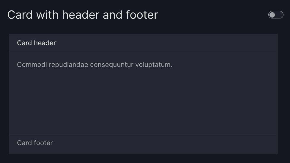
You can now add a header and footer to your Card by using the header and footer arguments. Both fields support Markdown text, so you can easily include text, links, and inline formatting.
Card with header and footer
import vizro.models as vm
from vizro import Vizro

page = vm.Page(
    title="Card with header and footer",
    components=[
        vm.Card(
            text="Commodi repudiandae consequuntur voluptatum.",
            header="Lorem ipsum header",
            footer="Lorem ipsum footer",
        ),
    ],
)

dashboard = vm.Dashboard(pages=[page])
Vizro().build(dashboard).run()
Run and edit this code in Py.Cafe
Place an image on a card
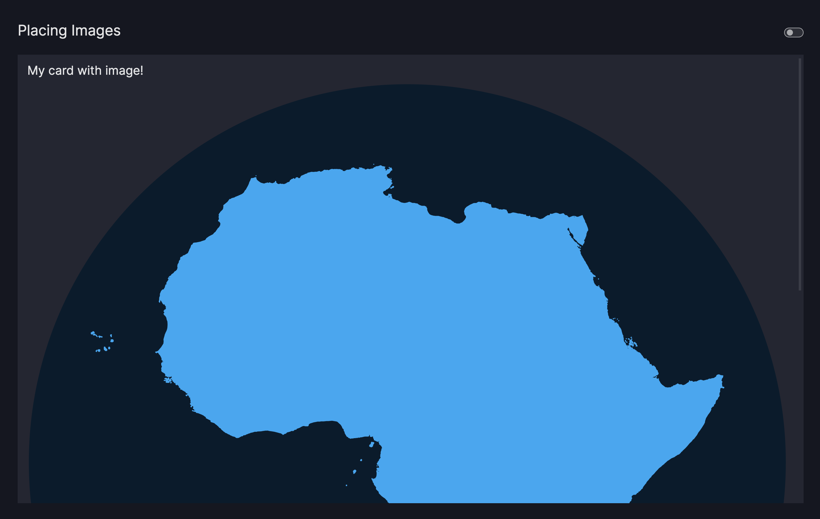
Images can be added to the text parameter by using the standard markdown syntax:

An image ALT text offers a description to your image and serves as a text placeholder or to improve the accessibility of your app. Providing an image ALT text is optional.
- To use a relative Image URL, place an image of your choice into your
assetsfolder first - Use markdown to render your image by using one of the following syntax:
- Relative Image URL:
 - Absolute Image URL:

- Relative Image URL:
Card with image
import vizro.models as vm
from vizro import Vizro
page = vm.Page(
title="Placing Images",
components=[
vm.Card(
text="""
### My card with image!

Commodi repudiandae consequuntur voluptatum laborum numquam blanditiis harum quisquam eius sed odit.
Fugiat iusto fuga praesentium option, eaque rerum! Provident similique accusantium nemo autem.
Obcaecati tenetur iure eius earum ut molestias architecto voluptate aliquam nihil, eveniet aliquid.
""",
),
],
)
dashboard = vm.Dashboard(pages=[page])
Vizro().build(dashboard).run()
# Still requires a .py to add data to the data manager and parse YAML configuration
# See yaml_version example
pages:
- components:
- text: |

Commodi repudiandae consequuntur voluptatum laborum numquam blanditiis harum quisquam eius sed odit.
Fugiat iusto fuga praesentium option, eaque rerum! Provident similique accusantium nemo autem.
Obcaecati tenetur iure eius earum ut molestias architecto voluptate aliquam nihil, eveniet aliquid.
title: My card with image!
type: card
title: Placing Images
Note
Note that inserting images using HTML is by default turned off by the dcc.Markdown to prevent users being exposed to cross-site scripting attacks. If you need to turn it on, a custom component would have to be created.
You might notice that the image is quite large. You'll find out how to style images in terms of their position and size in the next section.
Change image dimensions
To change the size or position of the image, add a URL hash to your image like this:

Note the added URL hash #my-image. Now create a CSS file placed in your assets folder and give an attribute selector to select images with that matching URL hash.
Card with styled image
import vizro.models as vm
from vizro import Vizro
page = vm.Page(
title="Styling Images",
layout=vm.Flex(), # (1)!
components=[
vm.Card(
text="""
### My card with image!

Commodi repudiandae consequuntur voluptatum laborum numquam blanditiis harum quisquam eius sed odit.
Fugiat iusto fuga praesentium option, eaque rerum! Provident similique accusantium nemo autem.
Obcaecati tenetur iure eius earum ut molestias architecto voluptate aliquam nihil, eveniet aliquid.
"""
),
]
)
dashboard = vm.Dashboard(pages=[page])
Vizro().build(dashboard).run()
- We use a
Flexlayout to ensure theCardonly occupies the vertical space it needs. Without this, it would default to filling the entire available space.
# Still requires a .py to add data to the data manager and parse YAML configuration
# See yaml_version example
pages:
- components:
- text: |

Commodi repudiandae consequuntur voluptatum laborum numquam blanditiis harum quisquam eius sed odit.
Fugiat iusto fuga praesentium option, eaque rerum! Provident similique accusantium nemo autem.
Obcaecati tenetur iure eius earum ut molestias architecto voluptate aliquam nihil, eveniet aliquid.
title: My card with image!
type: card
layout:
type: flex
title: Styling Images
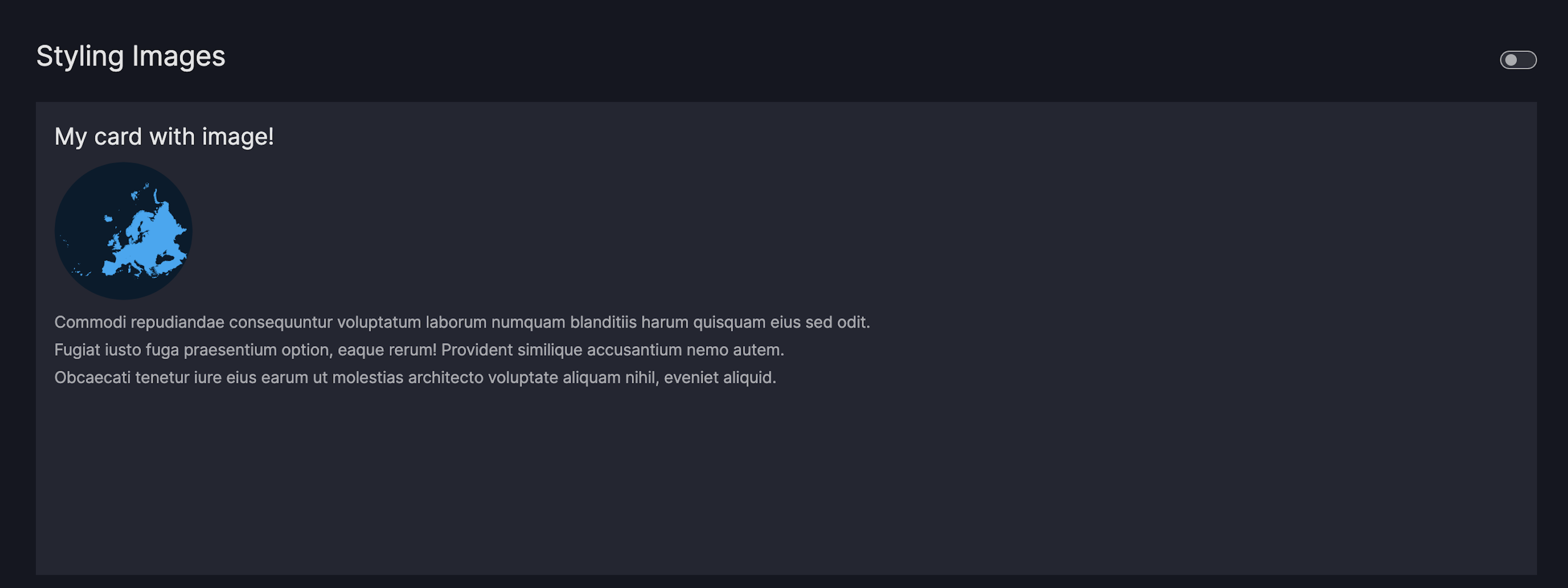
Use the following URL hashes in your image path to apply Vizro's default styling.
Float an image inside the card
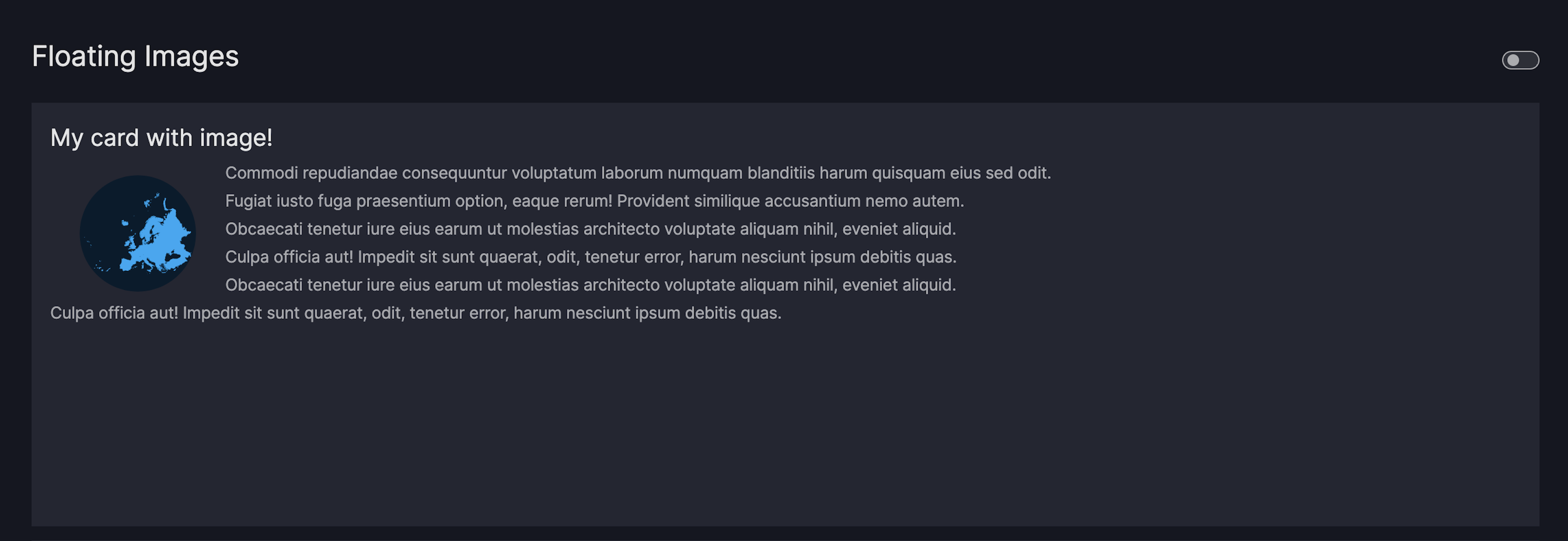
To float an image for example to the right of the text, use the src attribute as a CSS selector. Follow these steps:
- Add a hash (#) to the image URL, for example,
 - Target that hash in your custom CSS file
img[src*="#my-image"] { float: right; }
Card with floating image
import vizro.models as vm
from vizro import Vizro
page = vm.Page(
title="Floating Images",
layout=vm.Flex(), # (1)!
components=[
vm.Card(
text="""
### My card with floating image!

Commodi repudiandae consequuntur voluptatum laborum numquam blanditiis harum quisquam eius sed odit.
Fugiat iusto fuga praesentium option, eaque rerum! Provident similique accusantium nemo autem.
Obcaecati tenetur iure eius earum ut molestias architecto voluptate aliquam nihil, eveniet aliquid.
Culpa officia aut! Impedit sit sunt quaerat, odit, tenetur error, harum nesciunt ipsum debitis quas.
Obcaecati tenetur iure eius earum ut molestias architecto voluptate aliquam nihil, eveniet aliquid.
Culpa officia aut! Impedit sit sunt quaerat, odit, tenetur error, harum nesciunt ipsum debitis quas.
""",
),
],
)
dashboard = vm.Dashboard(pages=[page])
Vizro().build(dashboard).run()
- We use a
Flexlayout to ensure theCardonly occupies the vertical space it needs. Without this, it would default to filling the entire available space.
# Still requires a .py to add data to the data manager and parse YAML configuration
# See yaml_version example
pages:
- components:
- text: |

Commodi repudiandae consequuntur voluptatum laborum numquam blanditiis harum quisquam eius sed odit.
Fugiat iusto fuga praesentium option, eaque rerum! Provident similique accusantium nemo autem.
Obcaecati tenetur iure eius earum ut molestias architecto voluptate aliquam nihil, eveniet aliquid.
Culpa officia aut! Impedit sit sunt quaerat, odit, tenetur error, harum nesciunt ipsum debitis quas.
Obcaecati tenetur iure eius earum ut molestias architecto voluptate aliquam nihil, eveniet aliquid.
Culpa officia aut! Impedit sit sunt quaerat, odit, tenetur error, harum nesciunt ipsum debitis quas.
title: My card with floating image!
type: card
layout:
type: flex
title: Floating Images
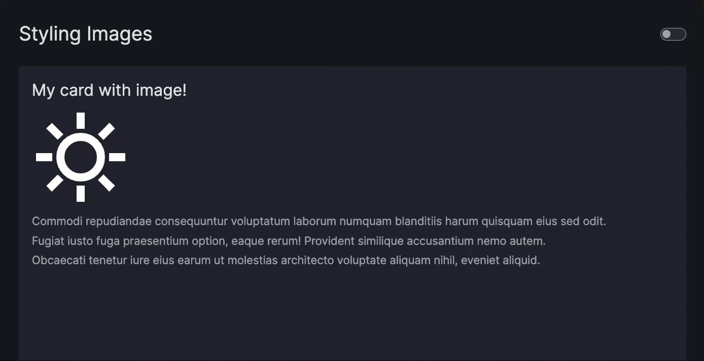
Make an icon responsive to theme switch
To make an icon responsive to theme switching, override its filter CSS property.
In this example, we use the --fill-icon-image-card CSS variable from the vizro-bootstrap CSS file. It uses the invert() function to flip the icon's color during a theme switch.
This approach works if your icon initially has a white fill color. If not, modify the SVG code by adding fill="white".
Responsive icon
Create a navigation card
This section describes how to use the Card component to create a navigation card, enabling users to navigate to another page by clicking on the card area.
For a button-style link navigation component, see the separate guide on creating a link button. To configure the navigation panel on the left hand side of the screen, refer to the separate guide on navigation.
To create a navigation card:
- Insert the
Cardinto thecomponentsargument of thePage. - Pass your Markdown text to the
Card.text. - Pass a relative or absolute URL to the
Card.href.
Navigation Card
import vizro.models as vm
import vizro.plotly.express as px
from vizro import Vizro

iris = px.data.iris()

page_1 = vm.Page(
    title="Homepage",
    components=[
        vm.Card(
            text="""
            ### Filters and parameters

            Leads to the first page on click.
            """,
            href="/filters-and-parameters",
        ),
        vm.Card(
            text="""
            ### Google - External Link

            Leads to an external link on click.
            """,
            href="https://google.com",
        ),
    ],
)

page_2 = vm.Page(
    title="Filters and parameters",
    components=[
        vm.Graph(figure=px.scatter(iris, x="sepal_length", y="petal_width", color="sepal_width")),
    ],
)

dashboard = vm.Dashboard(pages=[page_1, page_2])
Vizro().build(dashboard).run()
Run and edit this code in Py.Cafe
# Still requires a .py to add data to the data manager and parse YAML configuration
# See yaml_version example
pages:
  - components:
      - text: |
          ### Filters and parameters

          Leads to the first page on click
        href: /filters-and-parameters
        type: card
      - text: |
          ### Google - External Link

          Leads to an external link on click.
        href: https://google.com
        type: card
    title: Homepage
  - components:
      - figure:
          _target_: scatter
          color: sepal_width
          data_frame: iris
          x: sepal_length
          y: petal_width
        type: graph
    title: Filters and parameters
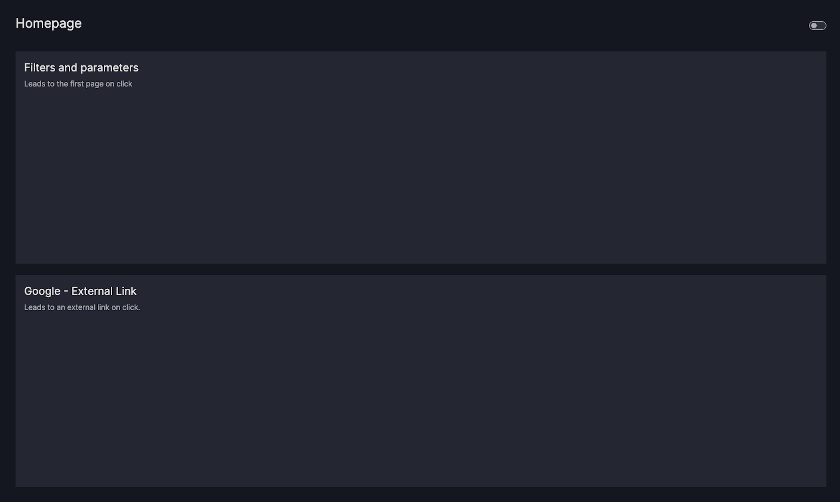
If you now click on the card area, you should automatically be redirected to the relevant href.
Note
When using the Card, keep the following in mind:
Create a KPI card
To create a KPI card, use the existing KPI card functions from vizro.figures. Unlike the static text card vm.Card, a KPI card must be created using a figure function, which enables the text content of the KPI to change based on input from controls.
For detailed examples on how to create a KPI card, refer to the figure user guide on KPI cards.
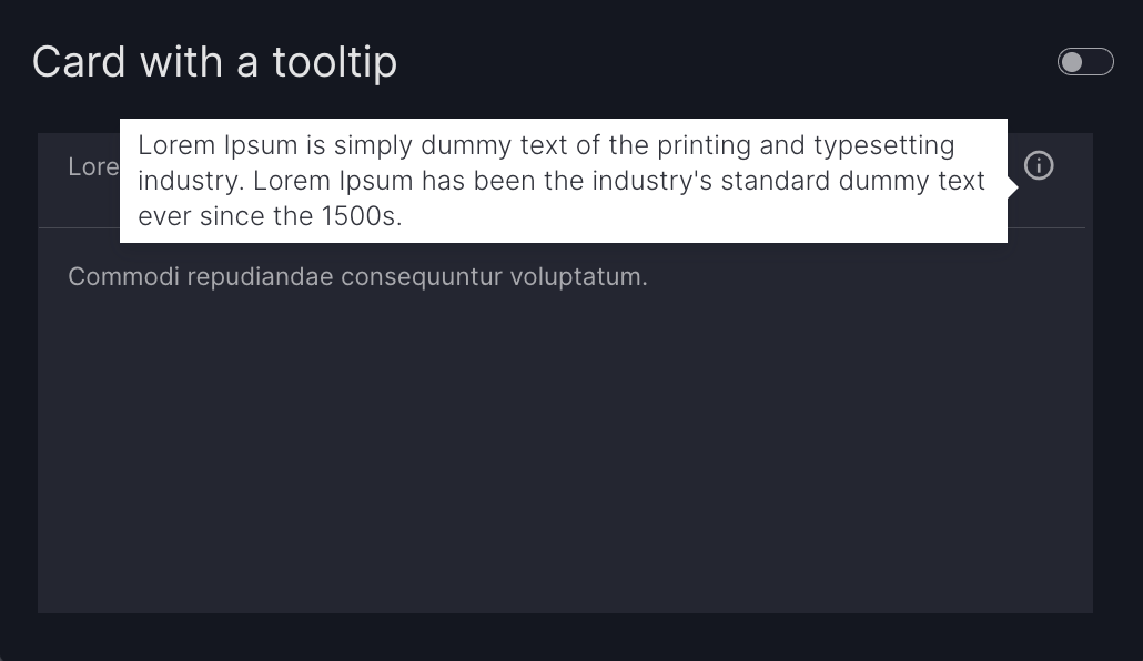
Add a tooltip
Use the description argument to add helpful context to your Card. This displays an info icon in the top-right corner, and hovering over it reveals a tooltip with your chosen text.
You can provide Markdown text to the description argument to use the default info icon, or pass a Tooltip model to customize the icon using any symbol from the Google Material Icons library.
Card with a tooltip
import vizro.models as vm
from vizro import Vizro

page = vm.Page(
    title="Card with a tooltip",
    components=[
        vm.Card(
            text="Commodi repudiandae consequuntur voluptatum.",
            header="Lorem ipsum",
            description="Lorem Ipsum is simply dummy text of the printing and typesetting industry. "
                        "Lorem Ipsum has been the industry's standard dummy text ever since the 1500s.",
        ),
    ],
)

dashboard = vm.Dashboard(pages=[page])
Vizro().build(dashboard).run()
Run and edit this code in Py.Cafe
# Still requires a .py to add data to the data manager and parse YAML configuration
# See yaml_version example
pages:
  - components:
      - text: |
          Commodi repudiandae consequuntur voluptatum.
        header: Lorem ipsum
        description: |
          Lorem Ipsum is simply dummy text of the printing and typesetting industry.

          Lorem Ipsum has been the industry's standard dummy text ever since the 1500s
        type: card
    title: Card with a tooltip
Trigger an action with a card
The example below shows how to use the set_control action to filter another Graph or Table when a Card is clicked.
Action triggered by card
import vizro.actions as va
import vizro.models as vm
import vizro.plotly.express as px
from vizro import Vizro

df = px.data.iris()

page = vm.Page(
    title="Action triggered by a card",
    components=[
        vm.Card(text="Filter: Setosa", actions=va.set_control(control="filter-id-1", value="setosa")),
        vm.Card(text="Filter: Virginica", actions=va.set_control(control="filter-id-1", value="virginica")),
        vm.Card(text="Filter: Versicolor", actions=va.set_control(control="filter-id-1", value="versicolor")),
        vm.Graph(figure=px.scatter(df, x="sepal_width", y="sepal_length", color="species")),
    ],
    controls=[vm.Filter(id="filter-id-1", column="species")],
    layout=vm.Grid(grid=[[0, 1, 2], [3, 3, 3], [3, 3, 3]])
)

dashboard = vm.Dashboard(pages=[page])
Vizro().build(dashboard).run()
Run and edit this code in Py.Cafe
# Still requires a .py to add data to the data manager and parse YAML configuration
# See yaml_version example
pages:
  - components:
      - type: card
        text: Filter: Setosa
        actions:
          - type: set_control
            value: setosa
      - type: card
        text: Filter: Viriginica
        actions:
          - type: set_control
            value: virginica
      - type: card
        text: Filter: Versicolor
        actions:
          - type: set_control
            value: versicolor
      - type: graph
        figure:
          _target_: scatter
          x: sepal_width
          y: sepal_length
          color: species
      - type: button
        text: Export data
        actions:
          - type: export_data
    controls:
      - type: filter
        id: filter-id-1
        column: species
    layout:
      - type: grid
        grid: [[0, 1, 2], [3, 3, 3], [3, 3, 3]]
    title: Action triggered by a card

The extra argument
The Card is based on the underlying Dash component dbc.Card. Using the extra argument you can pass extra arguments to dbc.Card in order to alter it beyond the chosen defaults.
Note
Using extra is a quick and flexible way to alter a component beyond what Vizro offers. However, it is not a part of the official Vizro schema and the underlying implementation details may change. If you want to guarantee that your apps keep running, we recommend that you pin your Vizro version.
An example use would be to specify a fixed Card height and width. For this, you can use extra={"style": {"height": "100px", "width": "200px"}}. This would be a shortcut to using custom CSS in the assets folder as explained in our guide on CSS.
Card with limited height
import vizro.models as vm
from vizro import Vizro

page = vm.Page(
     title="Card with fixed dimensions",
     components=[
         vm.Card(
             text="This card has fixed dimensions 200x100.",
             extra={"style": {"height": "100px", "width": "200px"}},
         ),
     ],
)

dashboard = vm.Dashboard(pages=[page])
Vizro().build(dashboard).run()
Run and edit this code in Py.Cafe
